Applications & Variations
Creative & Visual Direction
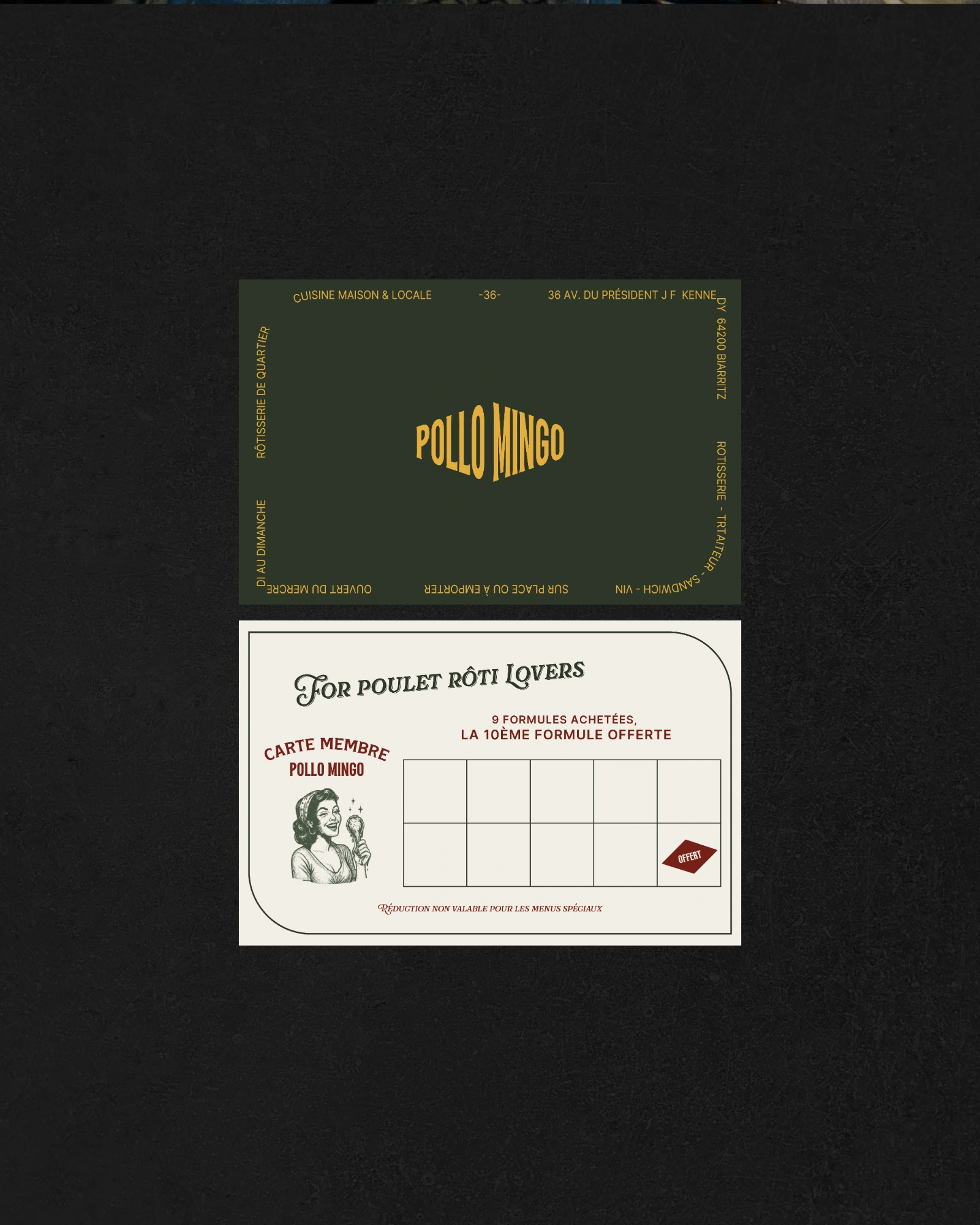
Logotype and variations
Market and Positioning
Print & Packaging
Color & Typography Systems
Graphic Systems (Icons, Patterns, Illustrations)
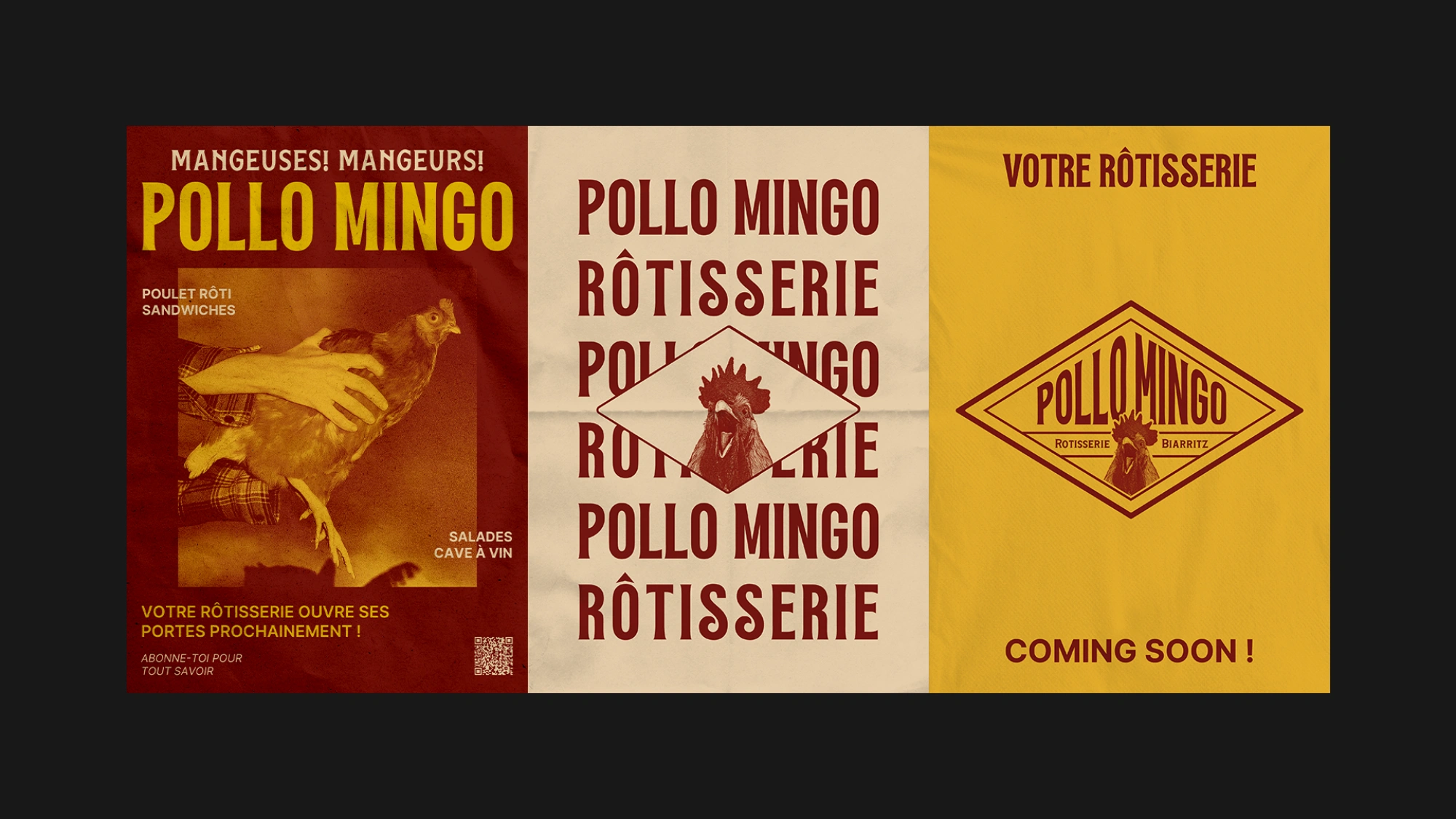
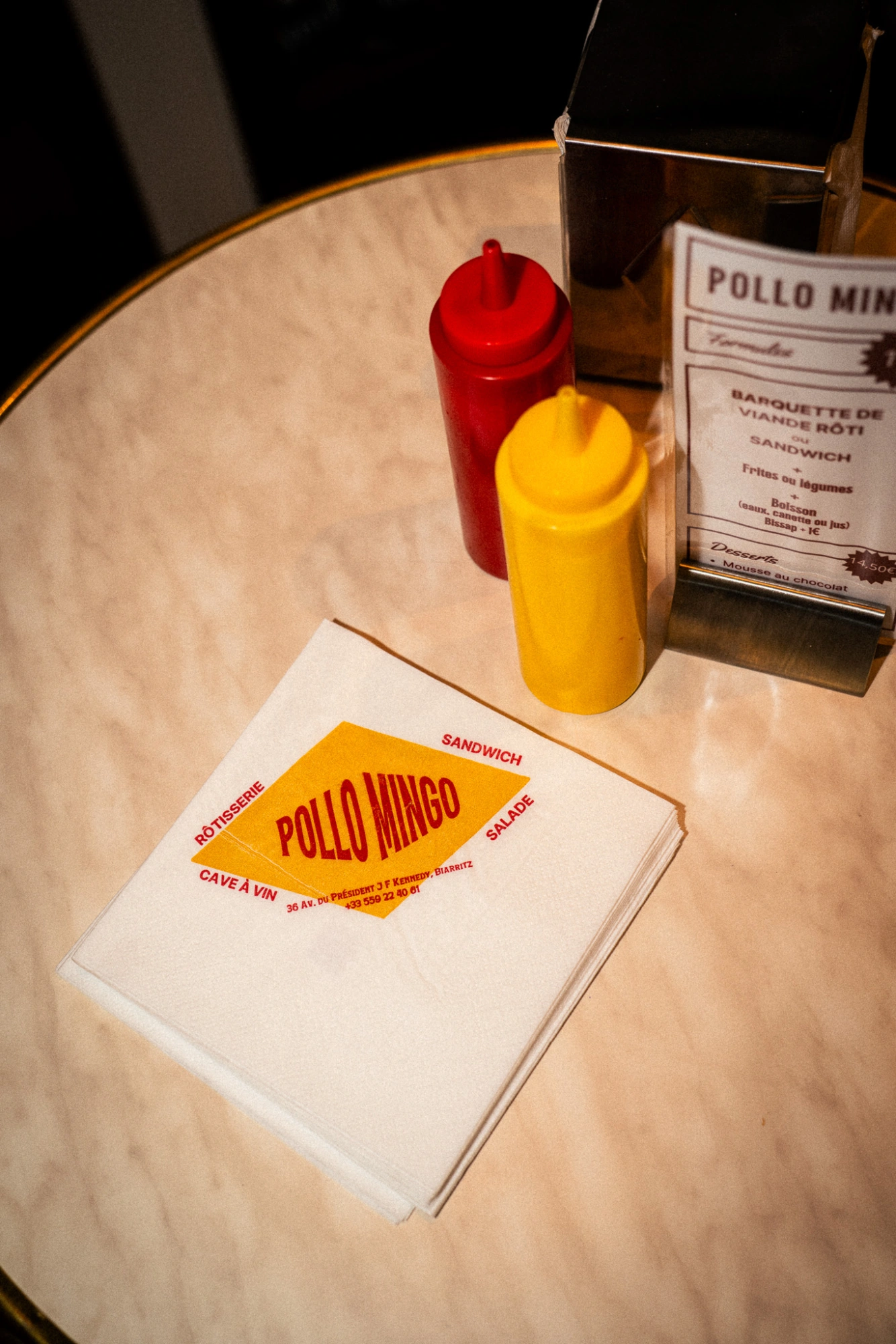
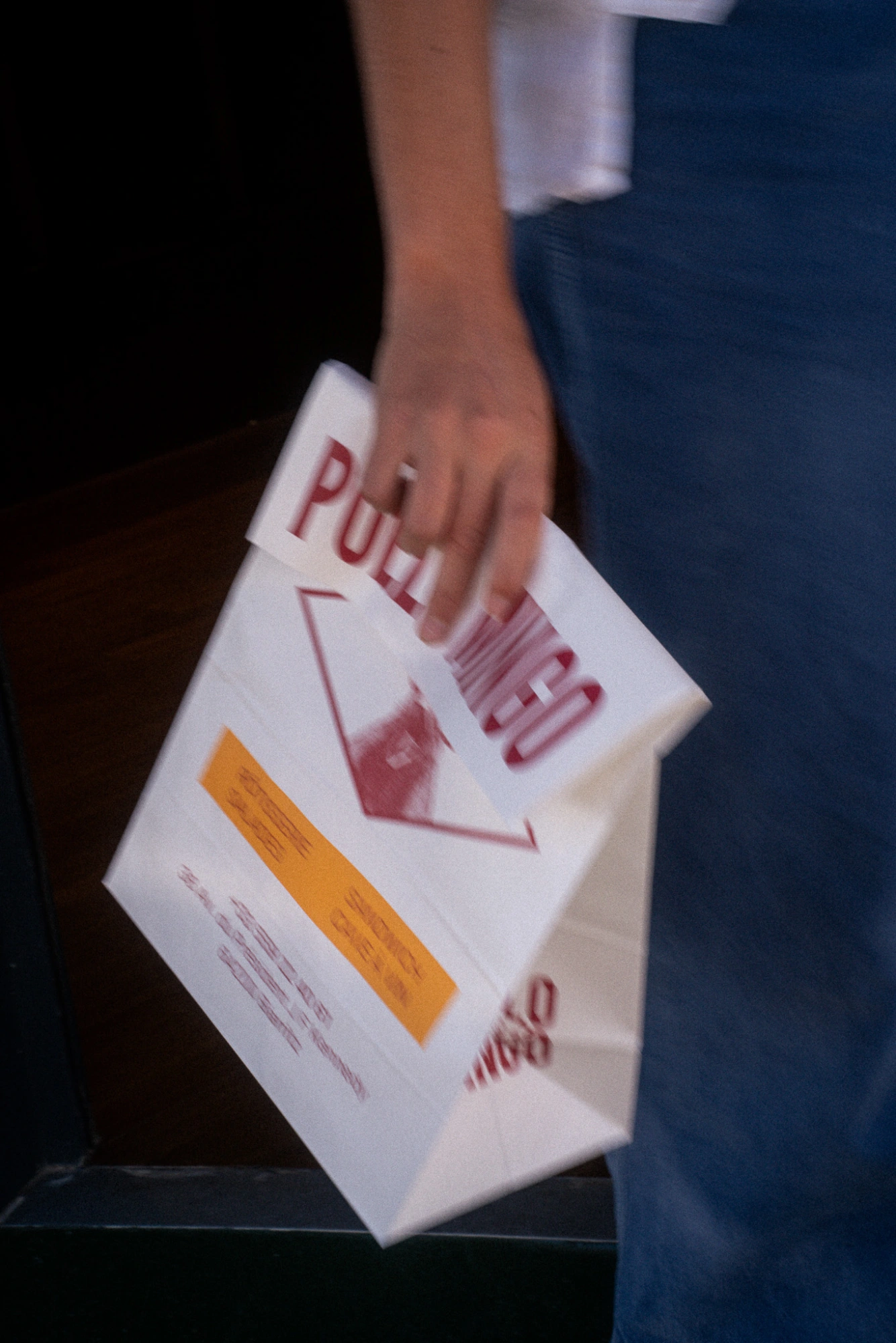


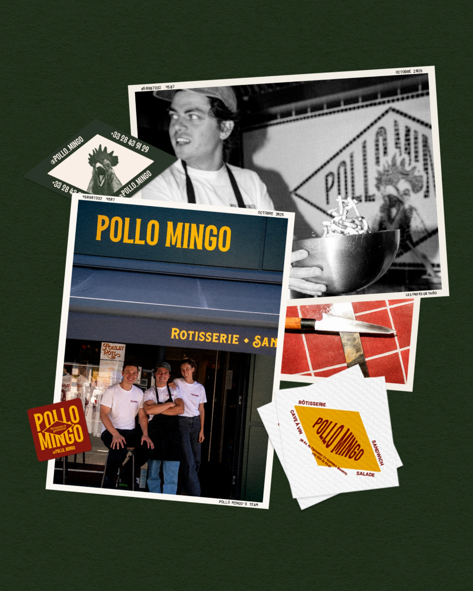


Pollo Mingo needed to assert its personality to avoid blending in with the tourist establishments along the coast. The challenge: to revitalize the neighborhood while offering an instantly memorable visual landmark. After an immersion workshop and an audit of local 'street-food' spots, Adèle defined a 'retro-artisan' positioning inspired by old American drugstores: strong serif typography, a paprika red and cream palette, and quirky humor centered around the chicken motif. She then developed this concept across three fronts: Digital / Print & Packaging: stamped kraft boxes, illustrated greaseproof paper, numbered stickers. / Location: enameled sign, welcome mosaic, stenciled lettering on rotisseries. Every element tells the same story: a rotisserie that's fun in its approach but authentic in its values.