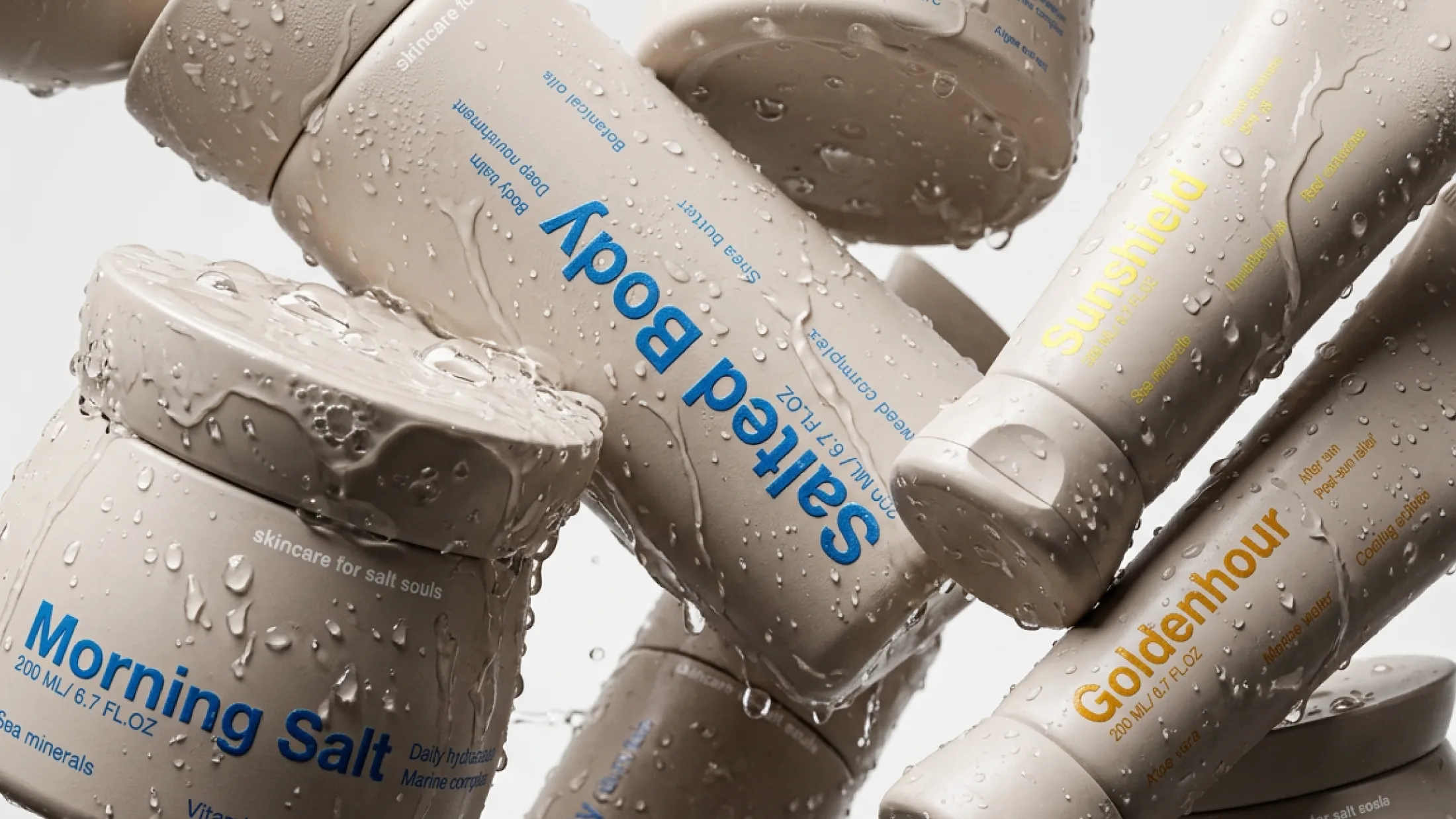
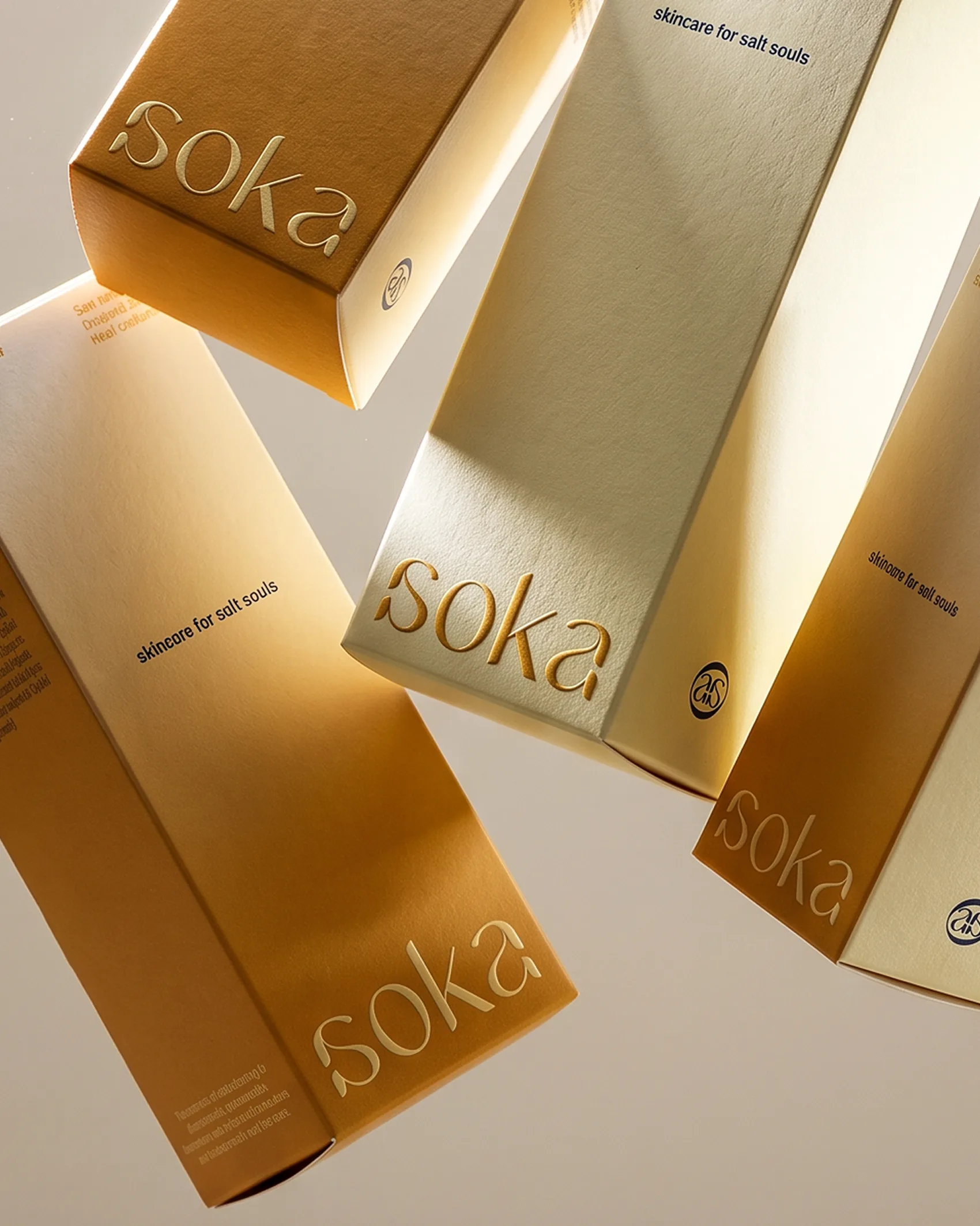
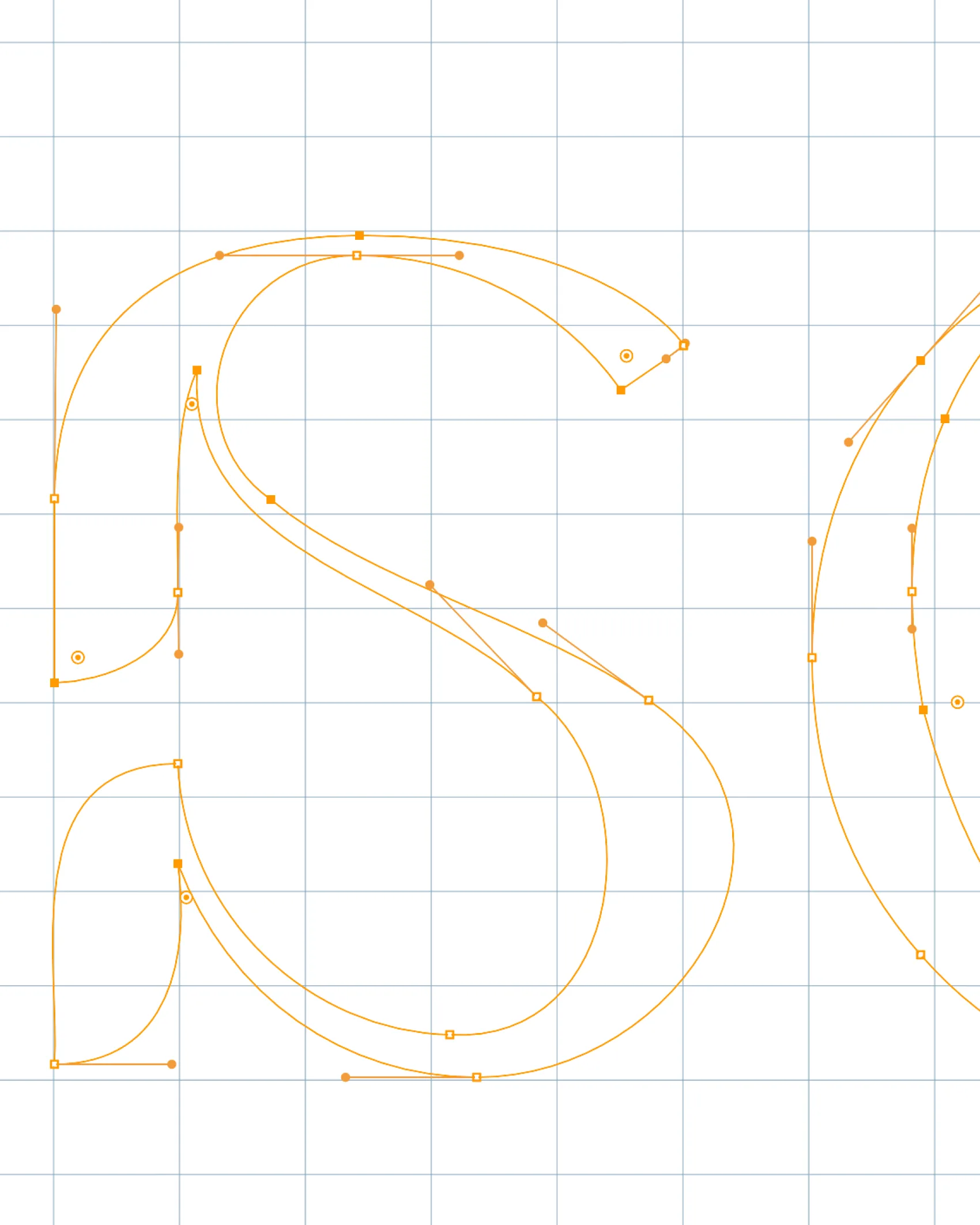
Soka is a research project born from a client brief: to imagine a skincare brand. Lucas developed the strategy, and Mathilde handled the design.
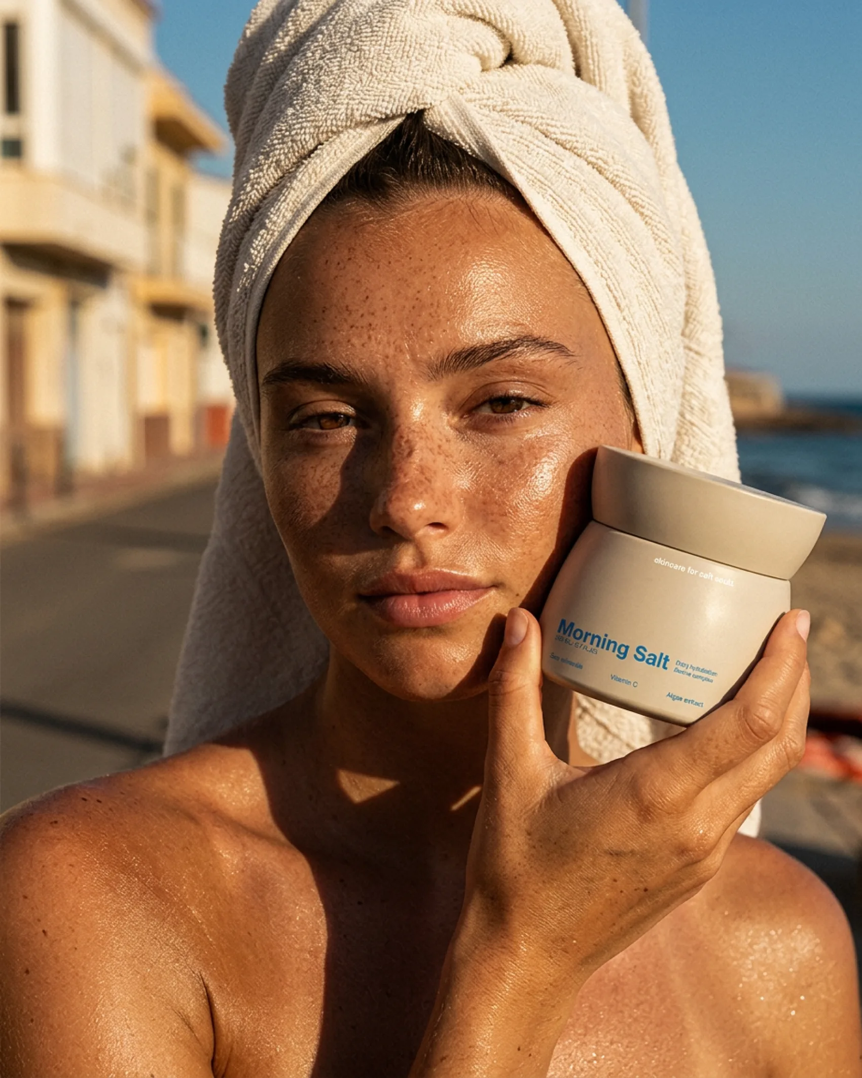
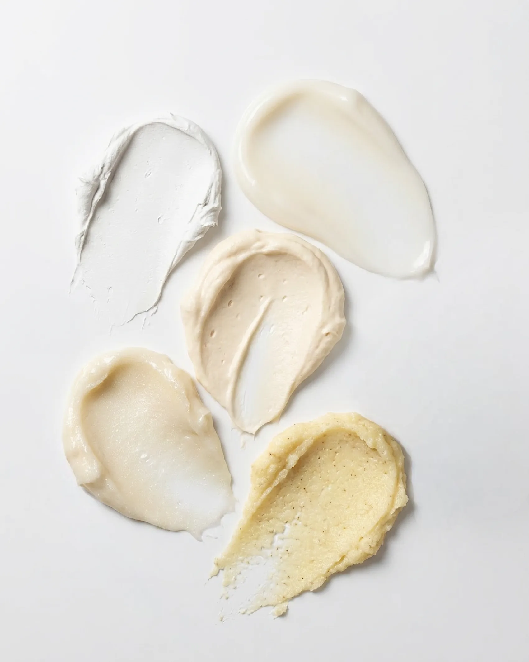
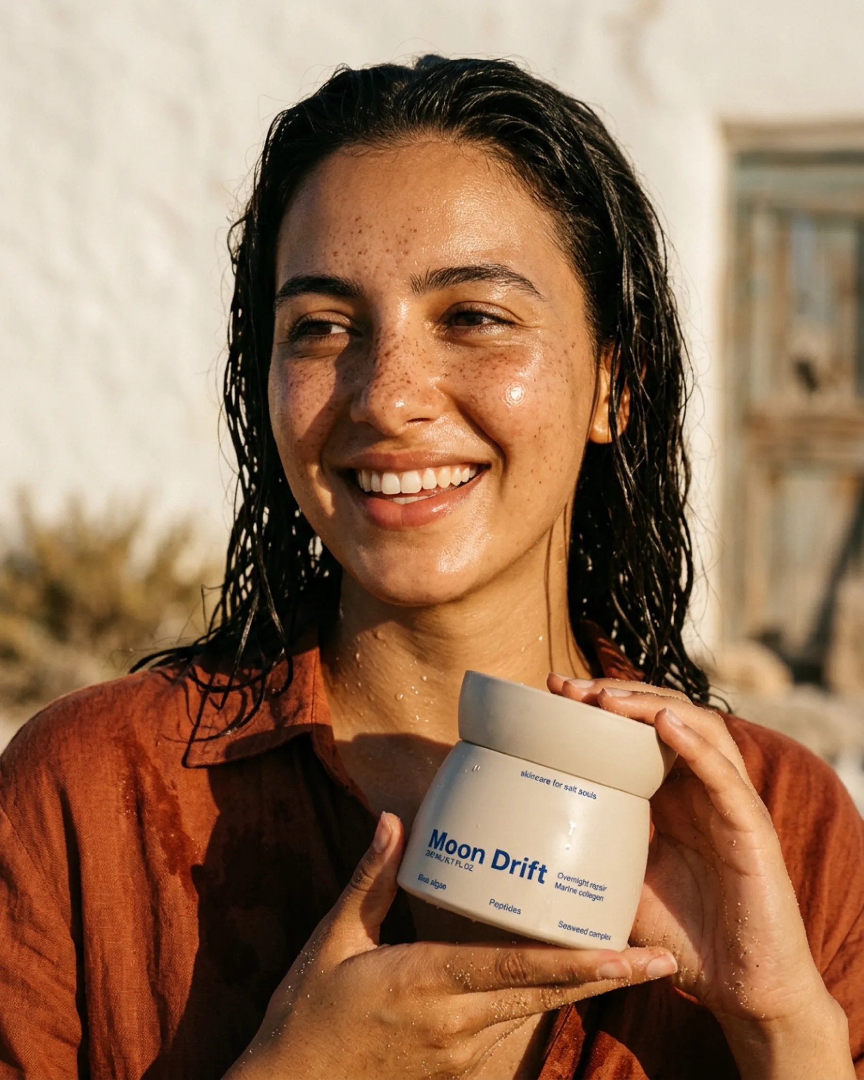
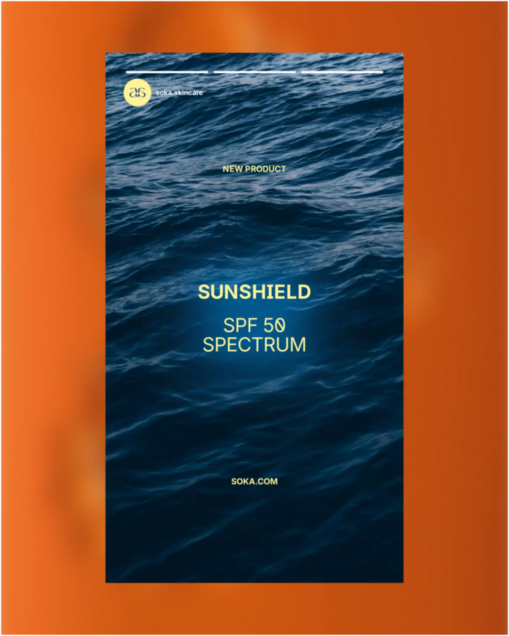
The brand targets millennials, with a secondary younger demographic. We needed color without being overly playful, and we had to evoke the sea and sun without becoming a sunscreen brand: the range covers other skincare needs and is also aimed at those living far from the coast.
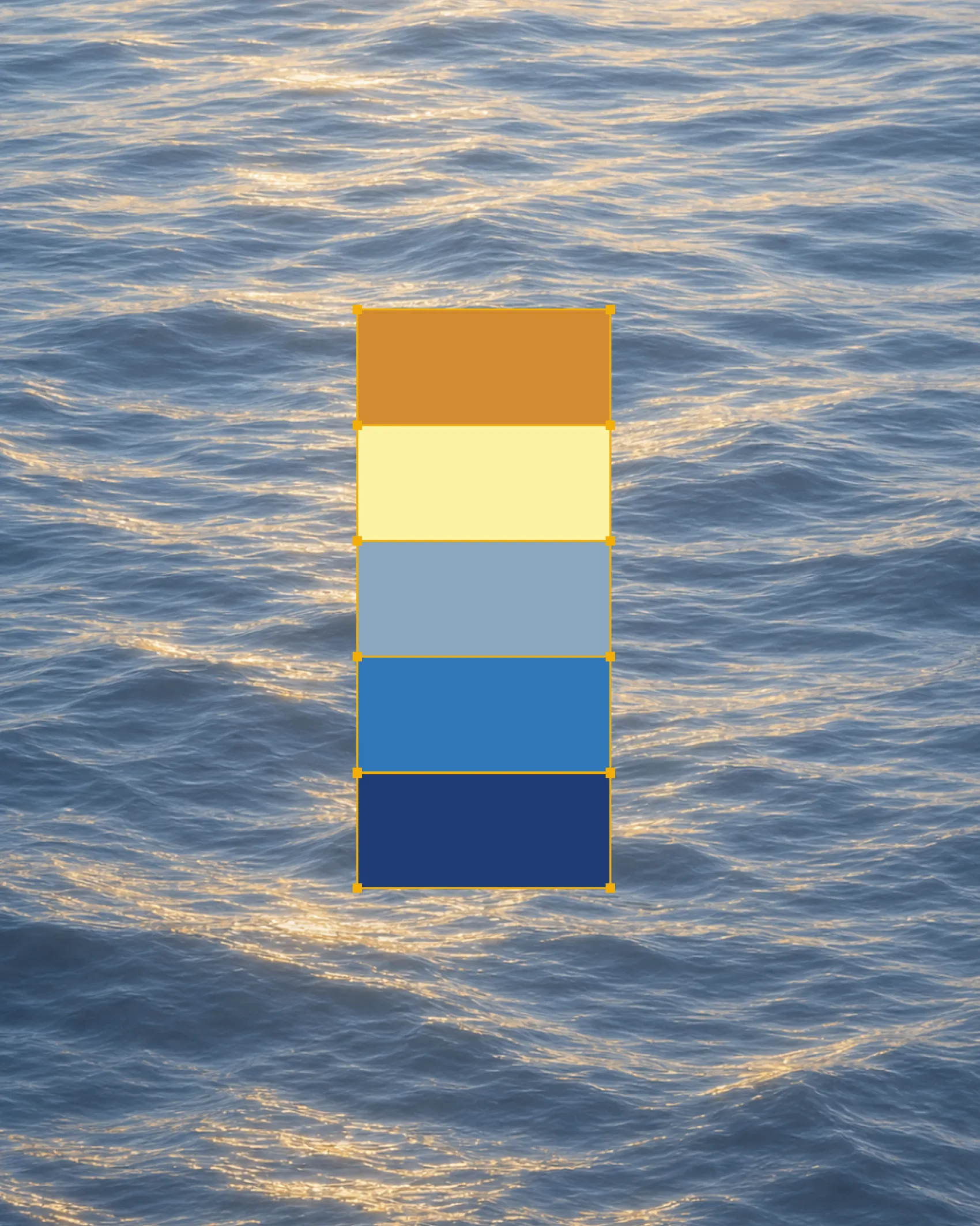
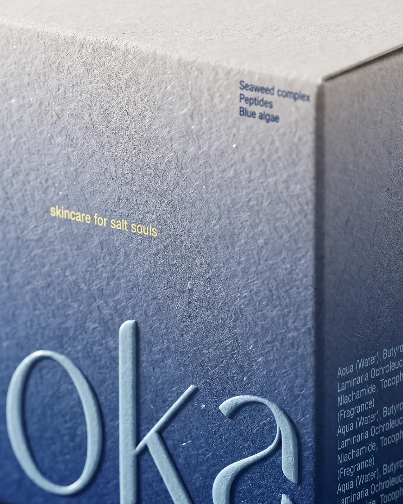
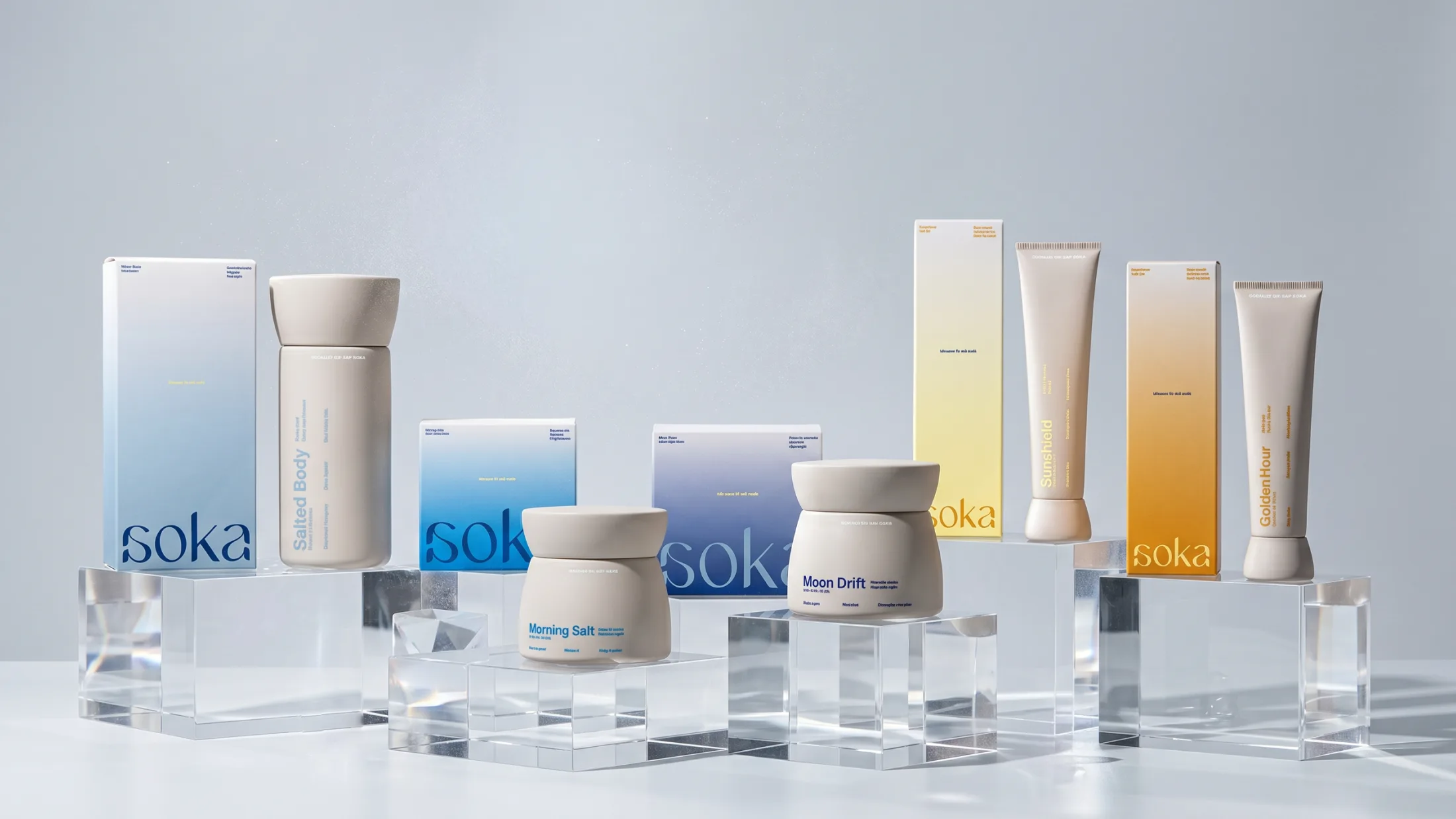
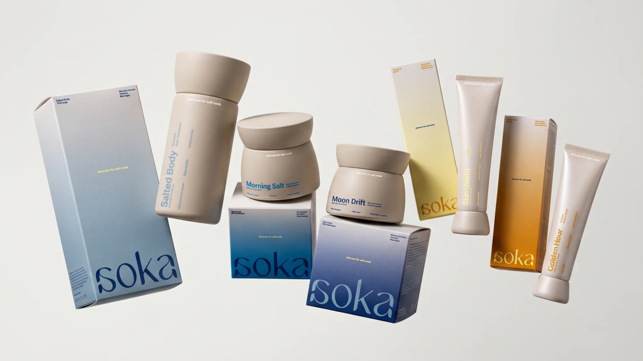
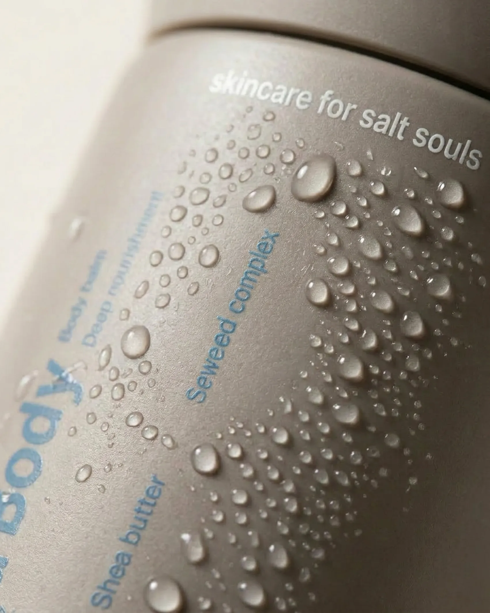
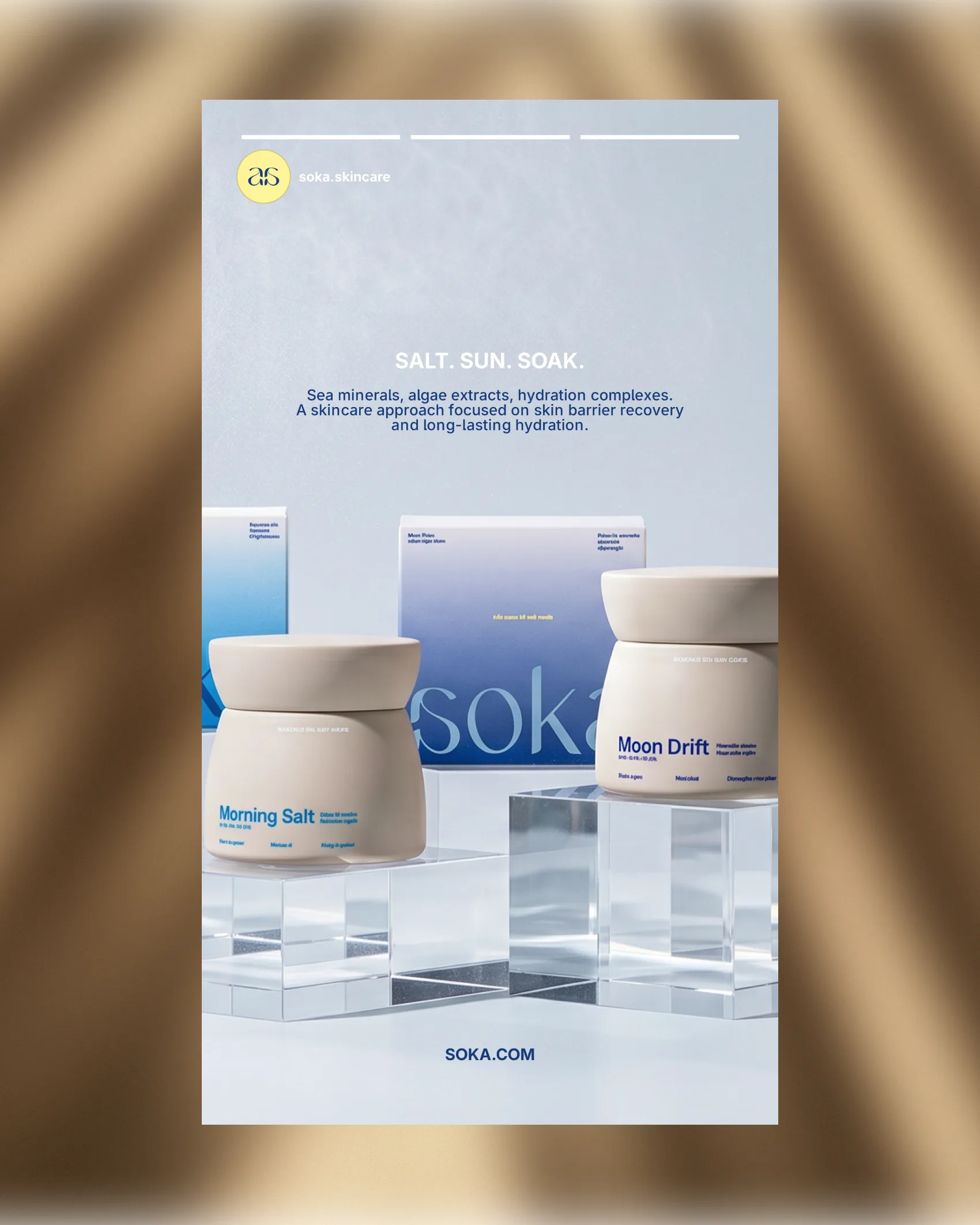
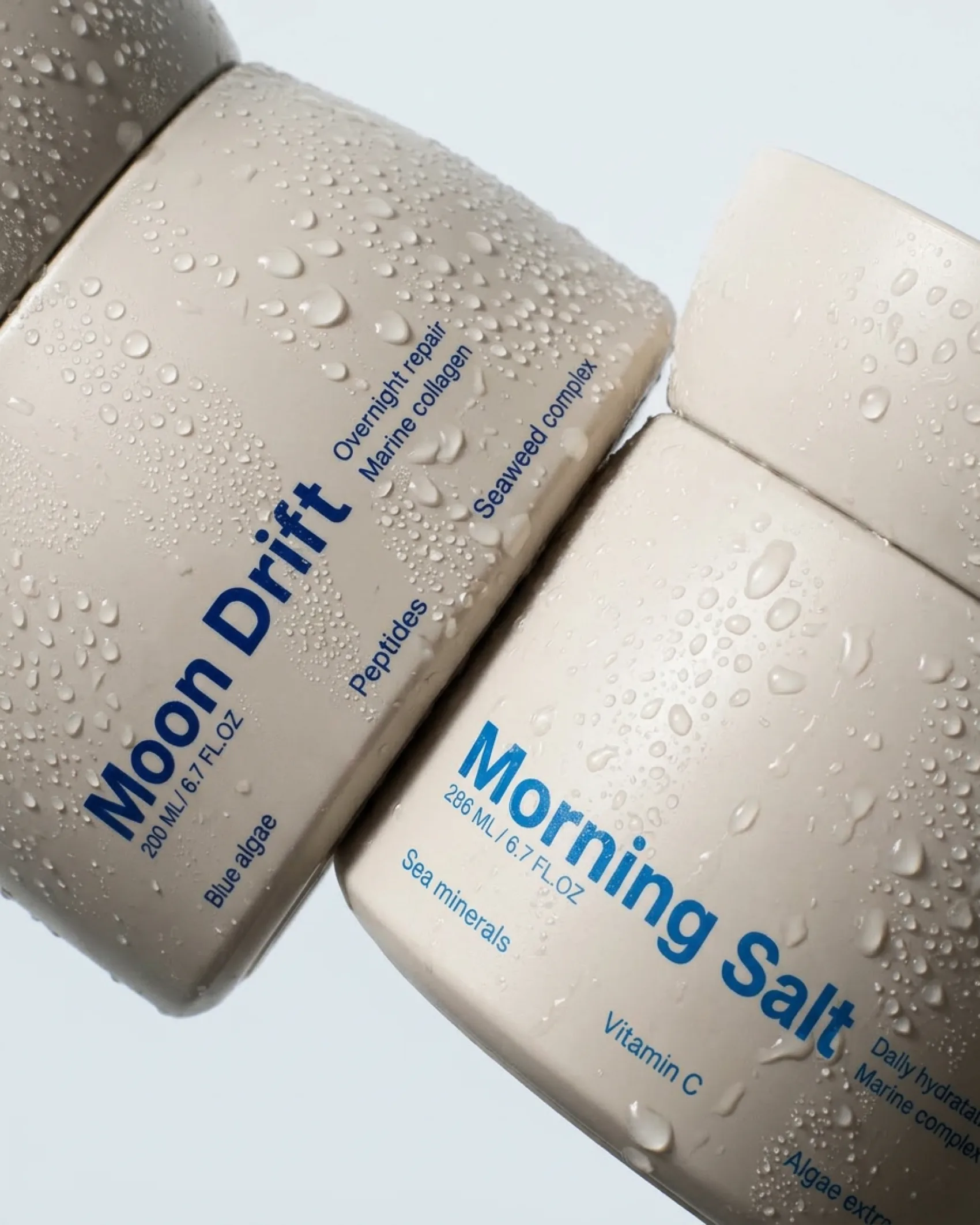
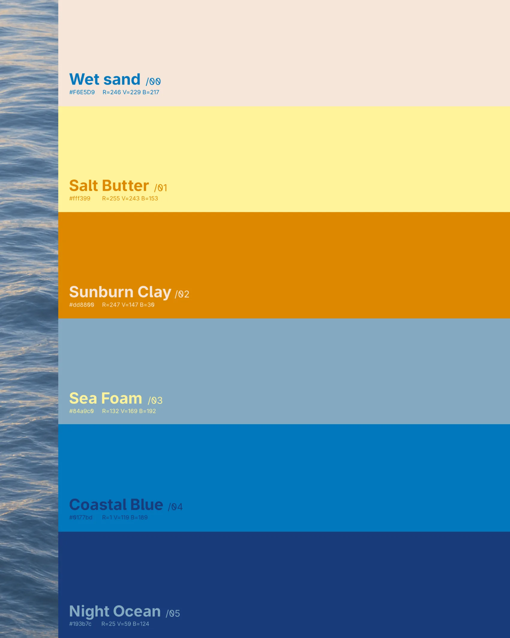
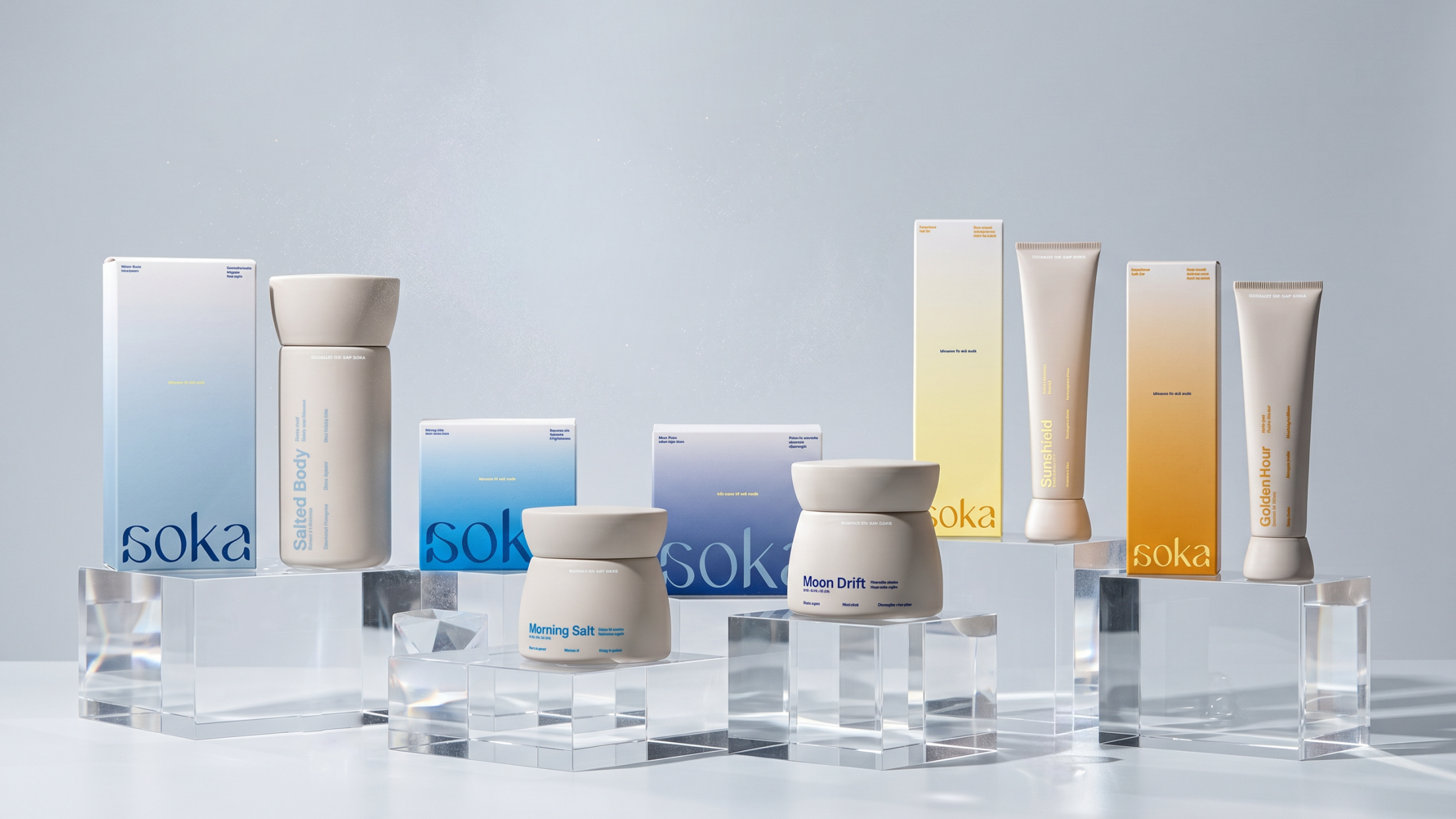
We treated the elements as ingredients: marine minerals, sun vitamins. The tagline "skincare for salt souls" sets the tone, and the vocabulary follows suit, from products like Morning Salt and Moon Drift to a color palette named after the coastline, from Wet Sand to Night Ocean.
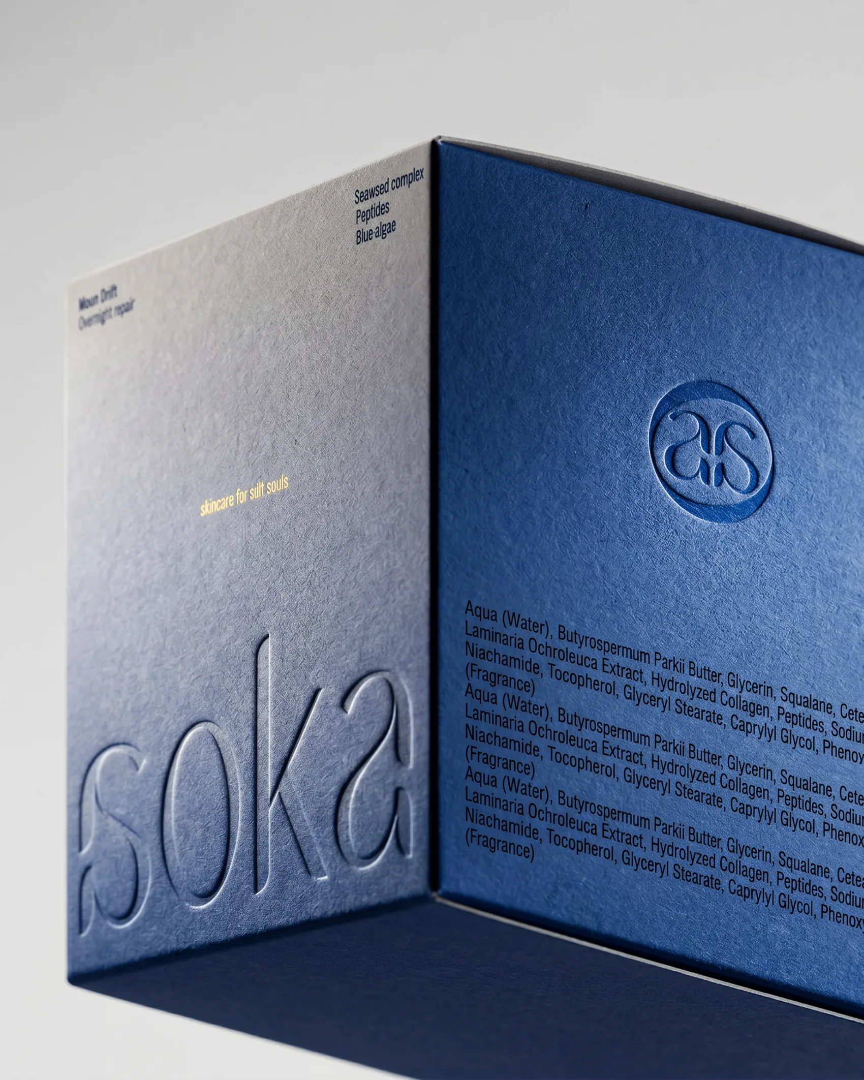
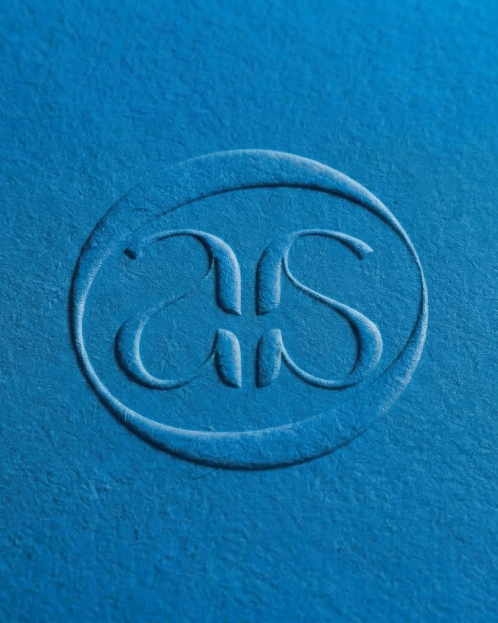
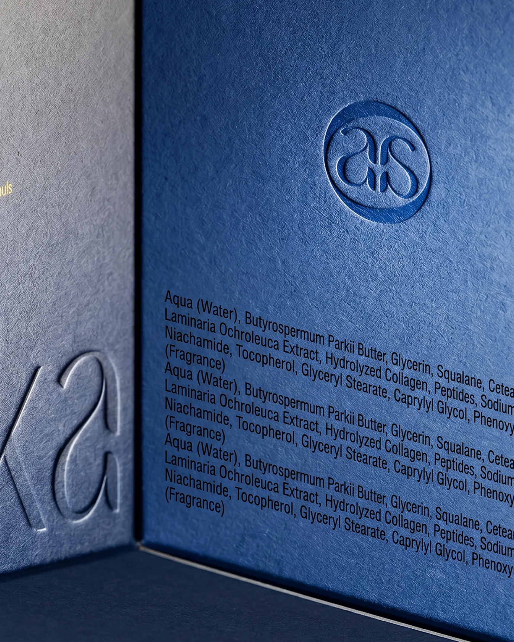
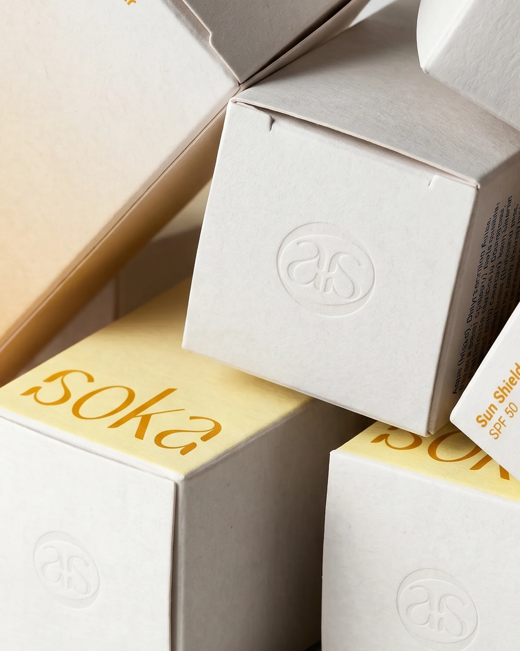
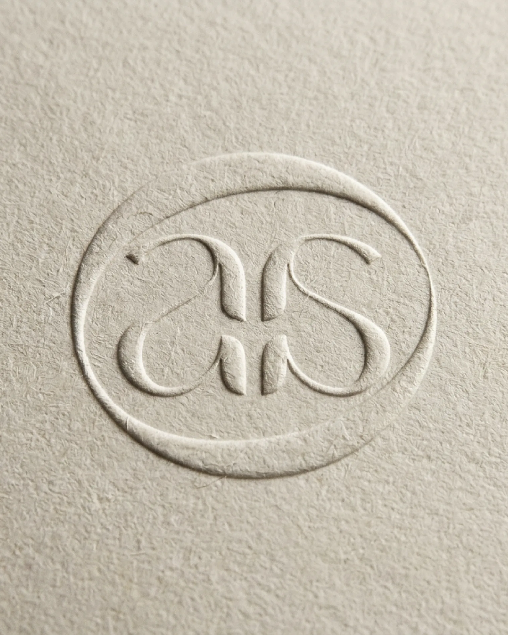
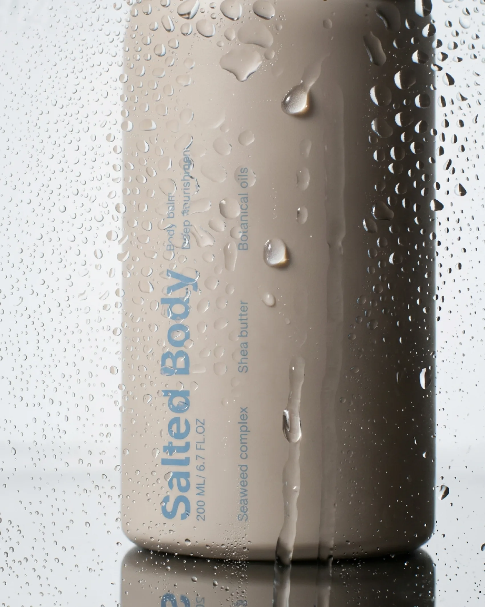
Mathilde designed packaging with minimalist codes, enhanced by texture: an embossed monogram in an oval, and gradients shifting from blue to white, or yellow to orange.