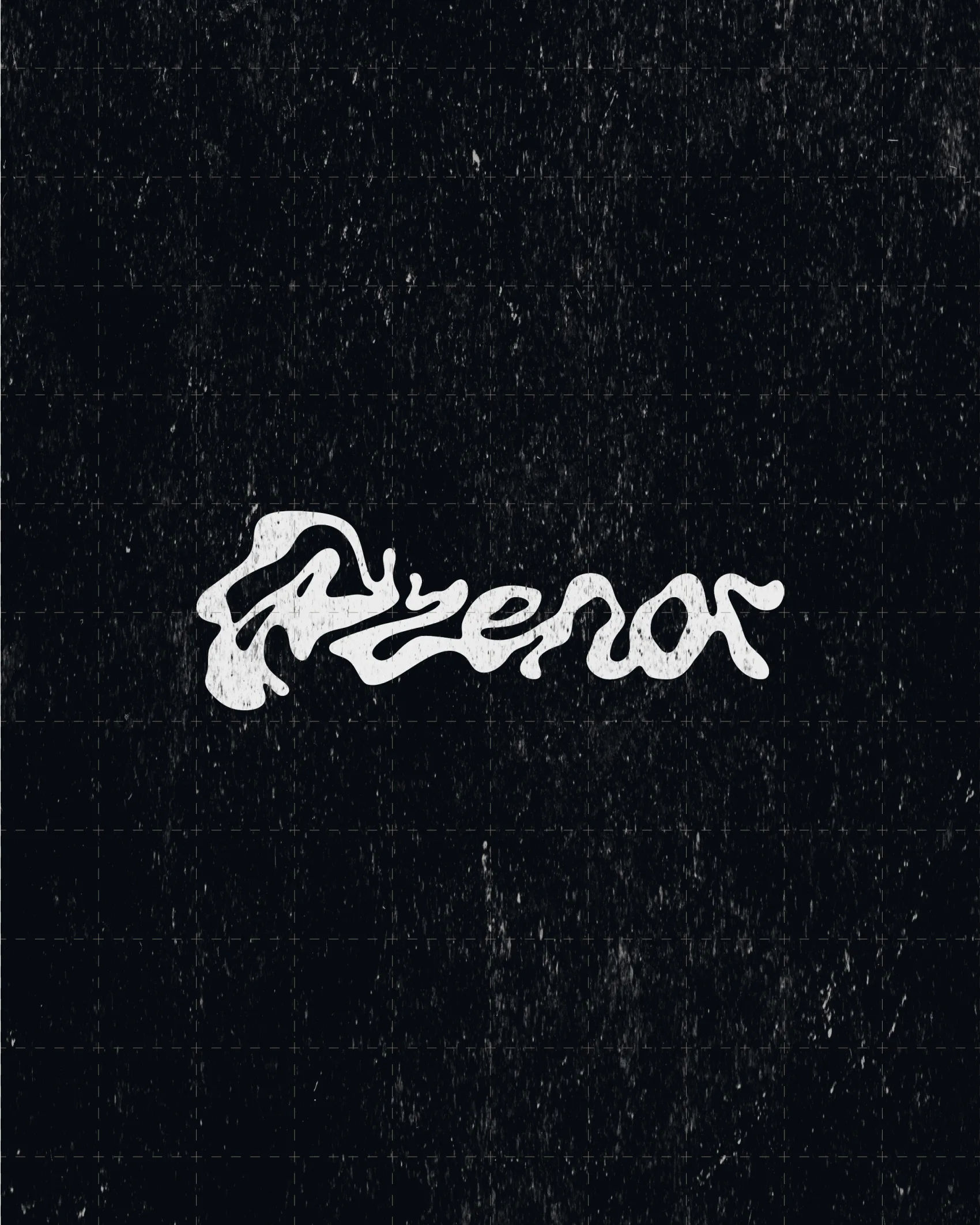
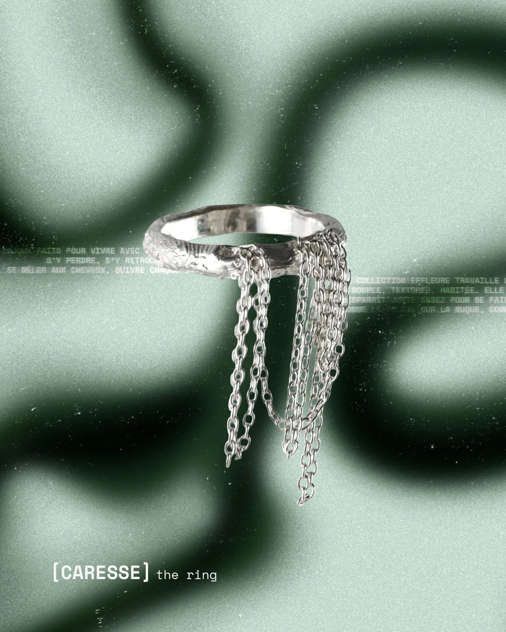
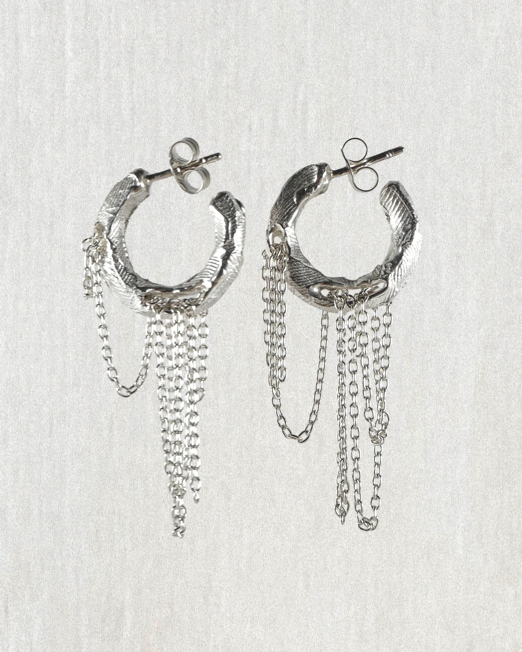
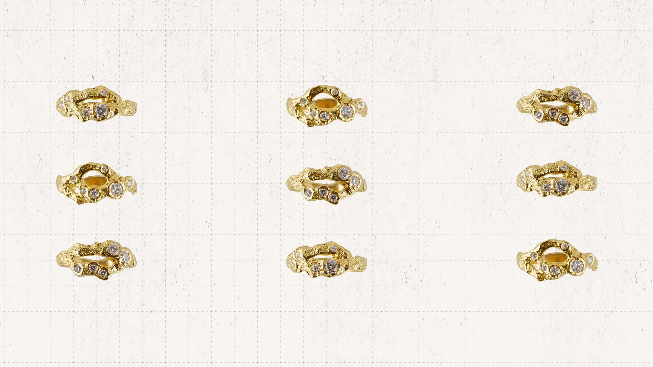
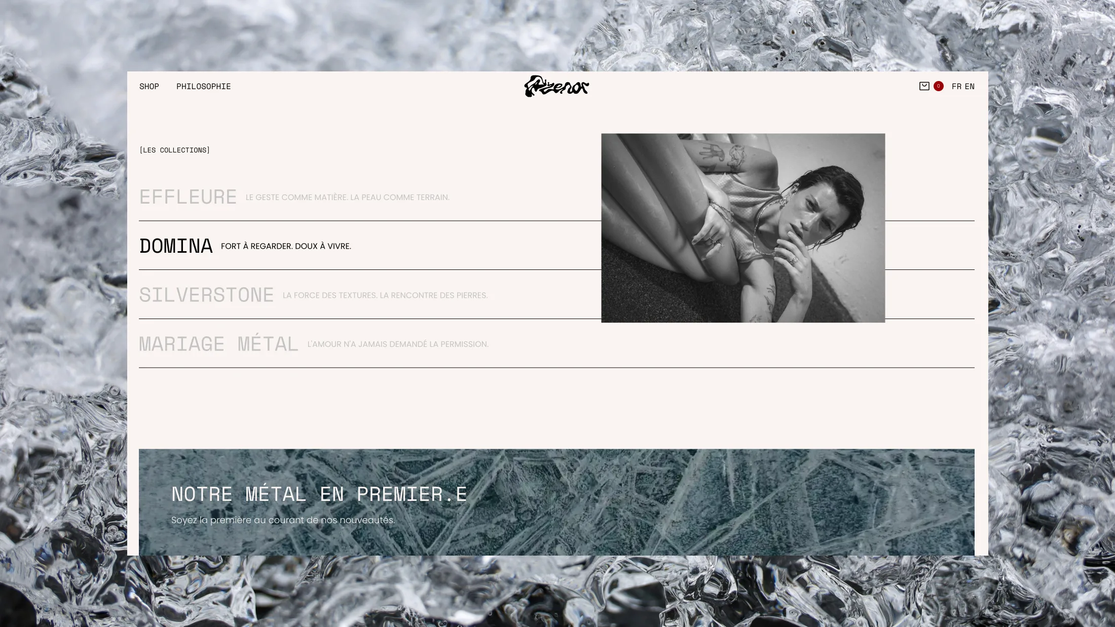
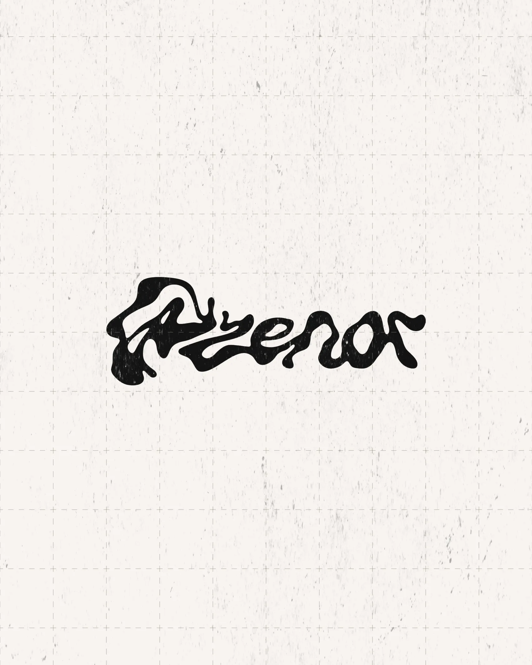
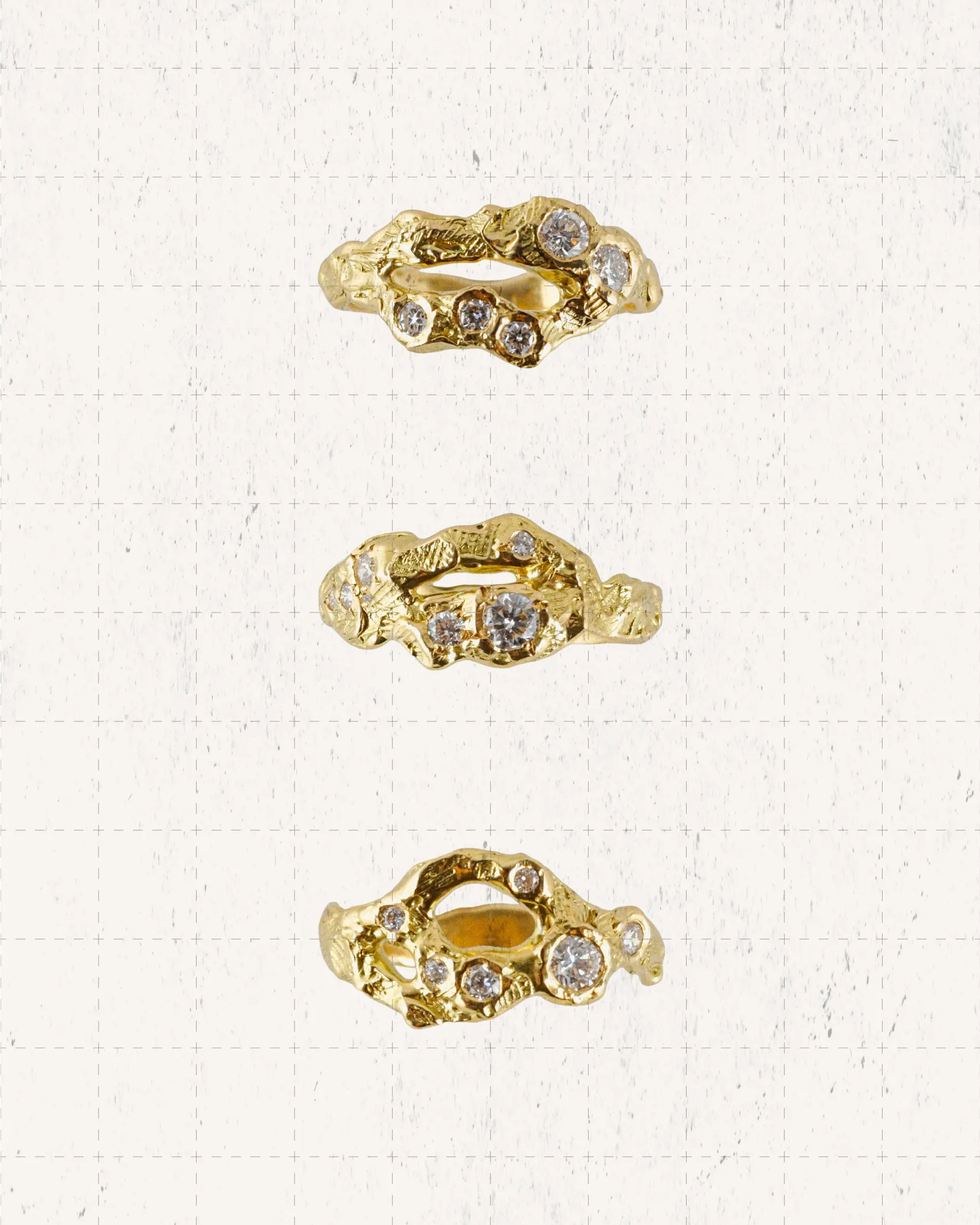
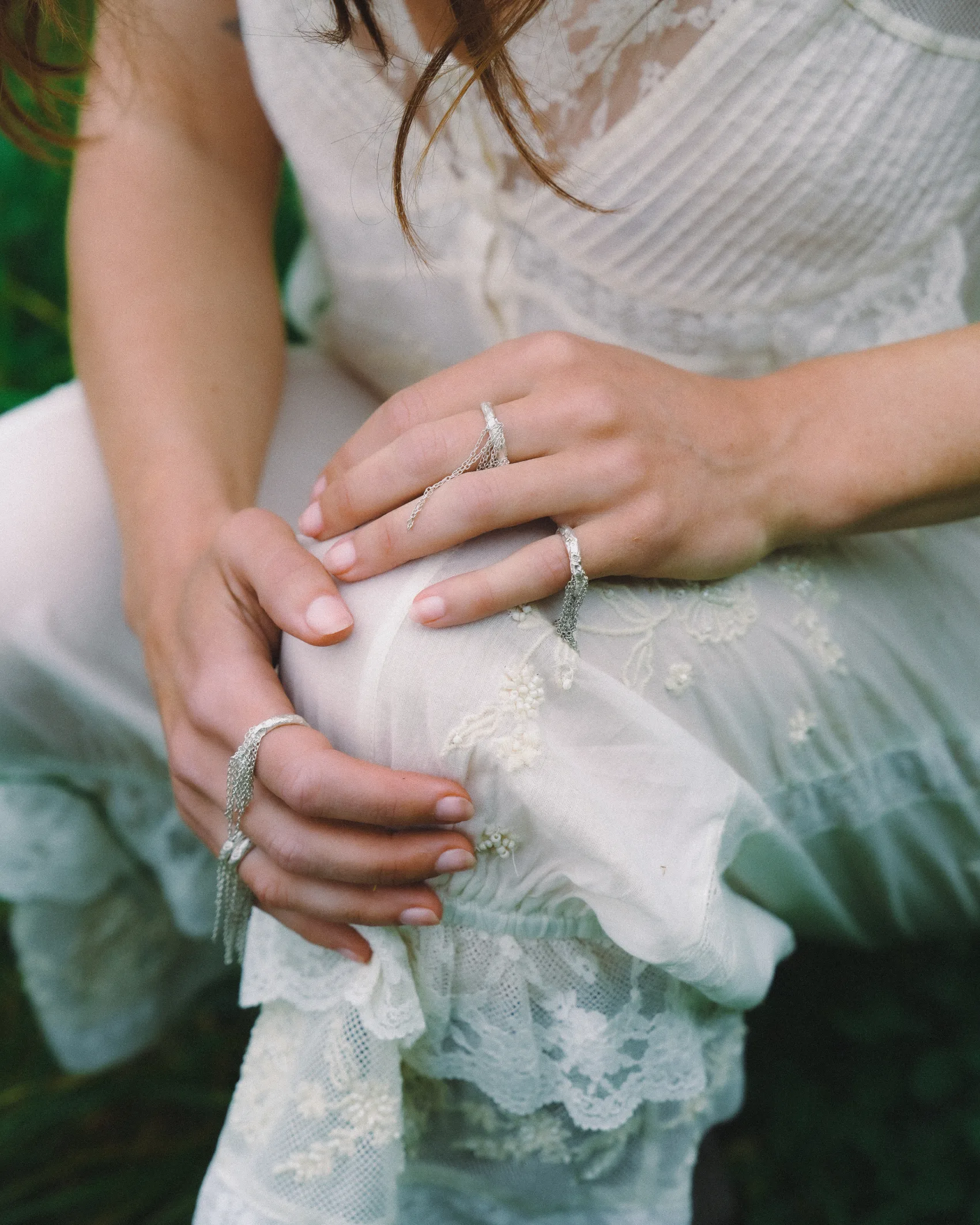
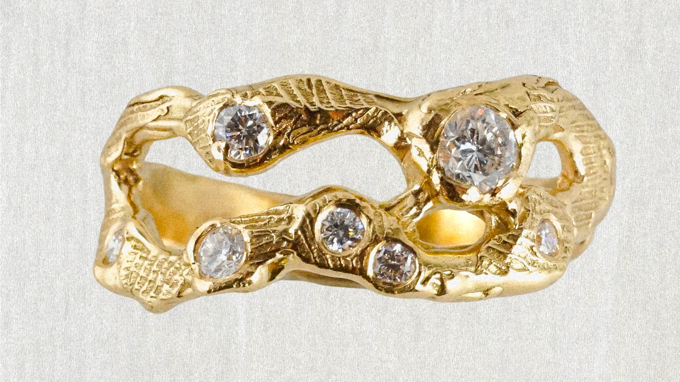
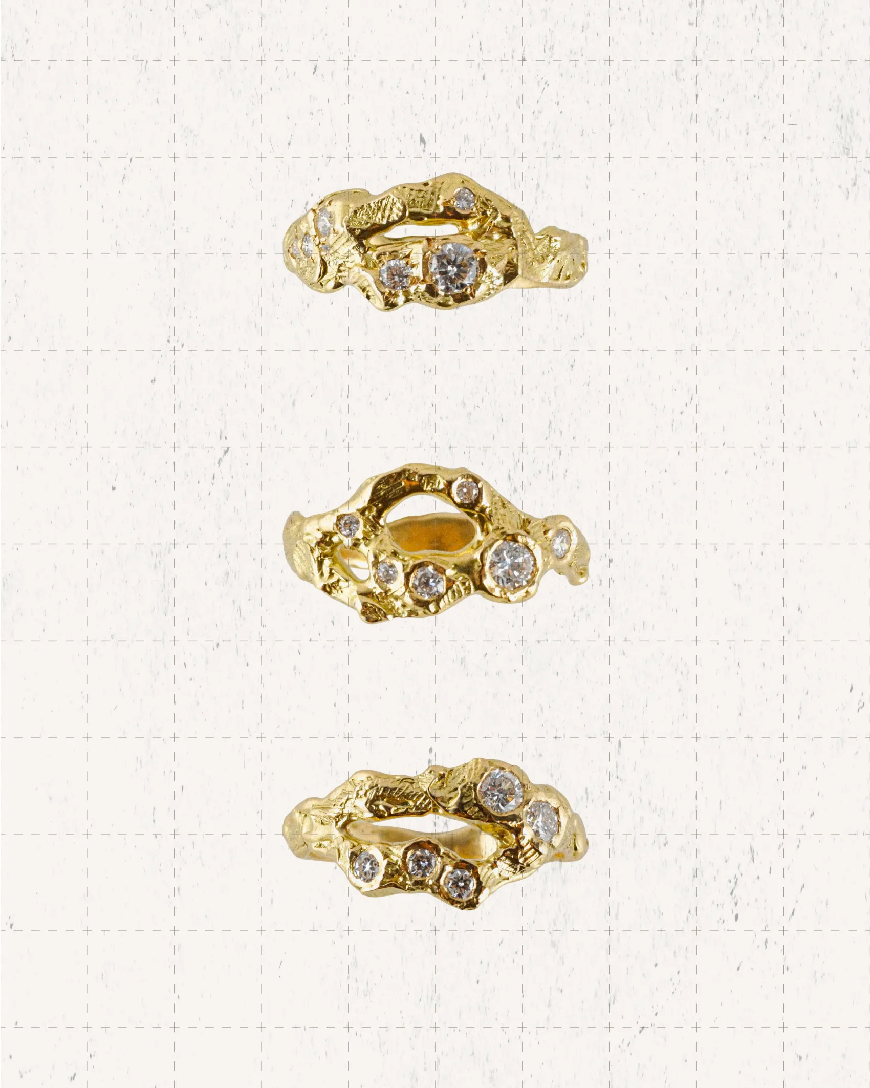
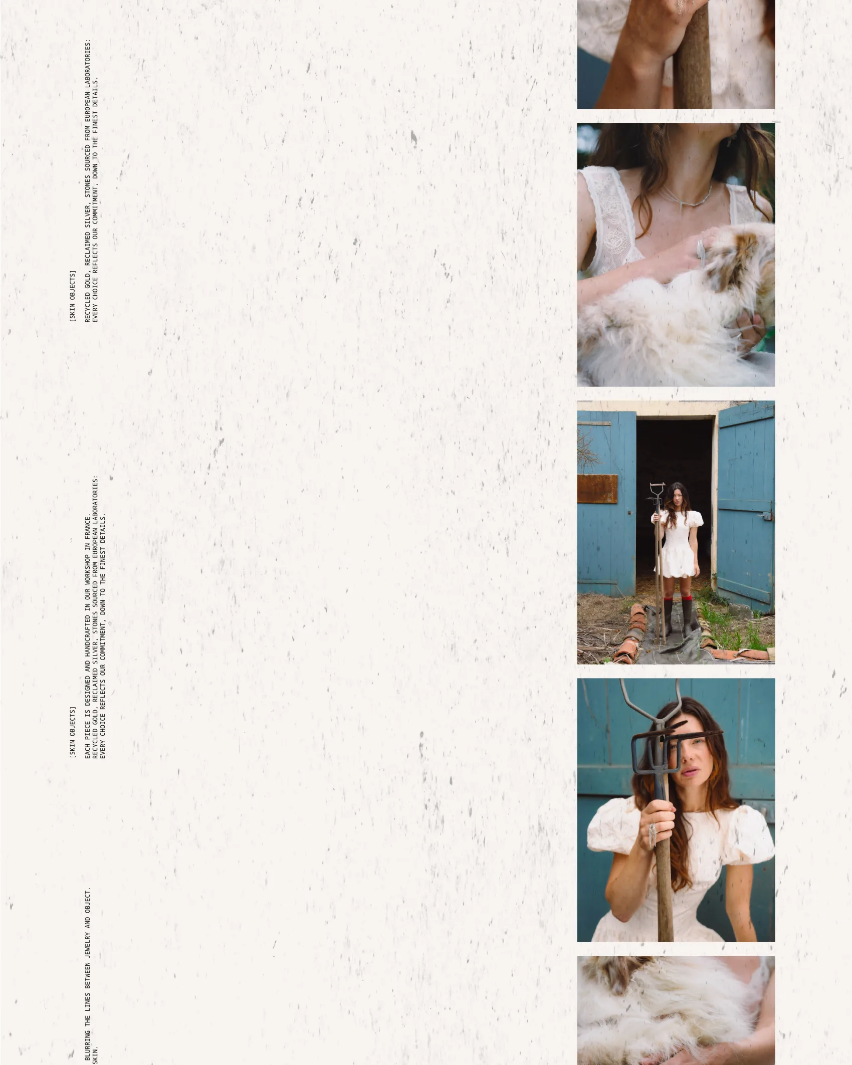
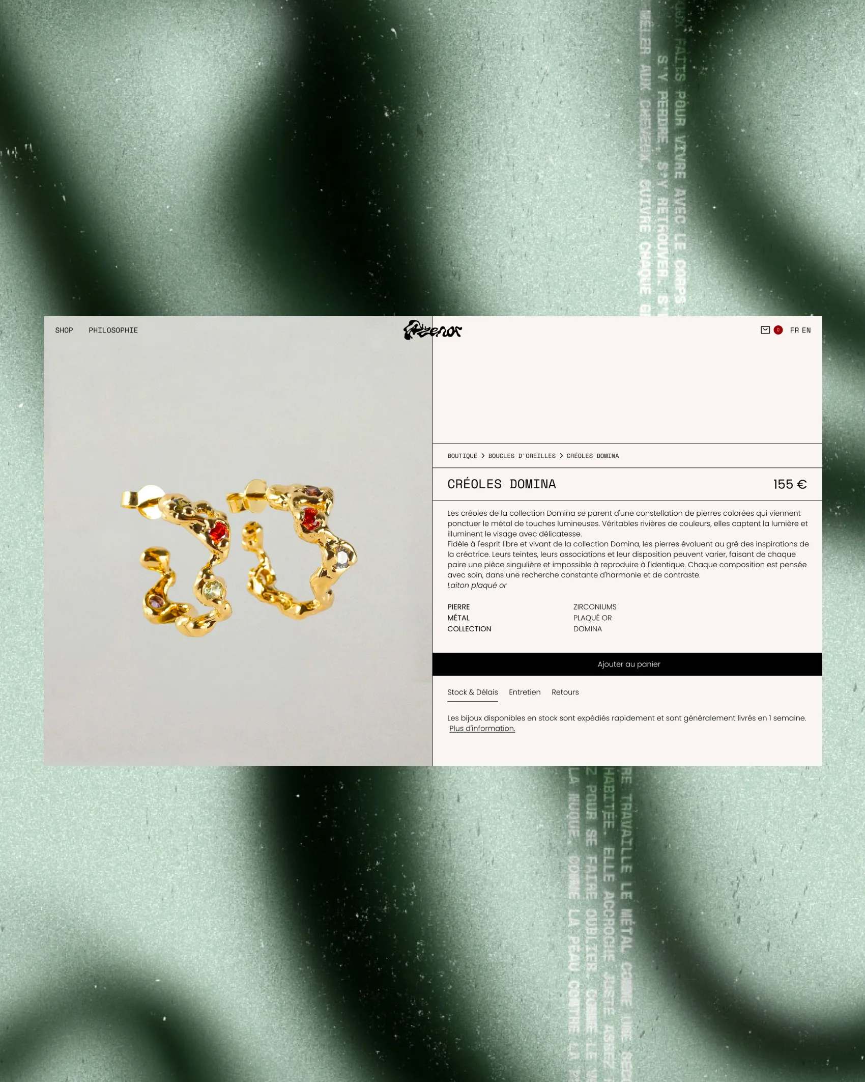
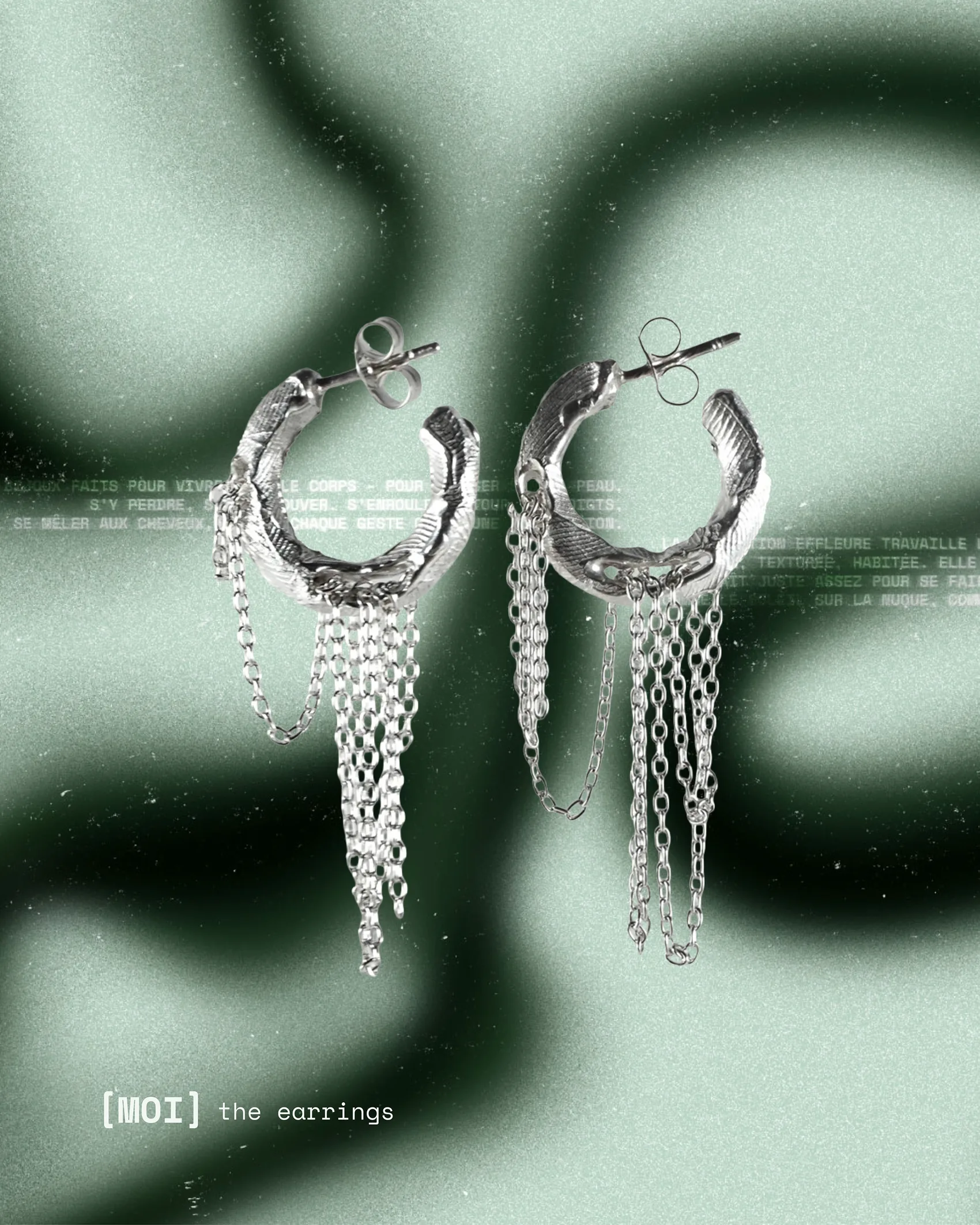
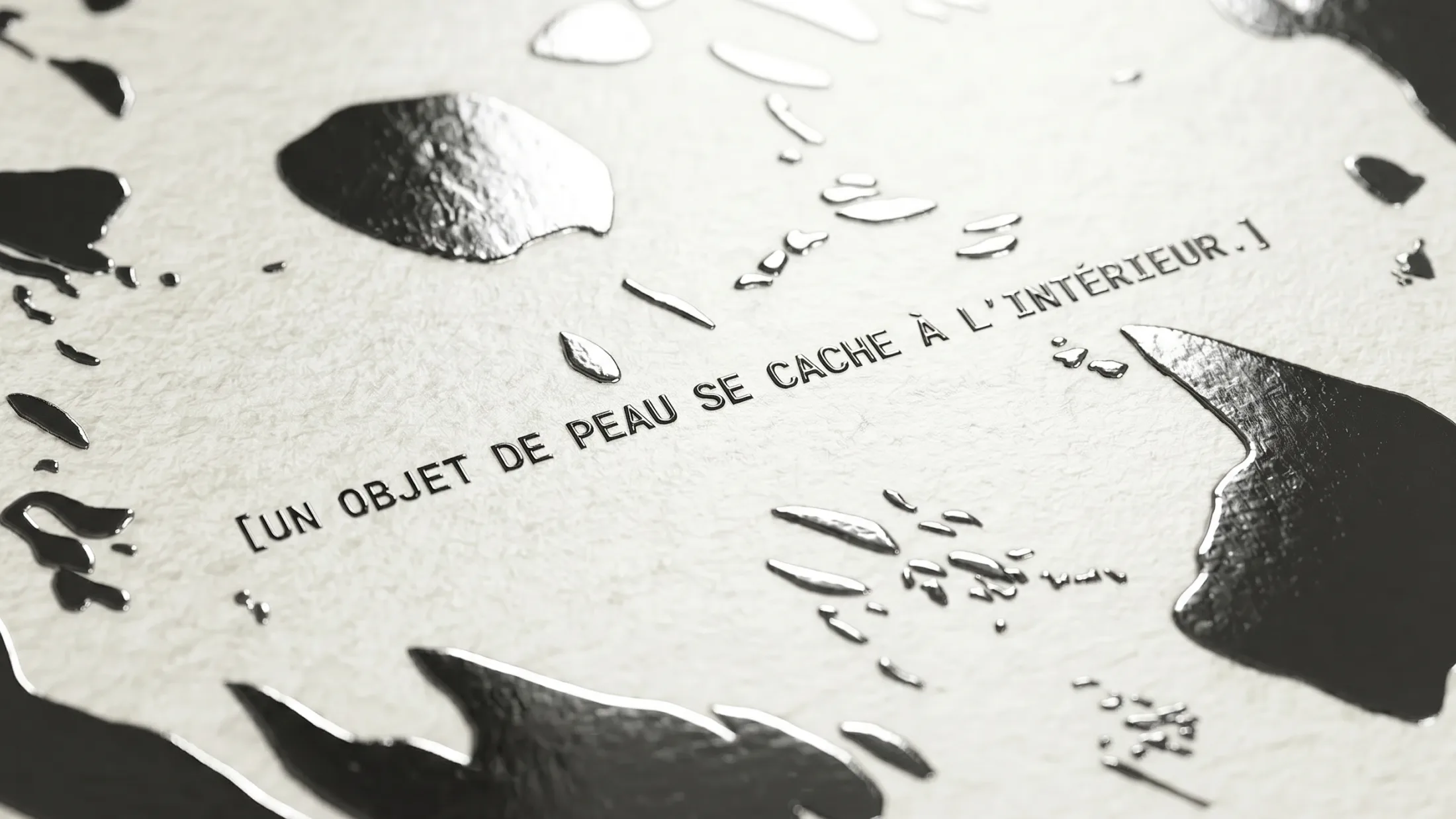
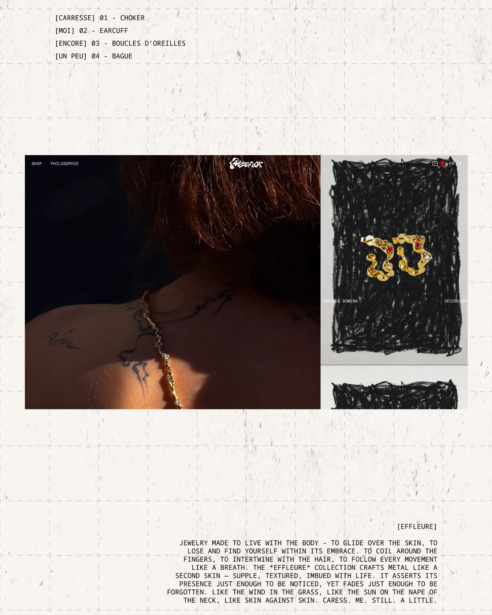
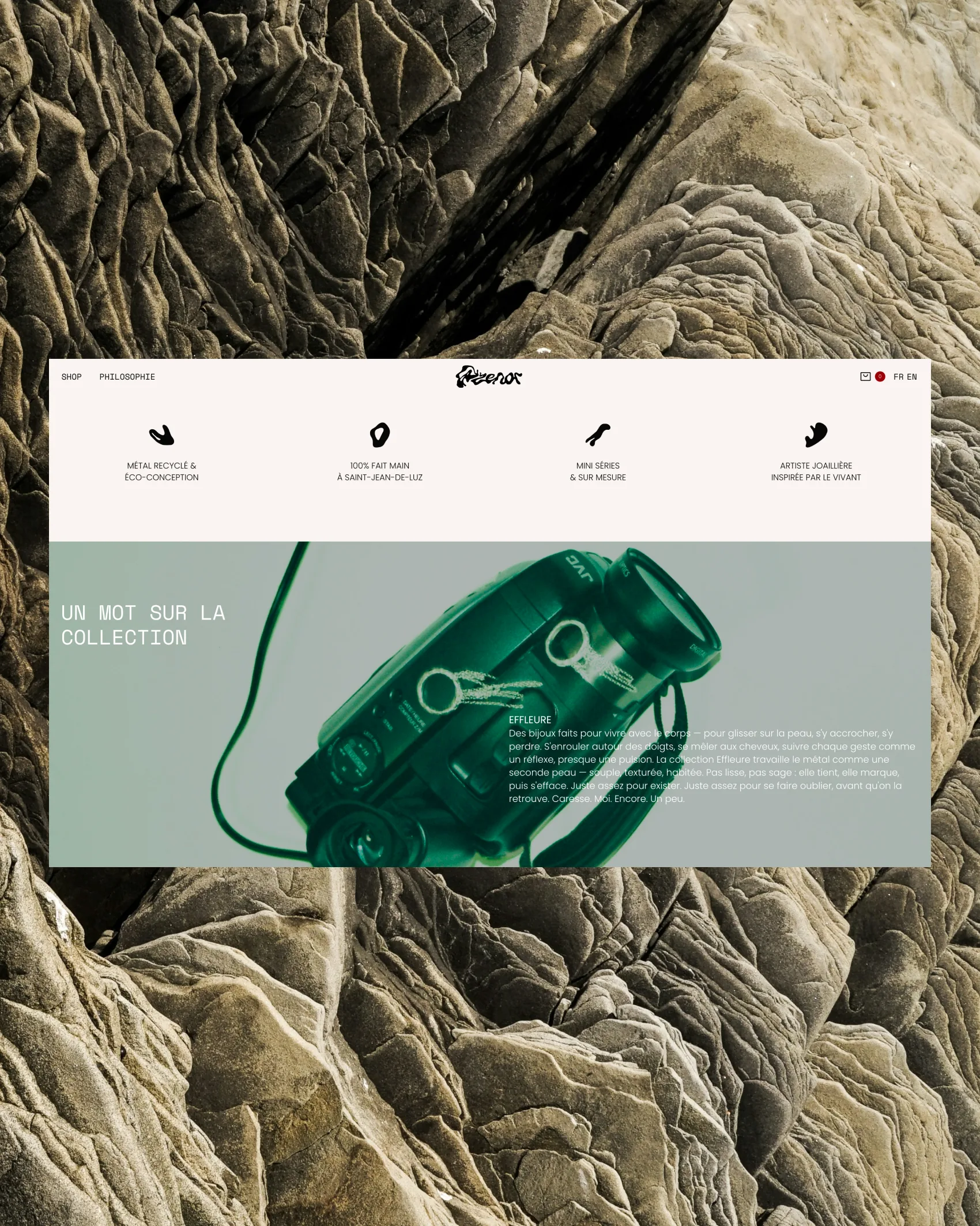
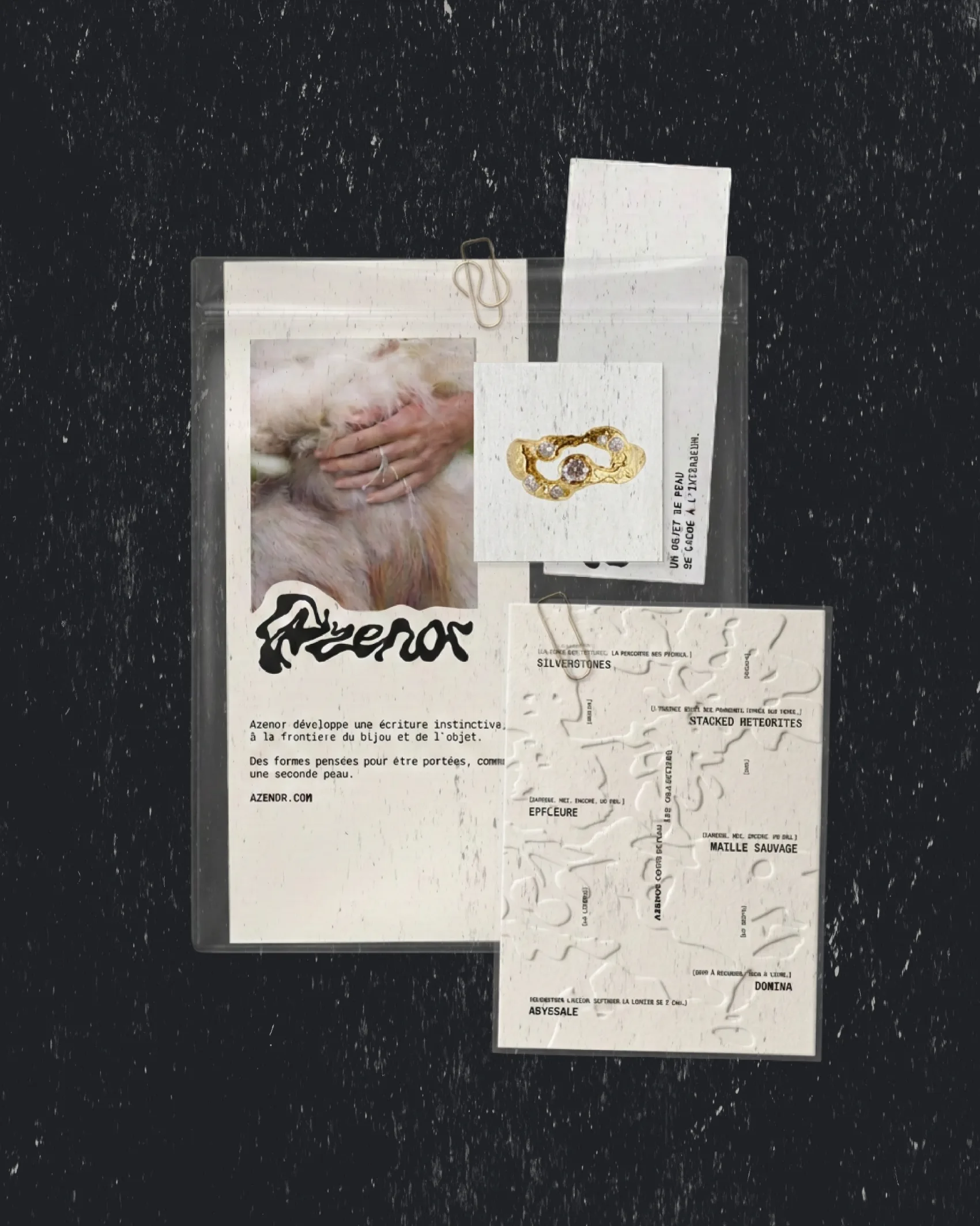
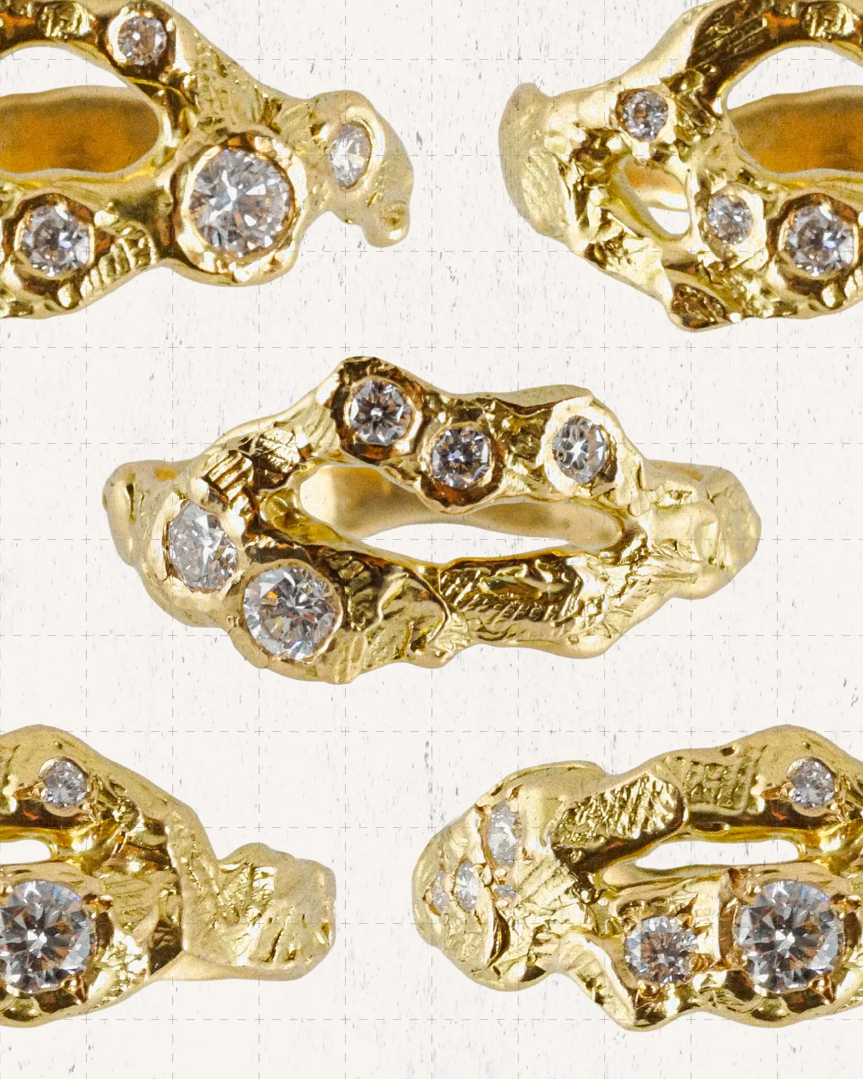
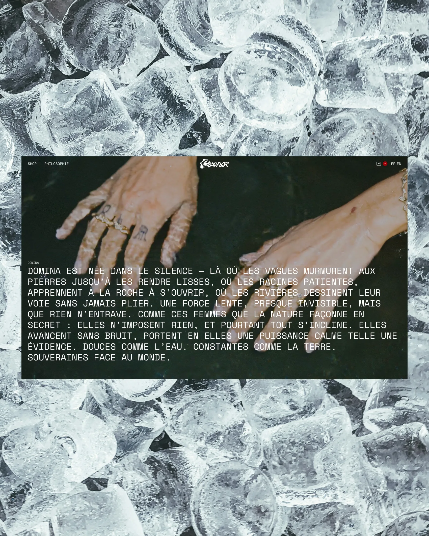
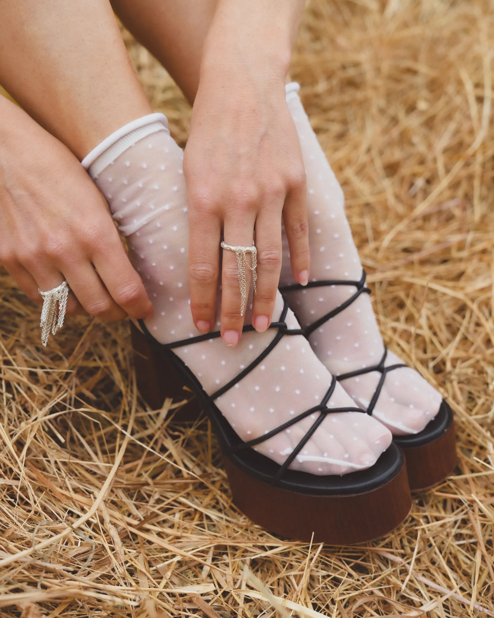
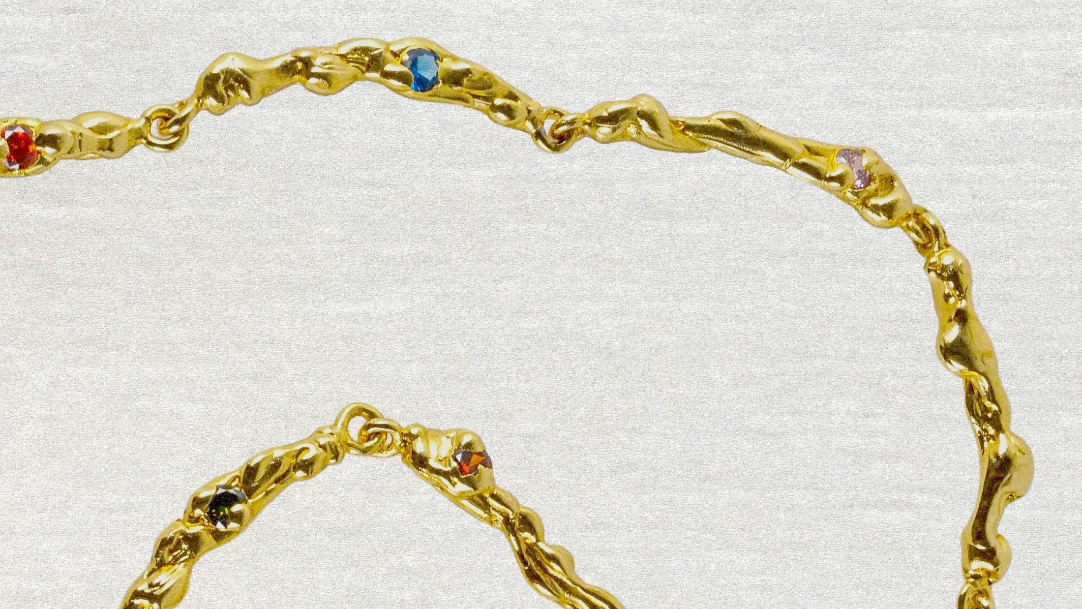
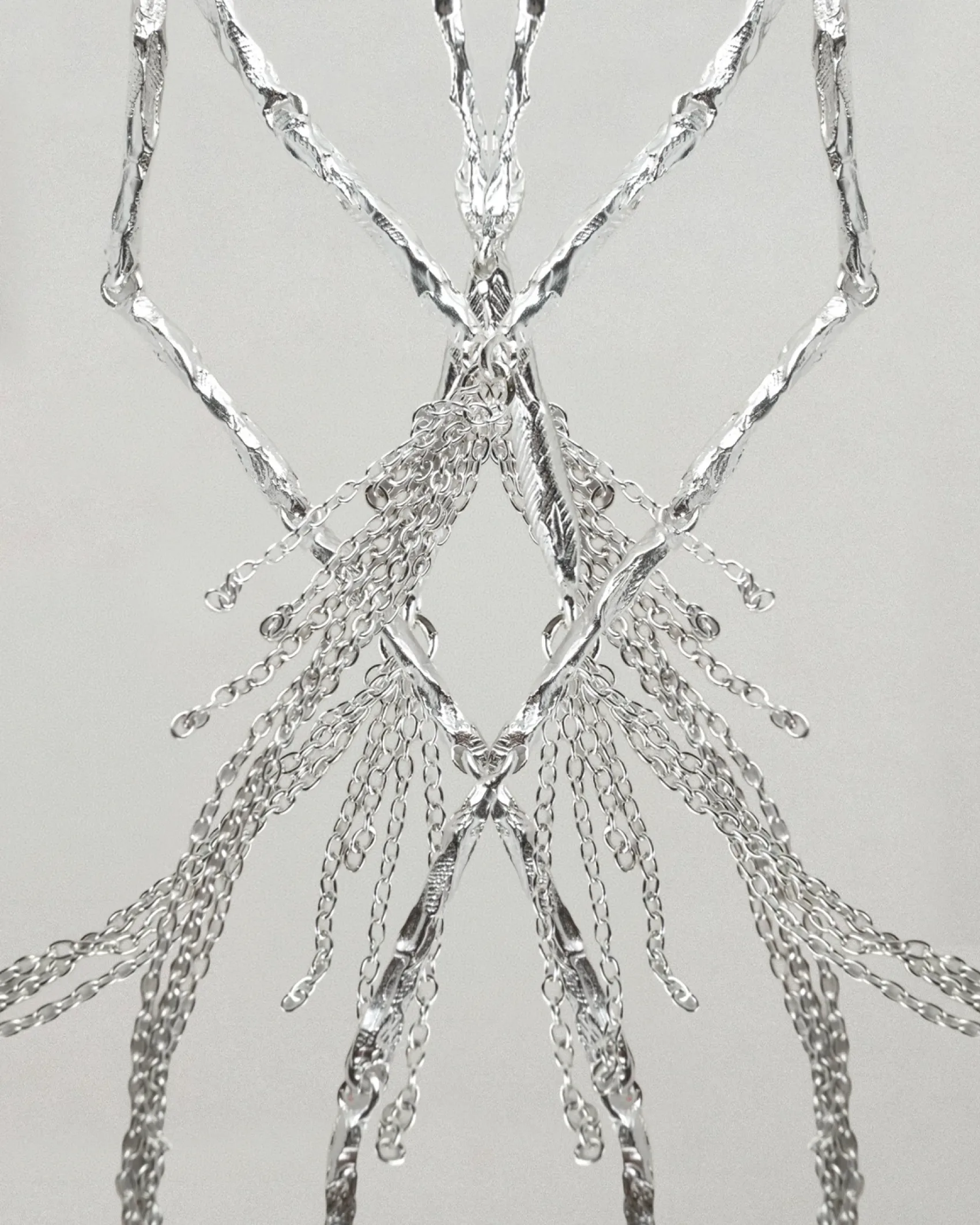
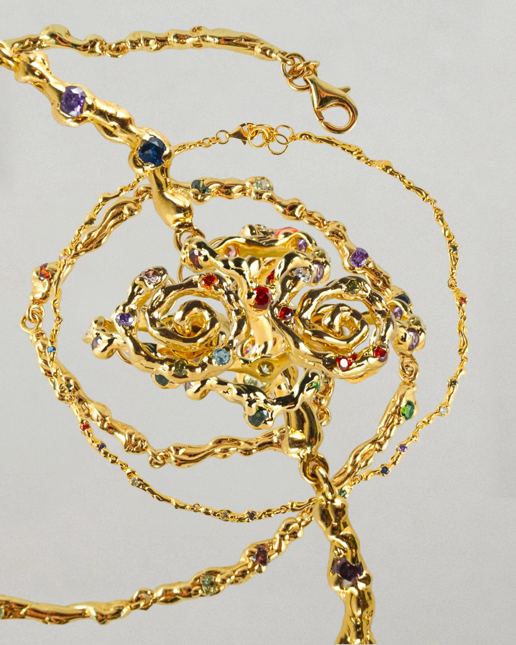
As Azenor Objects continues to grow, they sought a visual identity that could capture the essence of their "combat jewelry": raw, fluid, and visceral. The brand commissioned us to push the boundaries. We began with a co-design workshop to define the mental imagery of "molten metal" and the concept of "skin-like" objects. From this emerged an art direction that sculpts the material: an engraved logotype, a liquid monogram, layered photographic textures, and a palette of steel reflections and deep red. The brand guidelines detail every application, from tissue paper to social media presence. On the technical side, we connected Webflow to Shopify. The result: a free-form, highly visual front-end backed by a robust back-office (catalog, inventory, CRM). Everything was delivered with tutorials, technical SEO, and automations, empowering the Azenor team to manage their new showcase with complete autonomy.
Azenor Objects
For Azenor Objects, a jewelry artisan with a rebellious aesthetic, Himitsu forged a radical visual identity and an e-commerce site inspired by their molten metal.
Credits
Équipe

Mathilde Trenel

Lucas Vigneu
Livrables / Branding
Digital
Content
Crédits
Client








No items found.

No items found.
Découvrez également ...
/
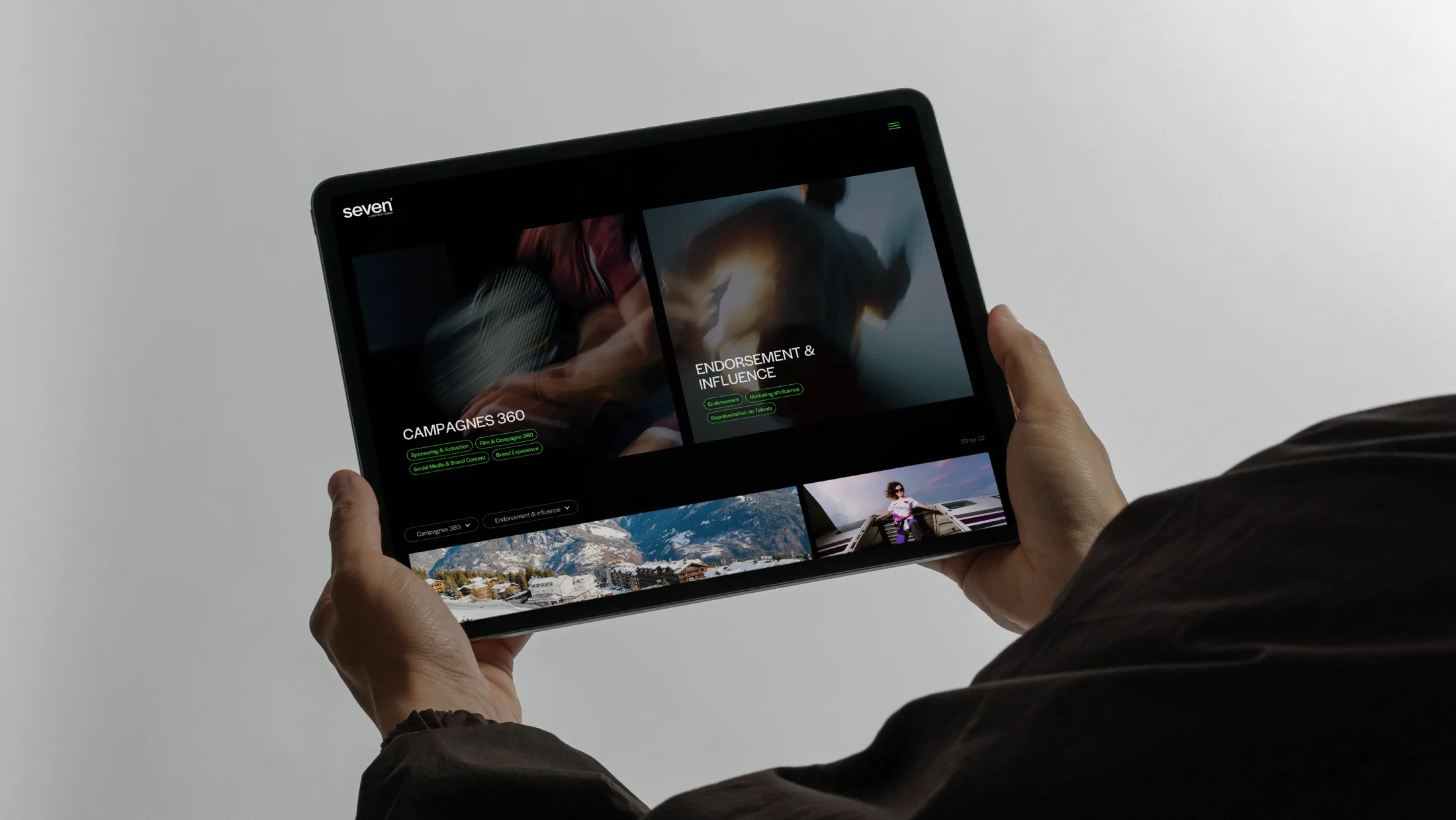
Seven
The 360° agency
/
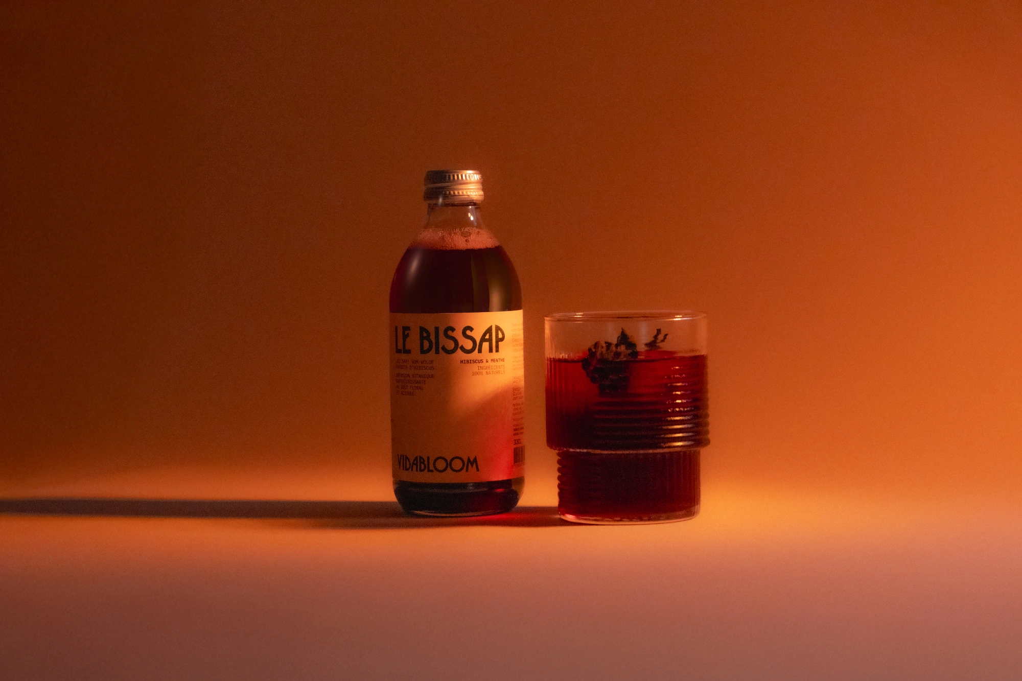
Vidabloom