Applications & Variations
Creative & Visual Direction
Logotype and variations
Color & Typography Systems
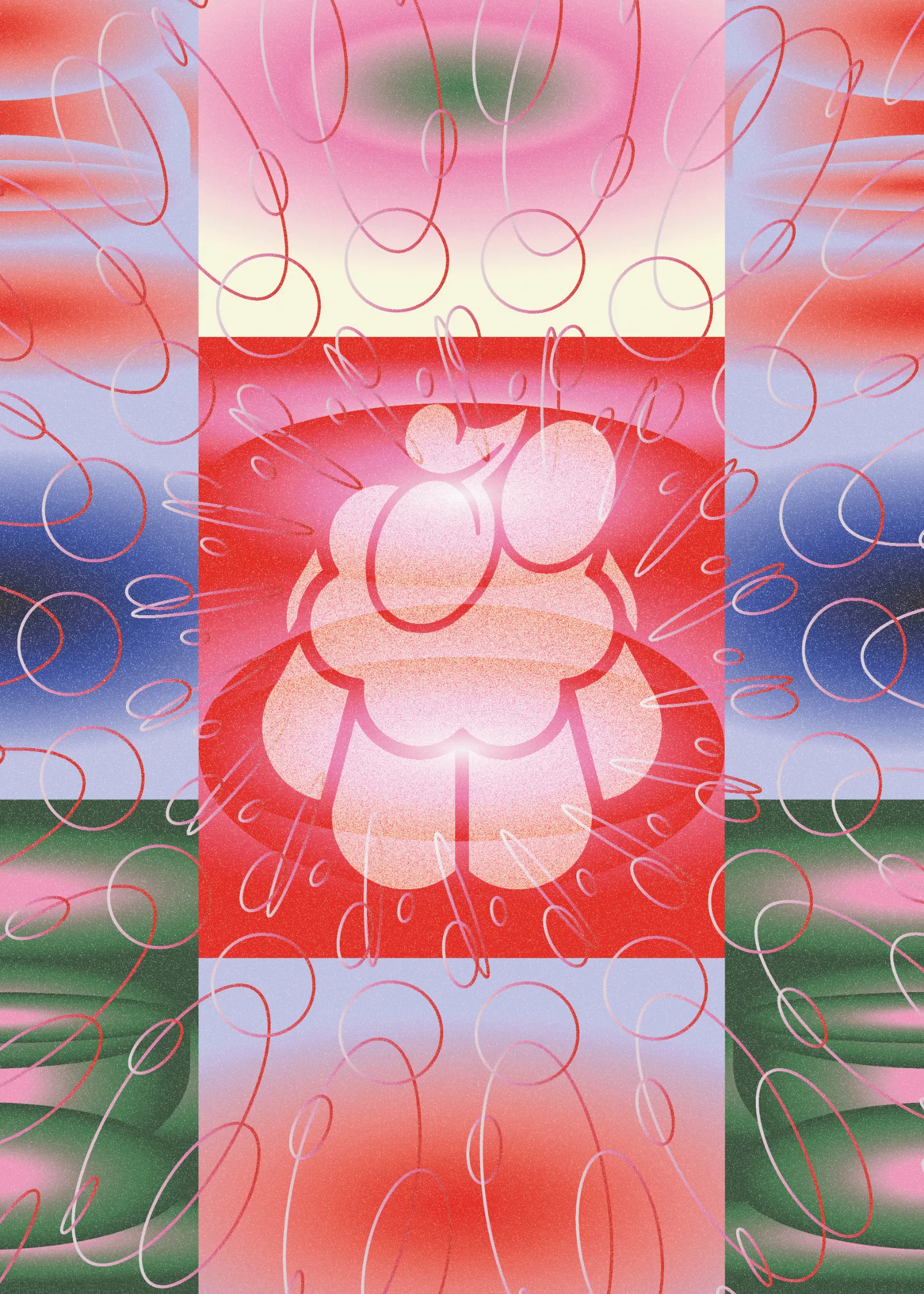
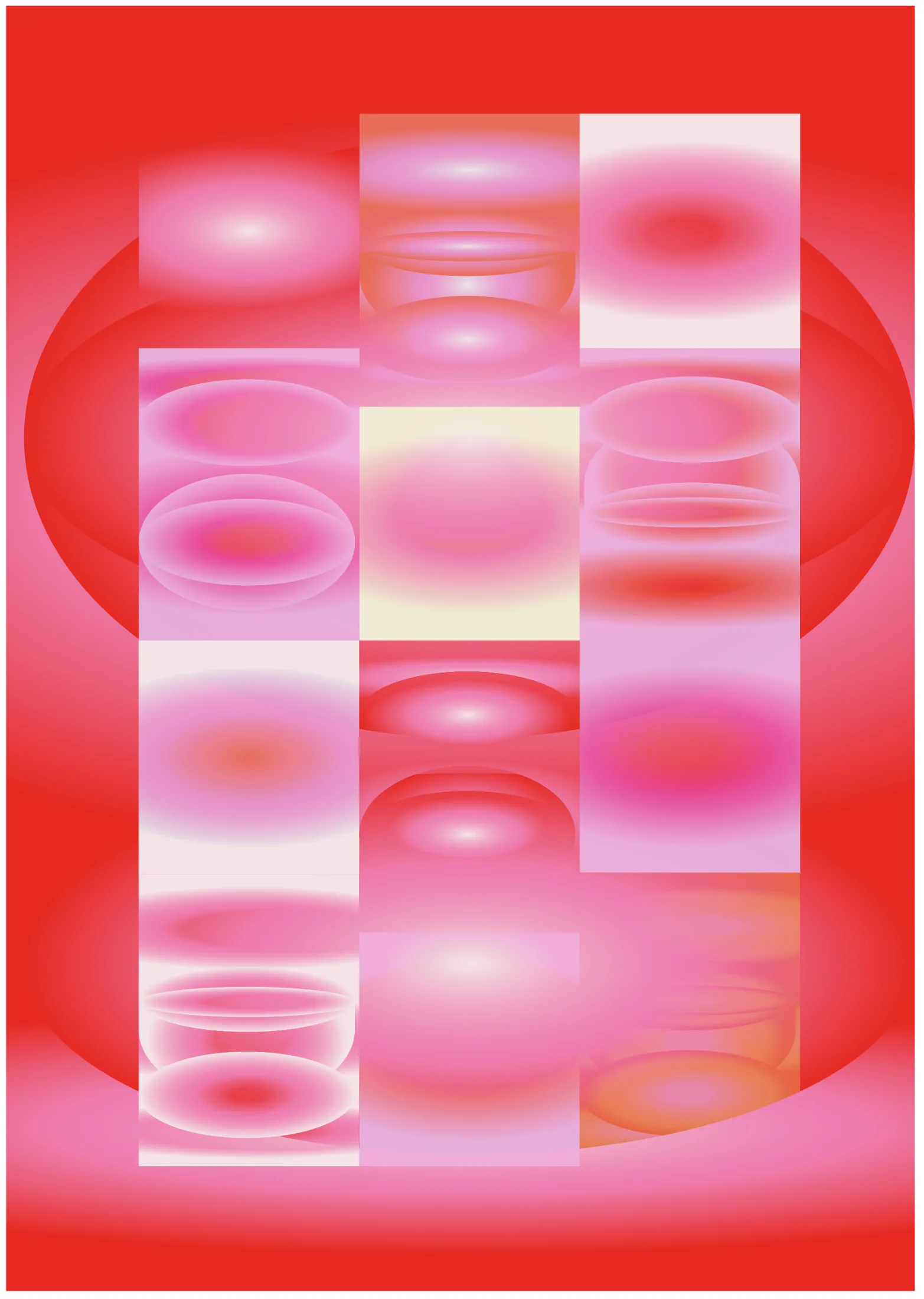
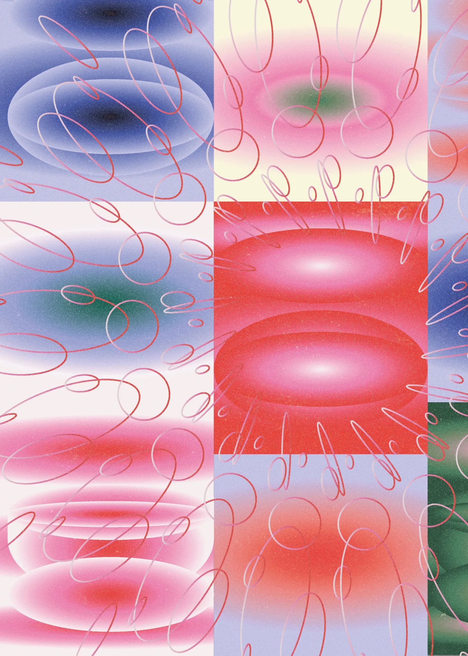
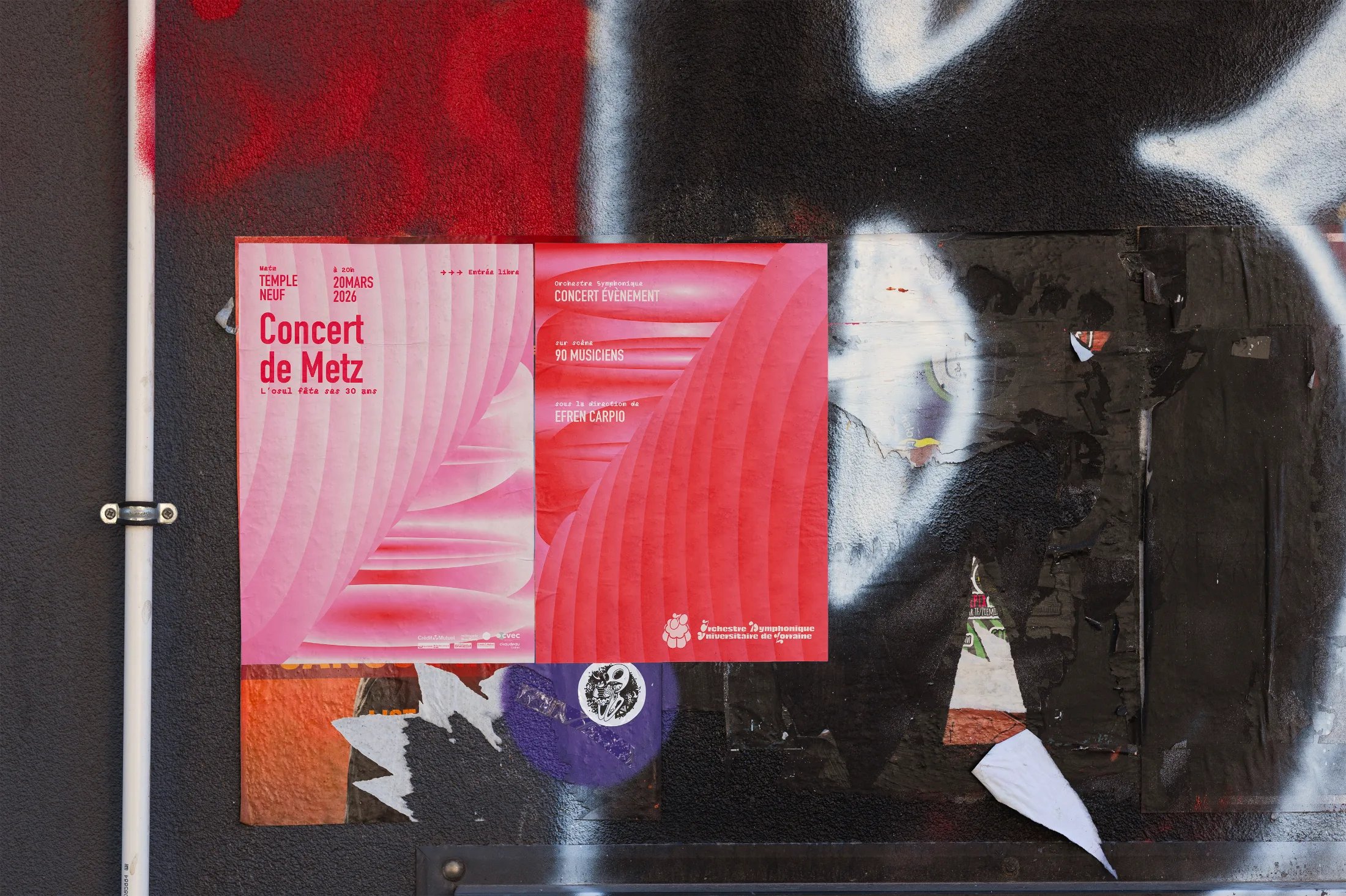
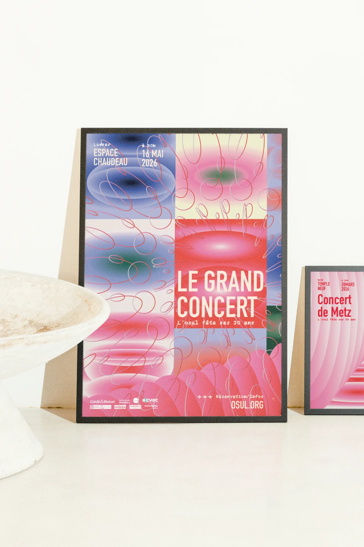
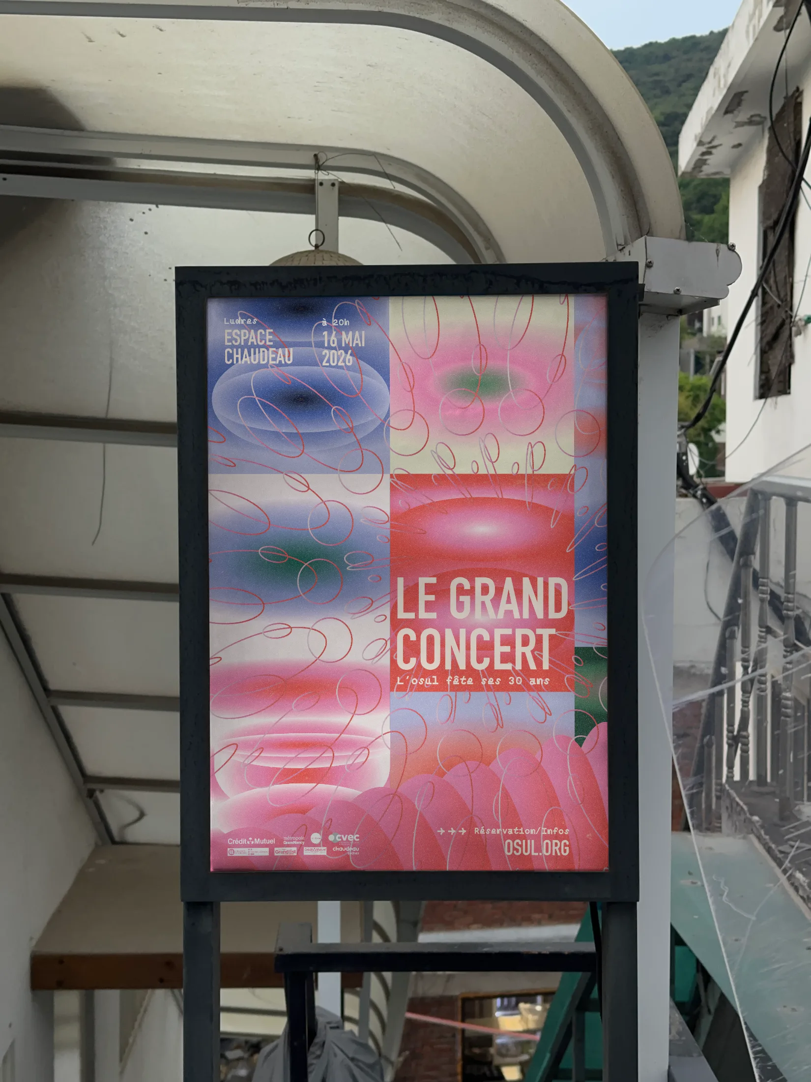
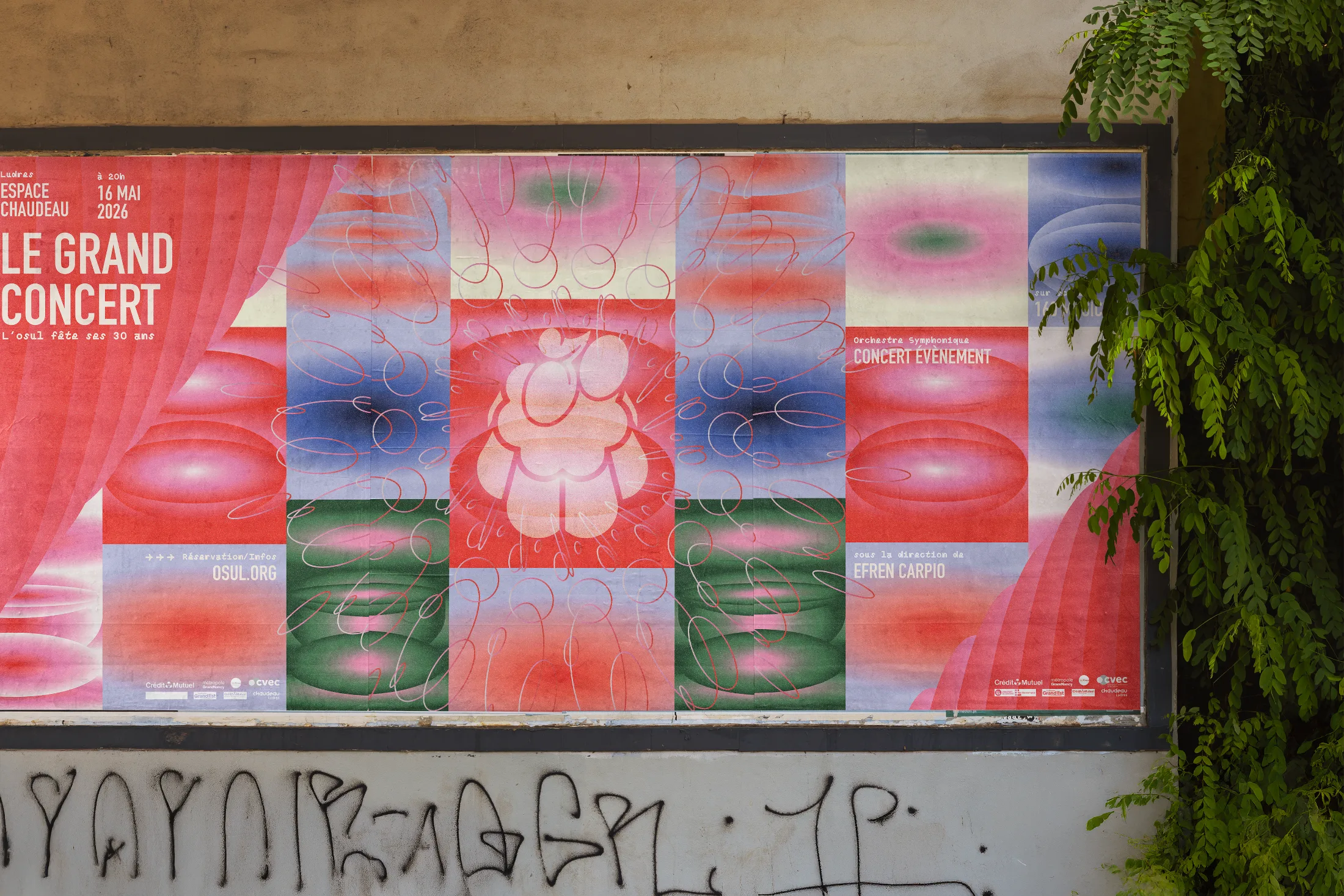
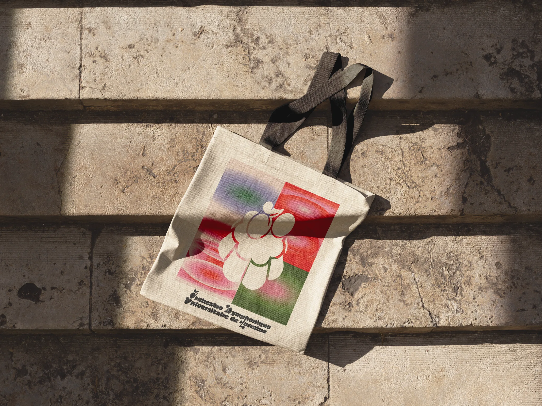
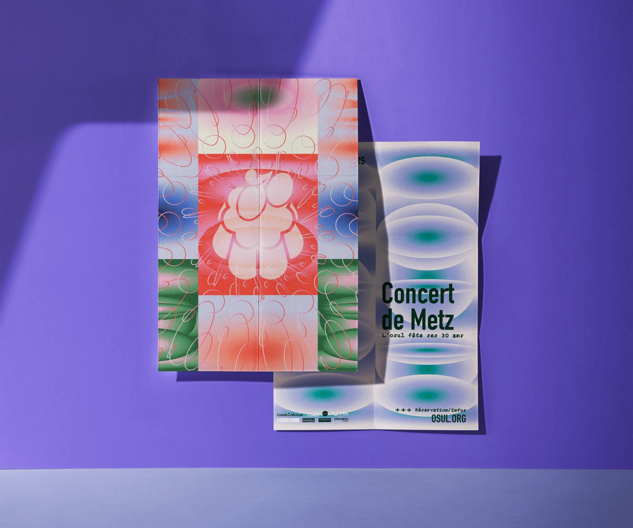
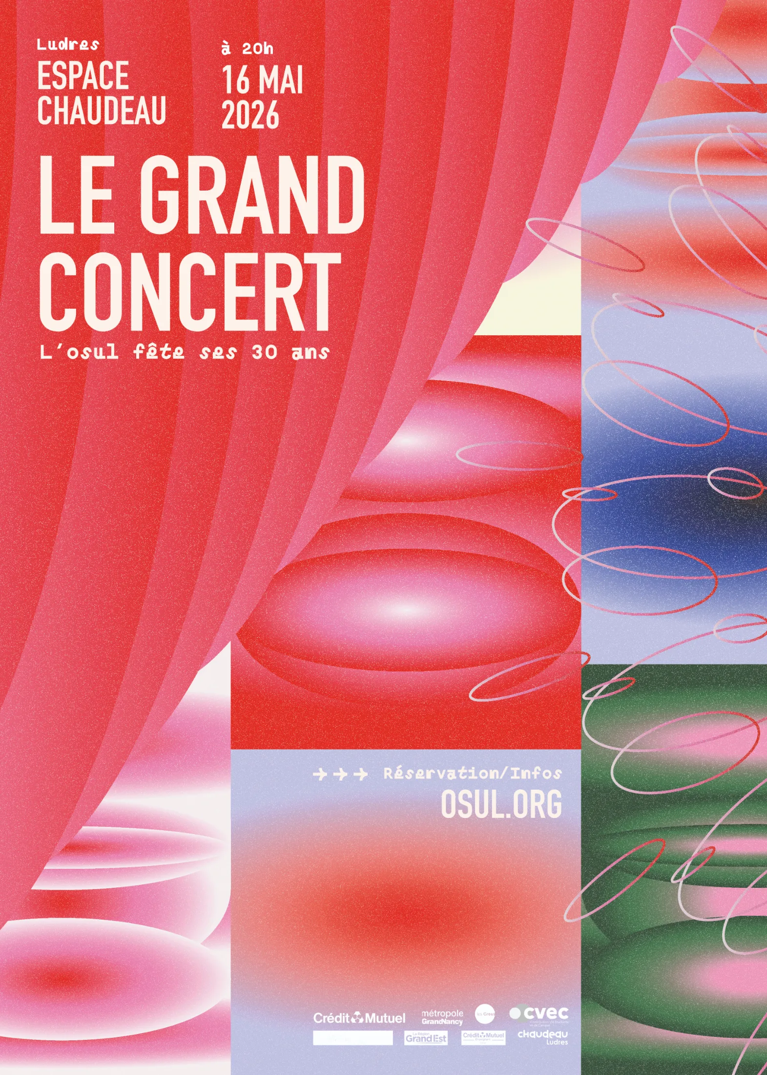
In a crowded cultural landscape, OSUL struggled to express its unique identity: a student orchestra where symphonic rigor and university energy coexist. Our challenge was to refresh the brand without betraying its heritage. After auditing their existing materials and the local and national competition, we identified a unique space: the fusion of emotions. Mathilde created a custom typeface with strokes that evoke musical notes, paired with a symbol built from two stylized staves. We developed a system of gradients to capture the nuances of a full orchestral sound, serving as a modular framework. The identity is applied across posters, programs, and social media using a flexible grid system. Deliverables: logo + symbol and variations, full alphabet, RGB/CMYK palette, gradient library, style guide (40 p.), and Canva templates for complete autonomy.