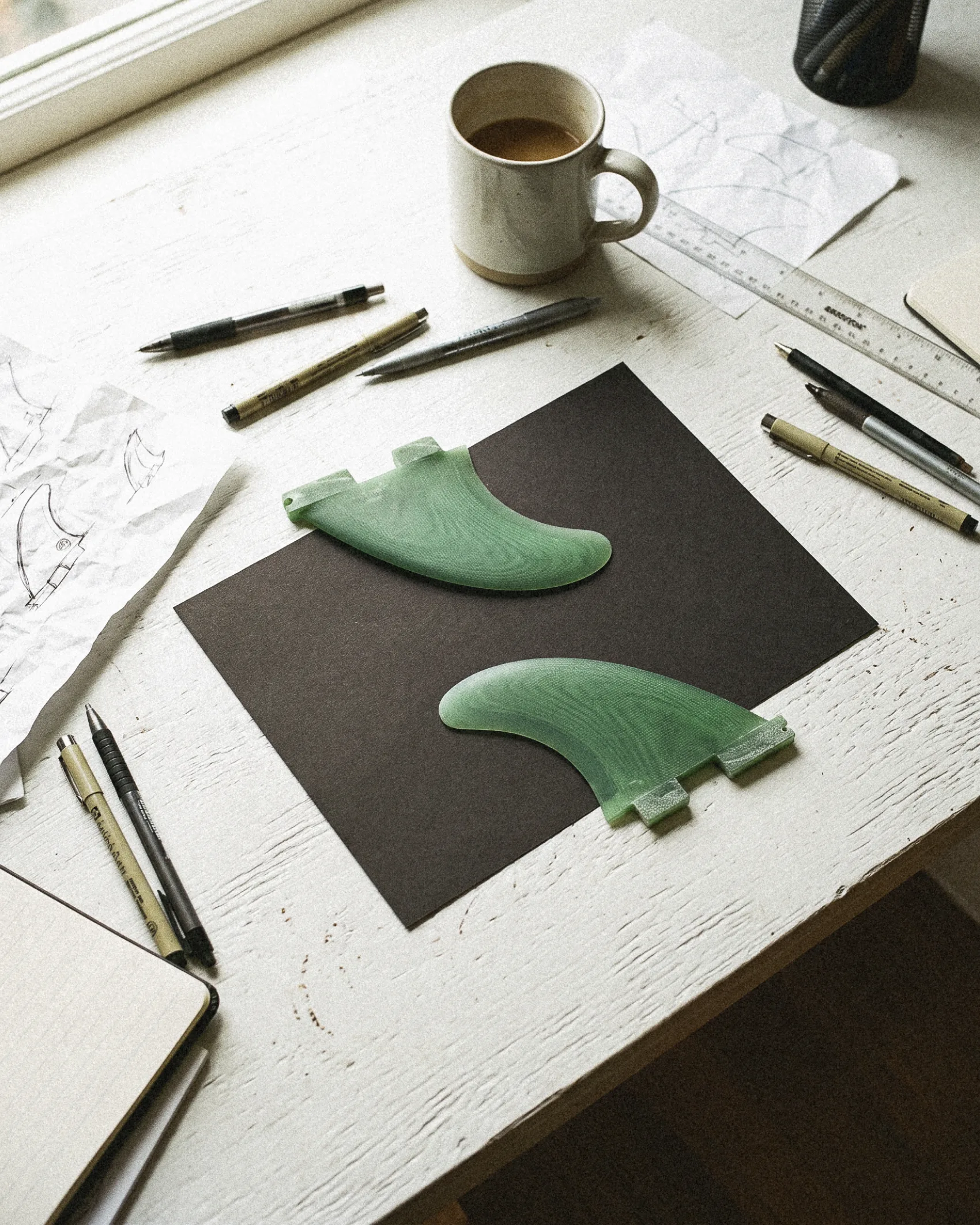
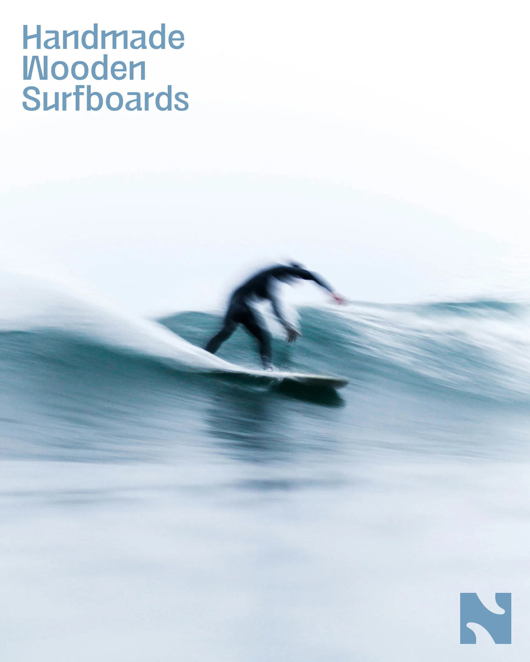
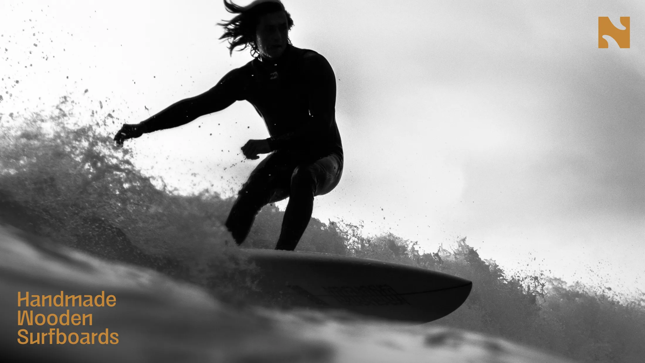
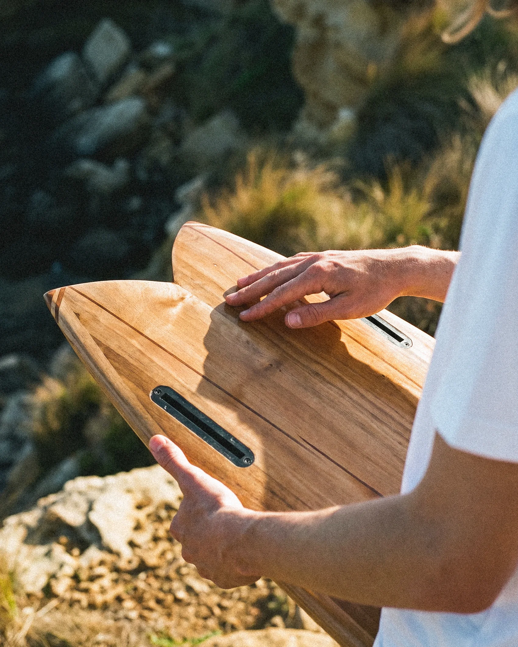
A wooden surfboard is long and difficult to craft. It is more eco-friendly than a standard board and lasts longer. Natubo had its name, a contraction of Natural Boards; everything else had to be built from scratch.
The trap was well-known: wooden surfboards and ecology often evoke the hippie imagery of the 70s. We wanted to showcase the precision of this craftsmanship without compromising its core philosophy.
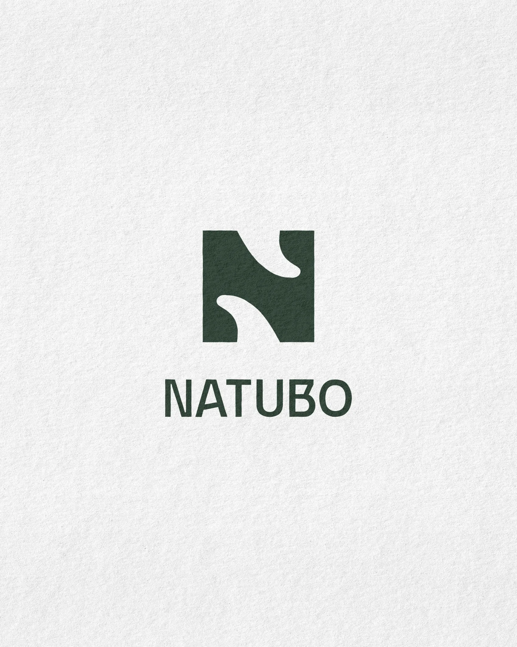
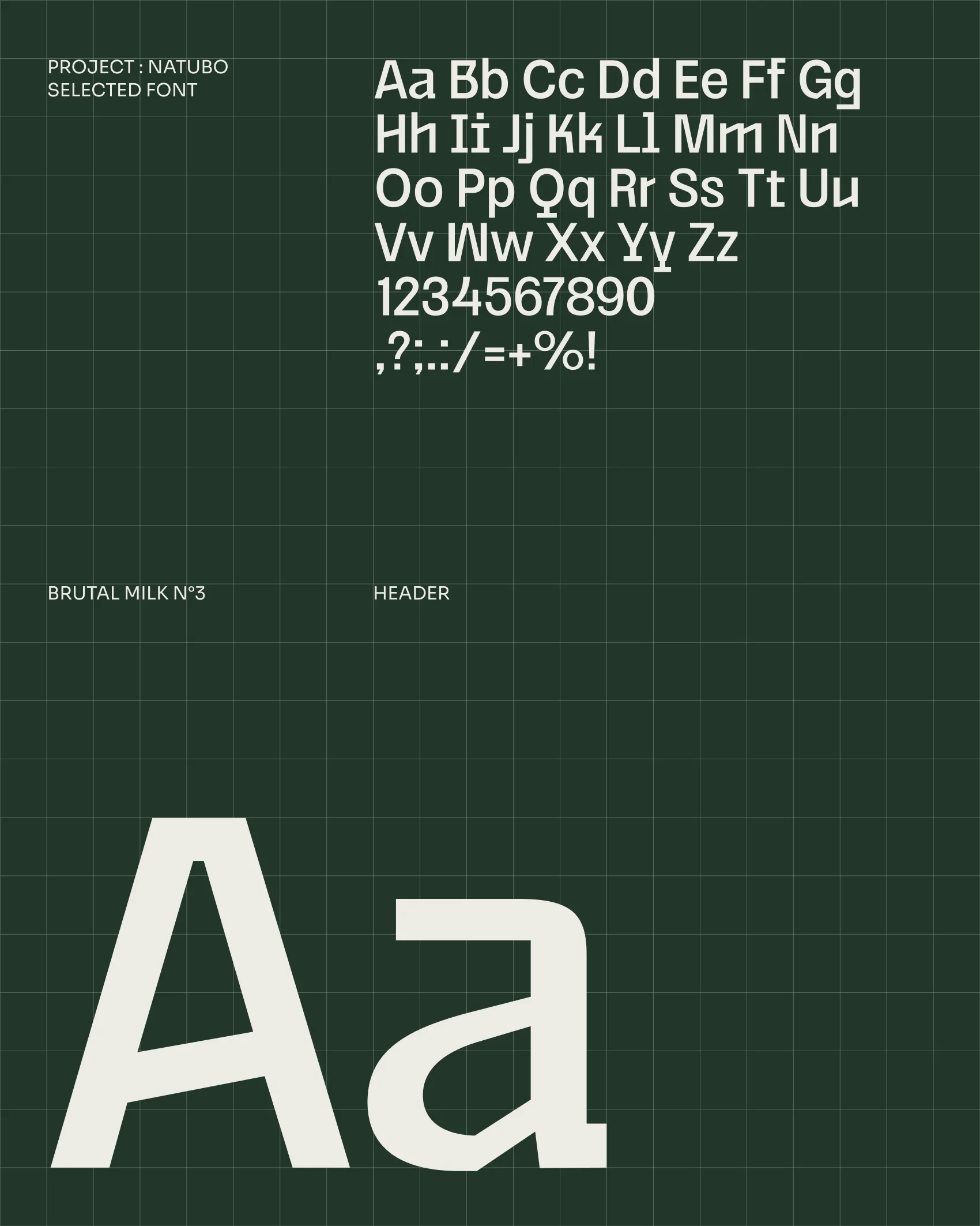
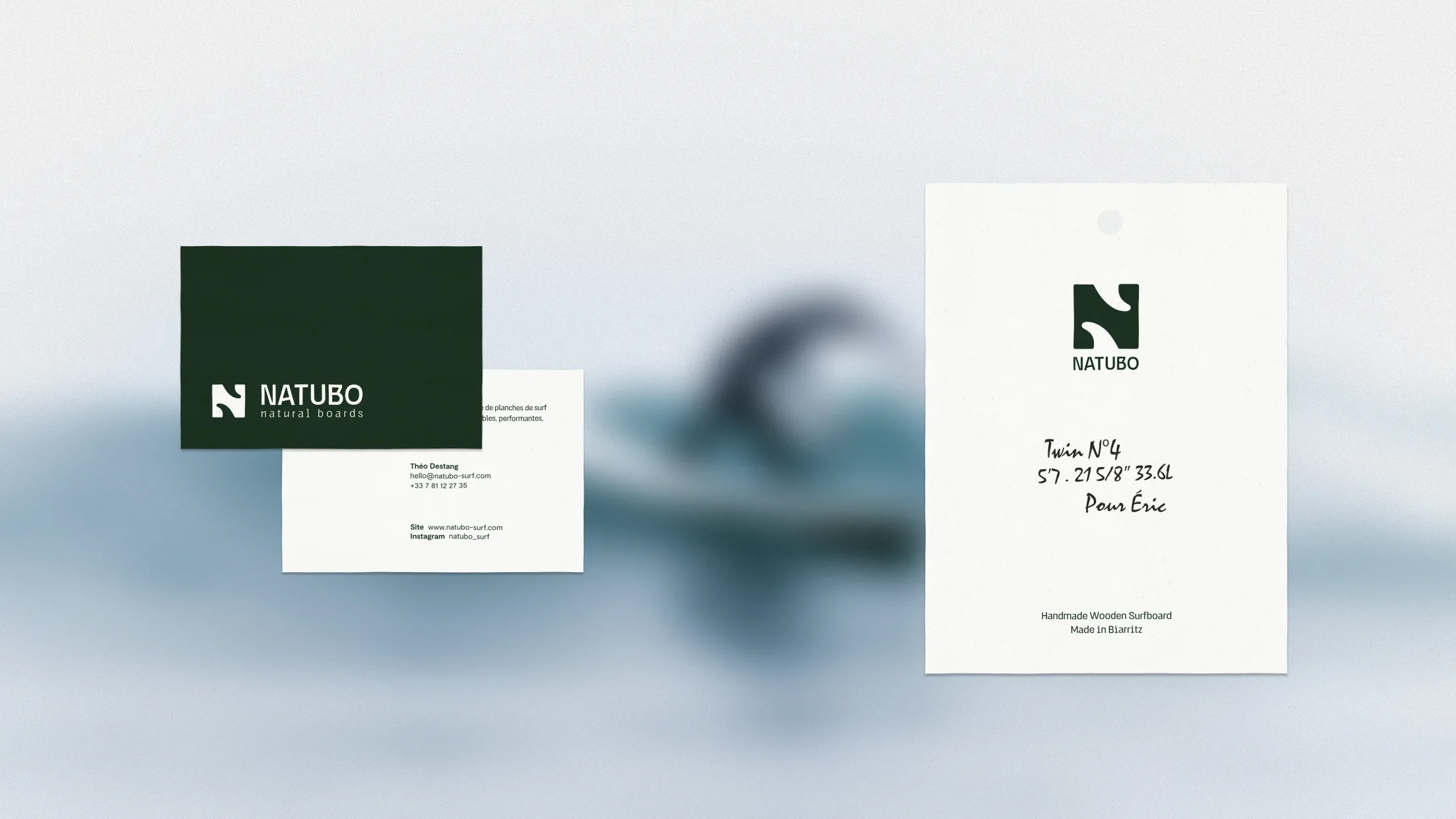
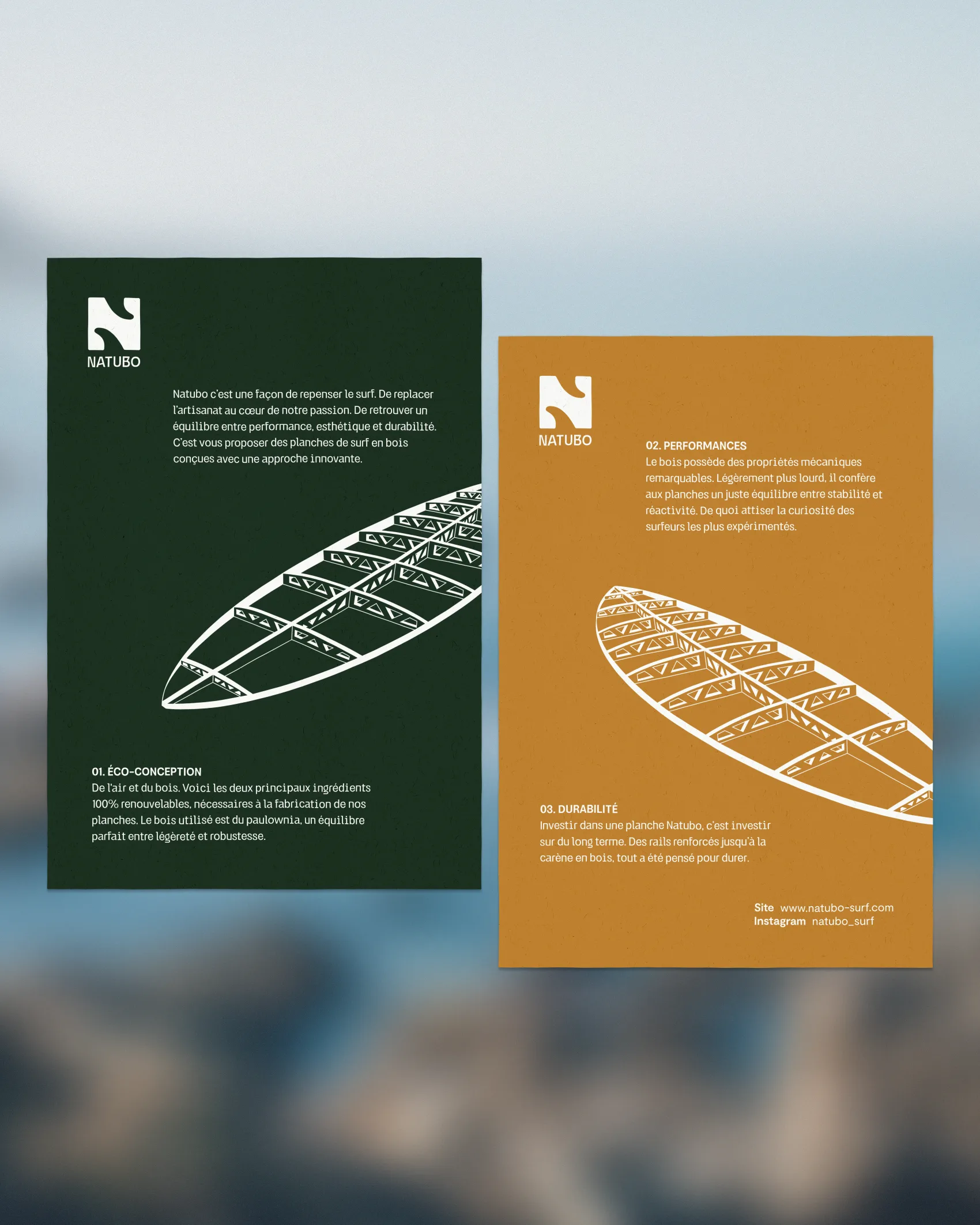
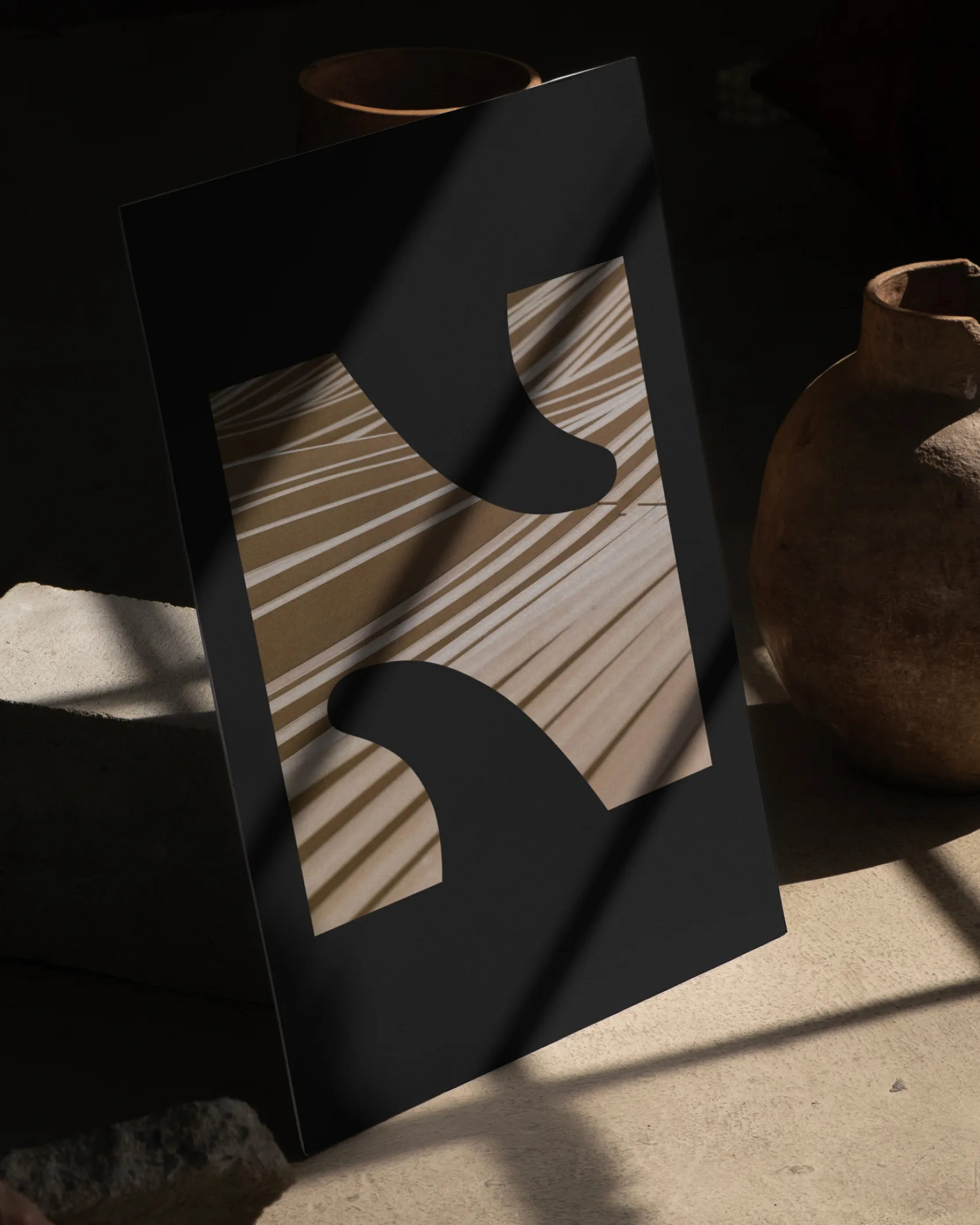
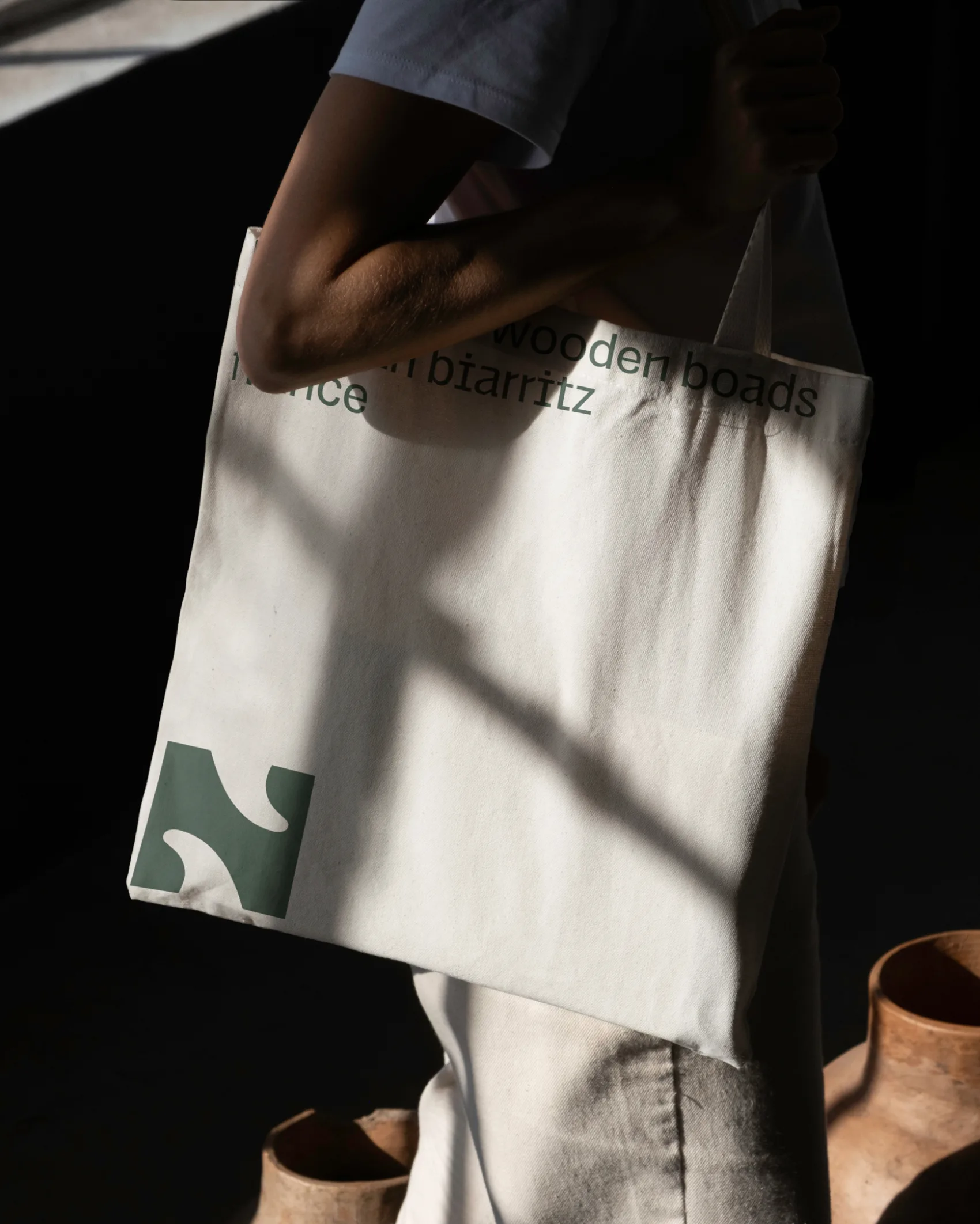
Lucas steered the brand identity toward modernity: a logotype and an N monogram, a typographic system, and layouts that borrow from technical drawing. The brochures present the board like a blueprint, in three points: eco-design, performance, and durability. The rigor reads almost like engineering.
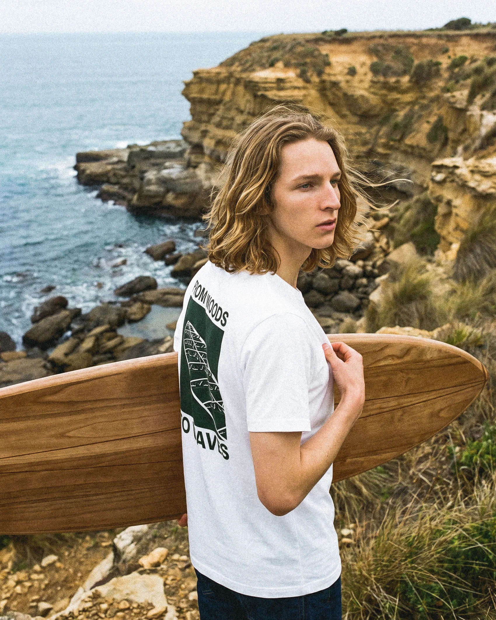
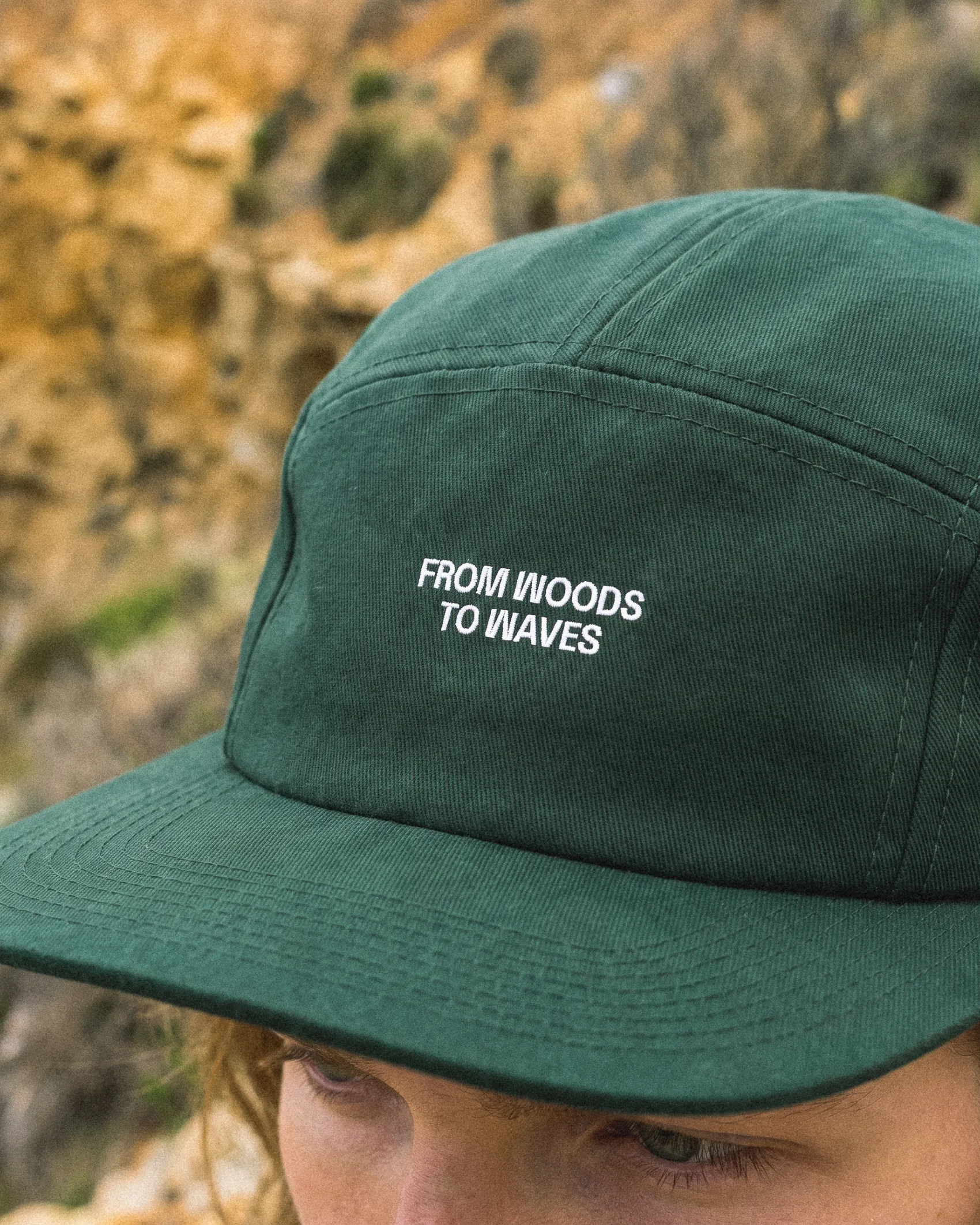
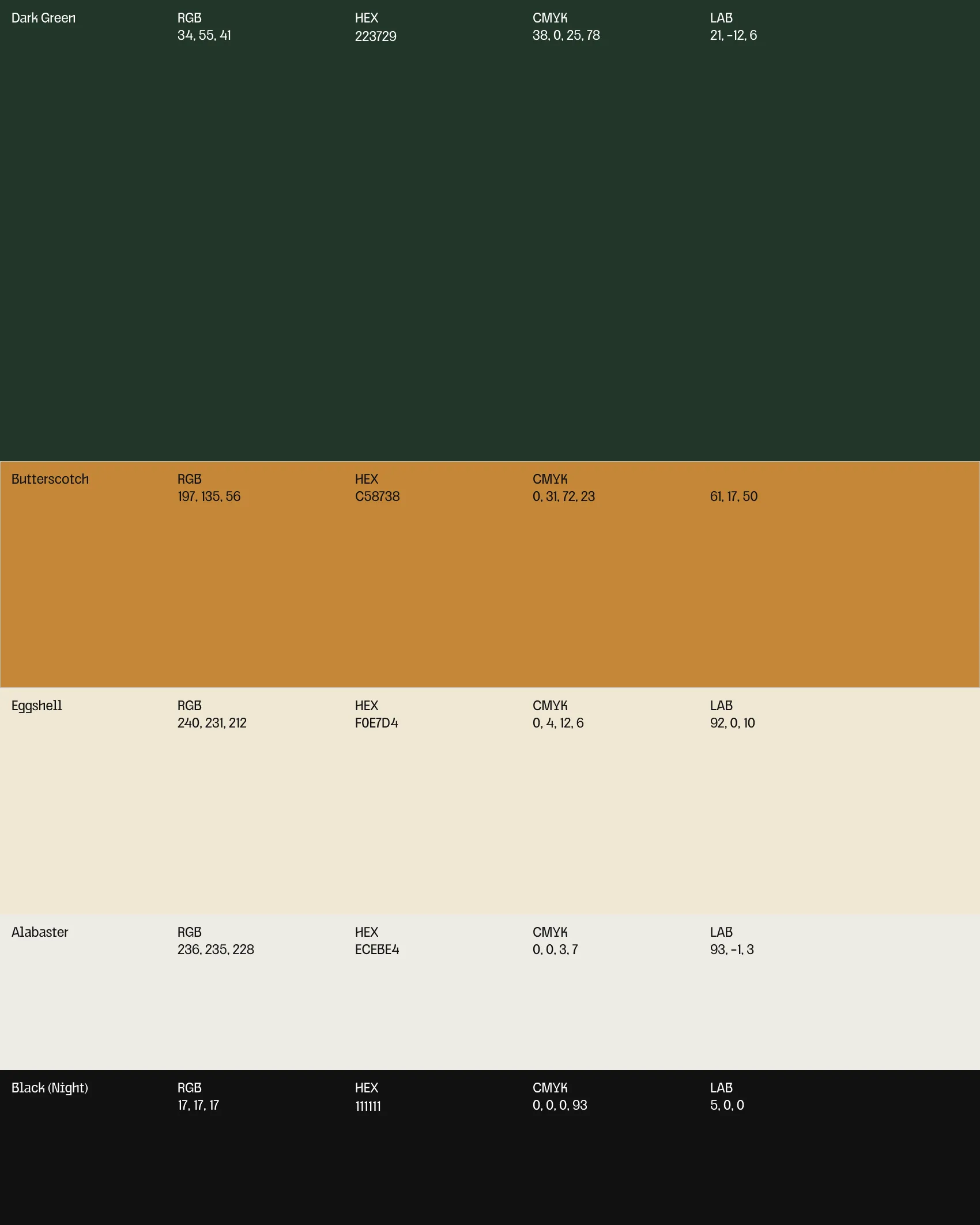
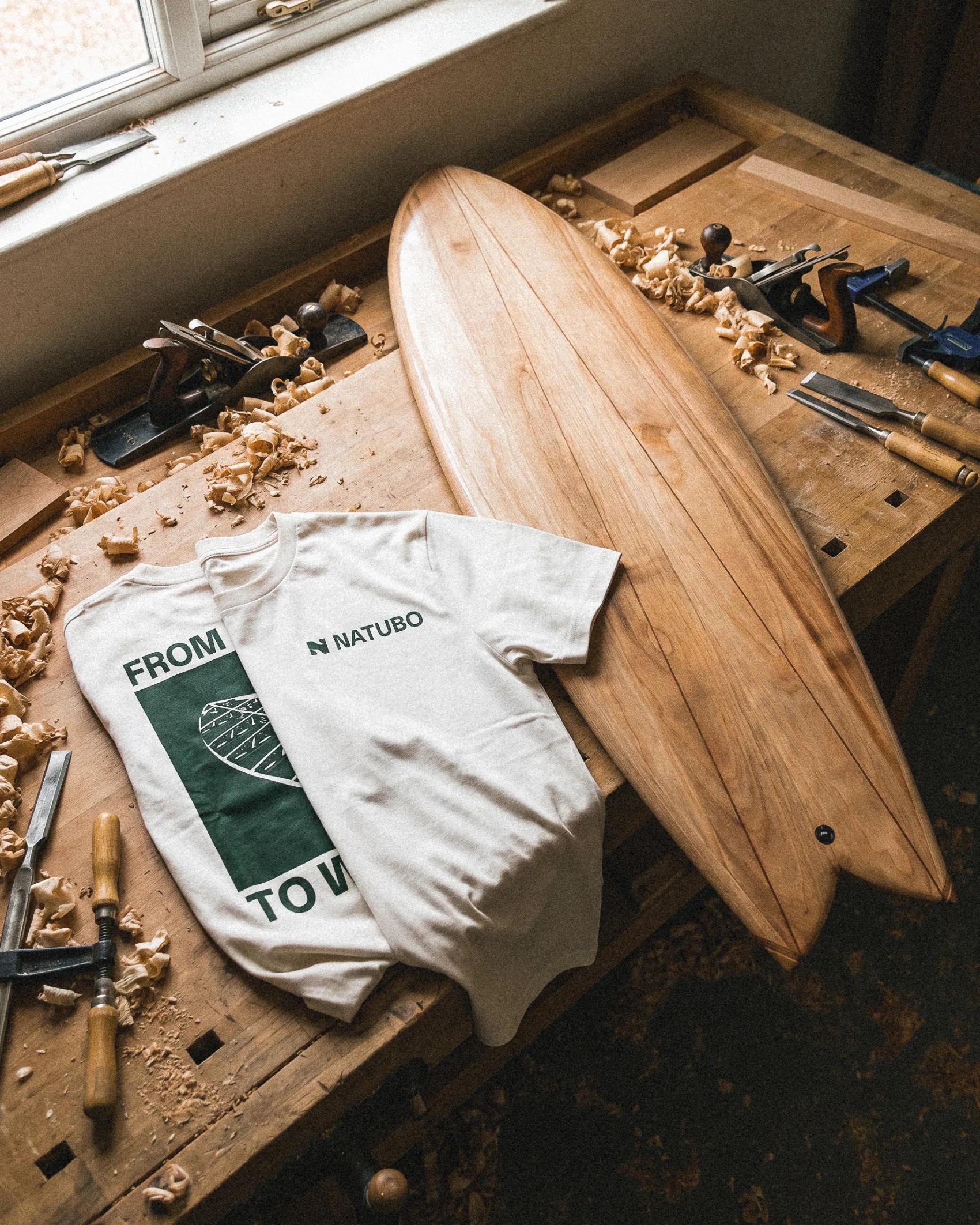
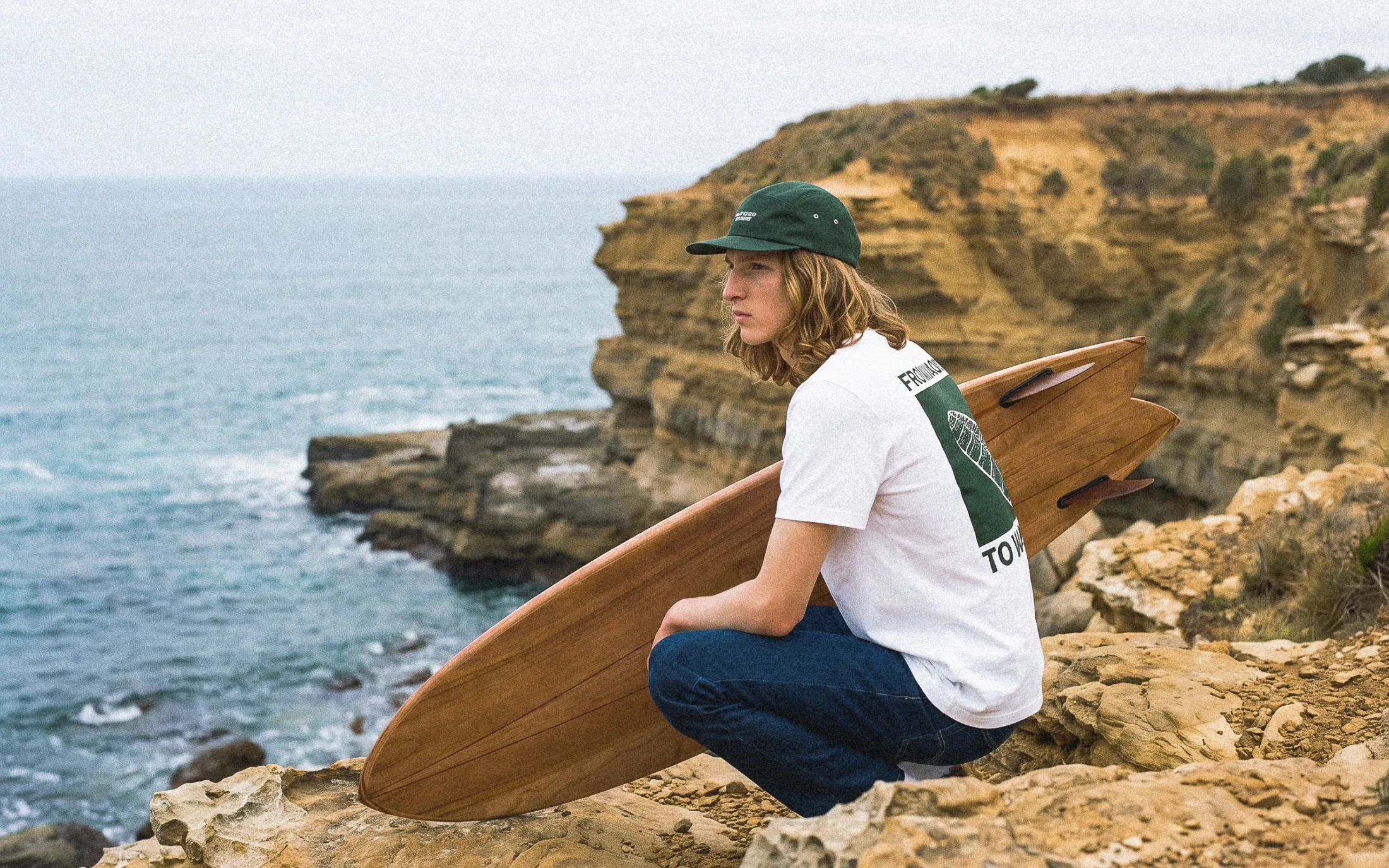
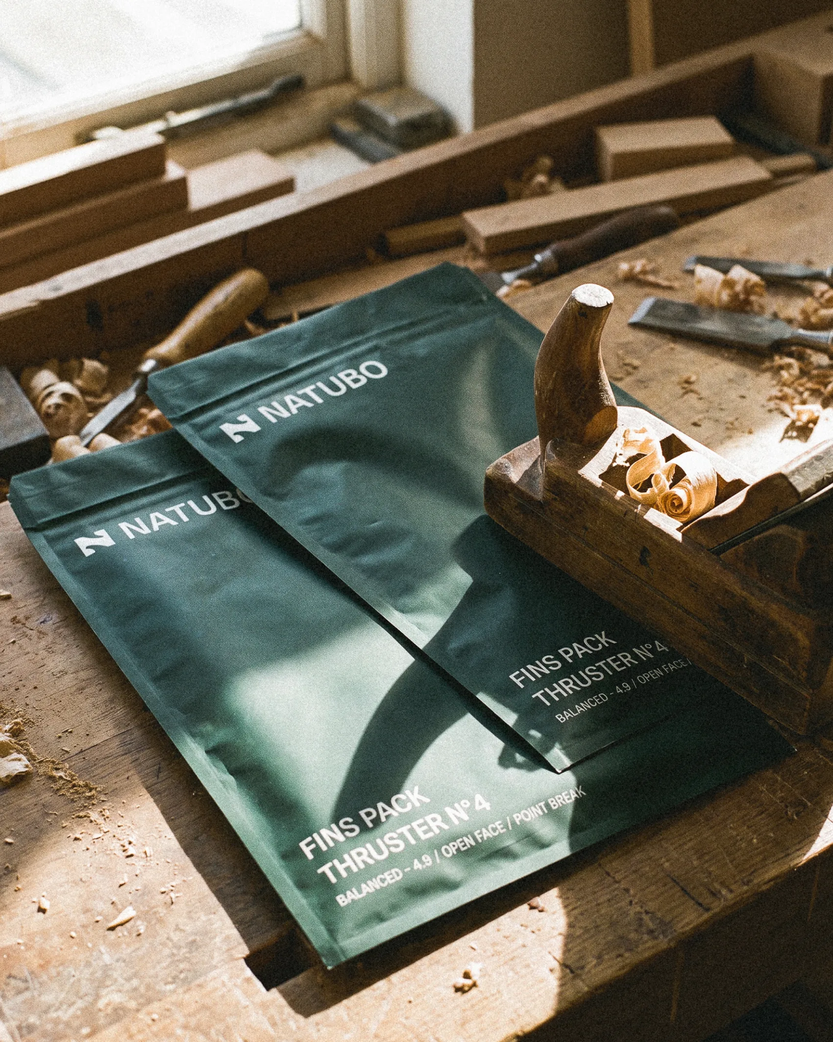
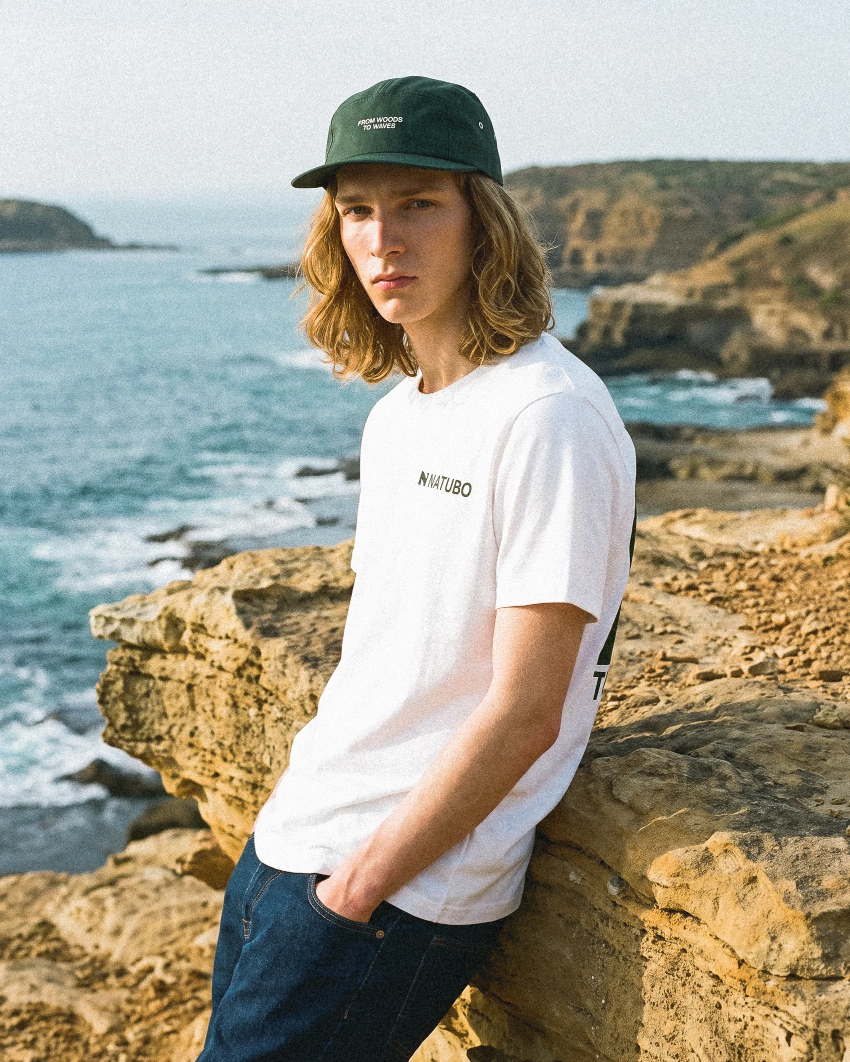
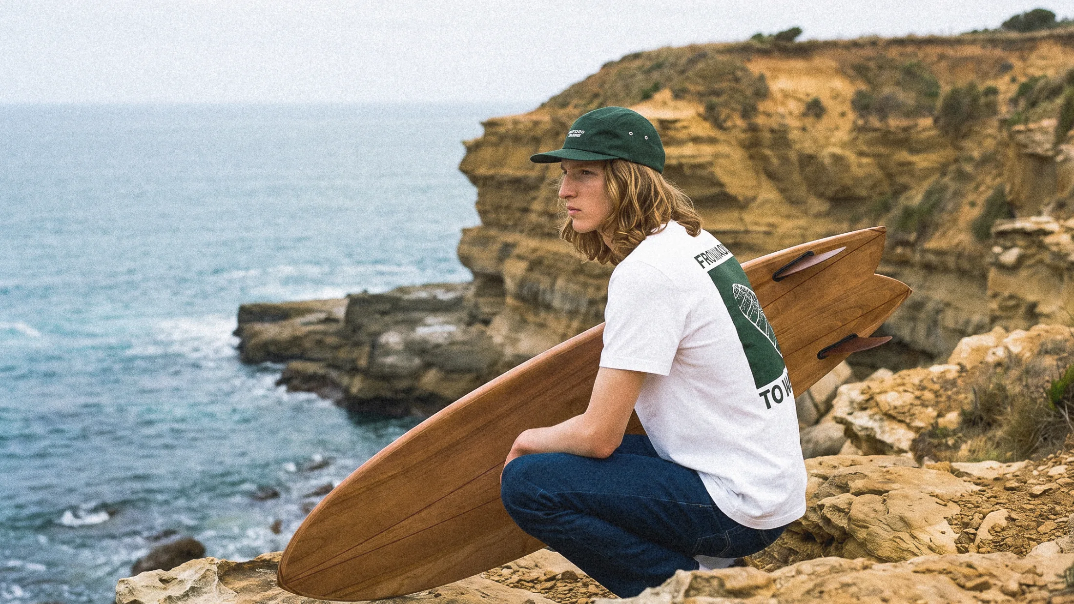
As a counterpoint, the art direction and a palette drawn from natural materials—forest green, caramel, eggshell—provide balance. The images highlight the wood, the shavings, and the surfers with their boards. Each board is custom-made, and its label is hand-signed by the craftsman for the buyer. On the caps, the embroidered signature sums it all up: « From Woods to Waves ».