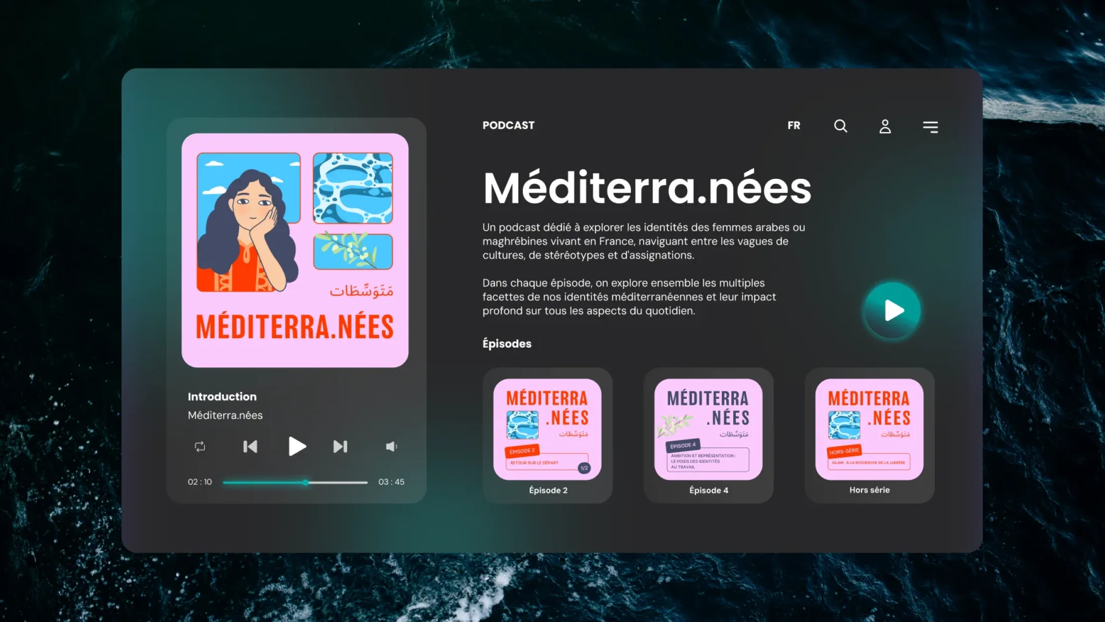
Leïla Chaouachi launched Méditerra.nées to discuss the identities of Arab and North African women living in France with her guests. The podcast is, first and foremost, a space for exchange and understanding; its branding needed to convey that at first glance.
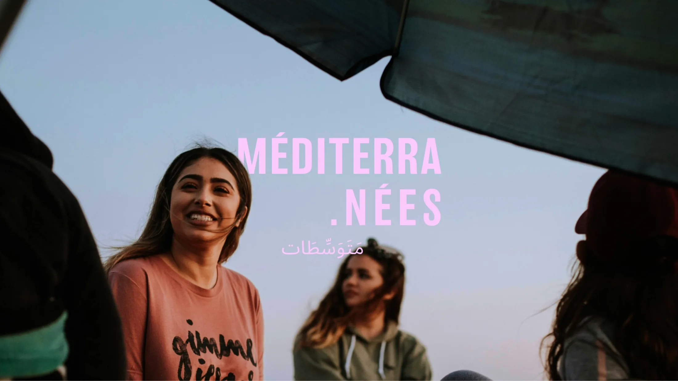
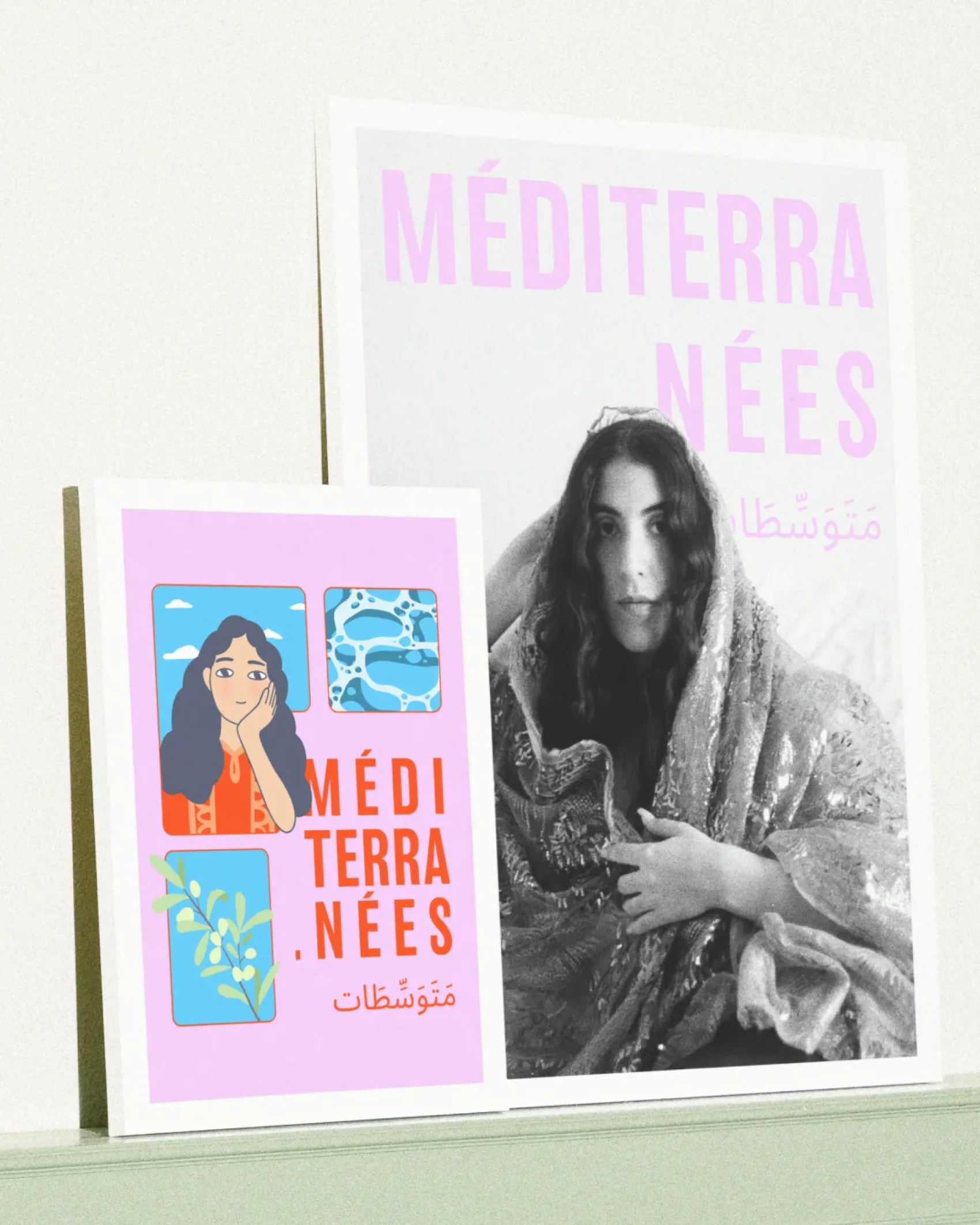
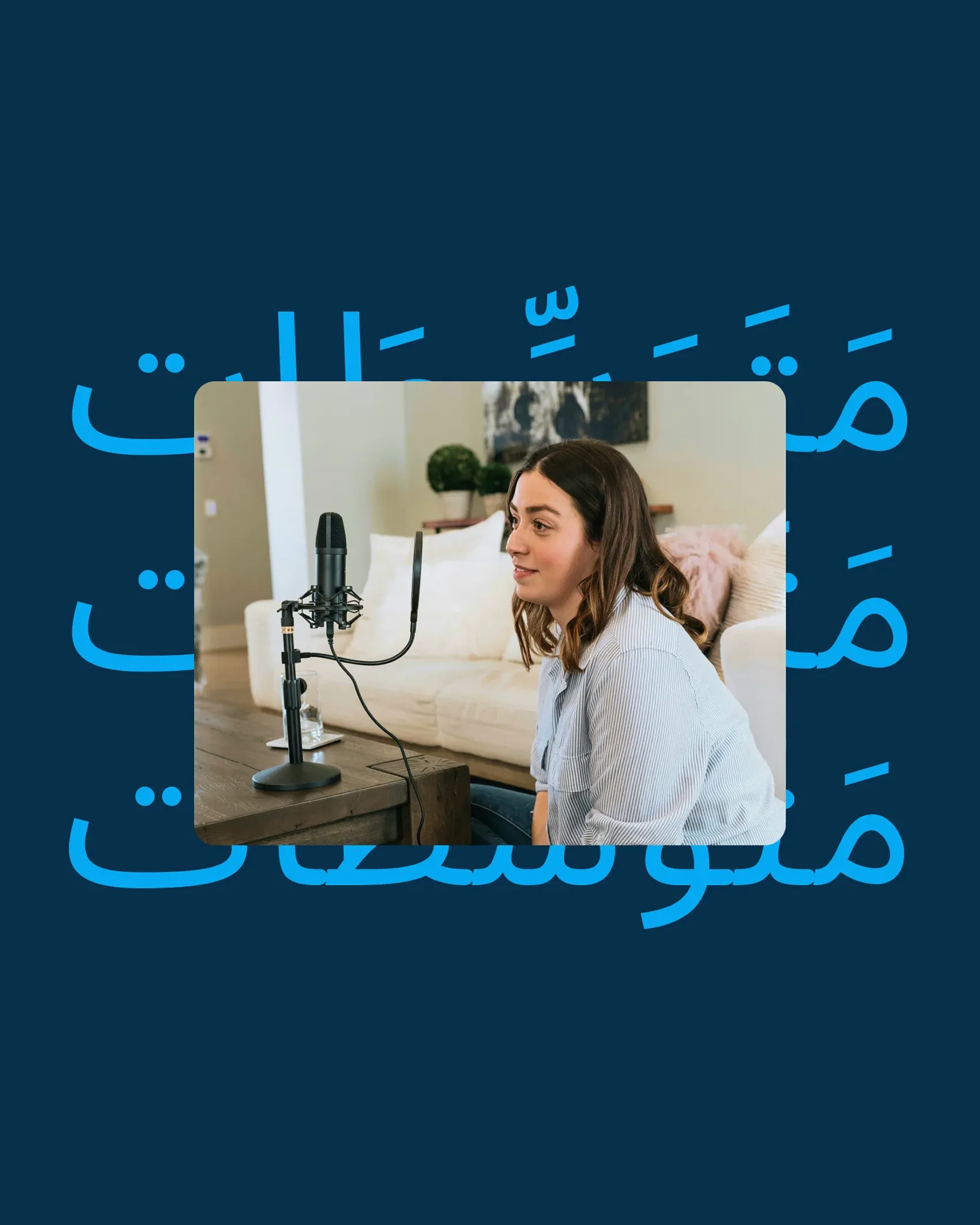
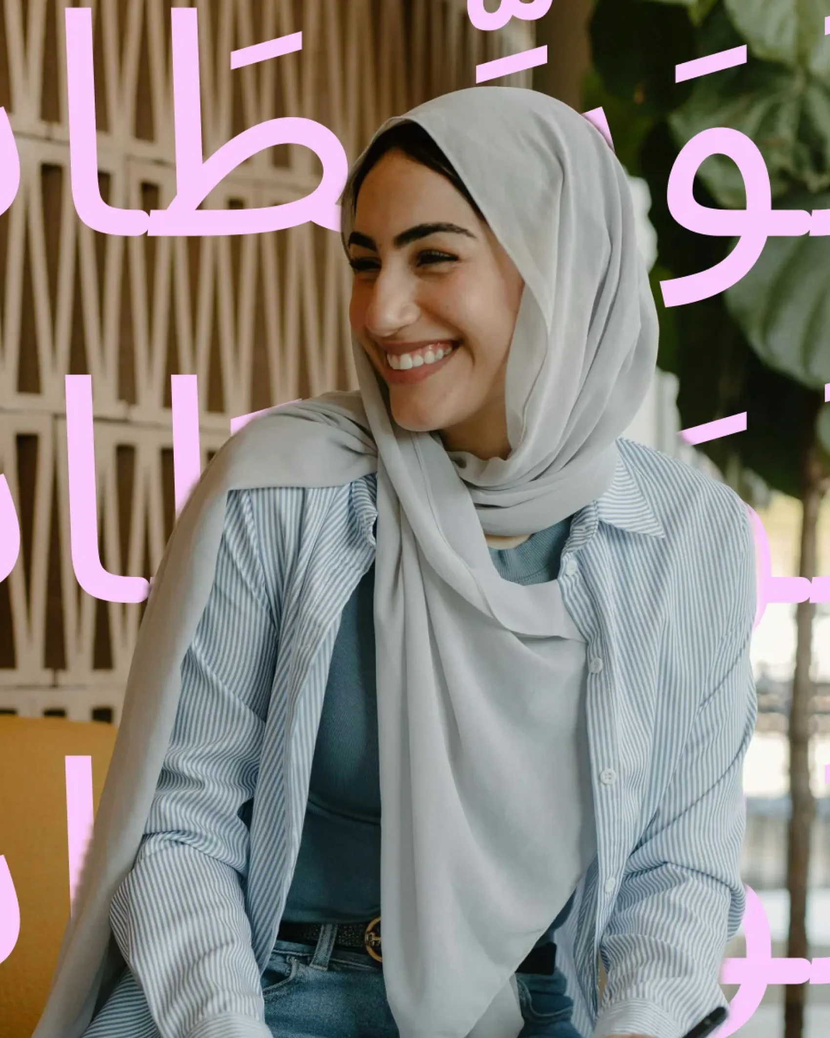
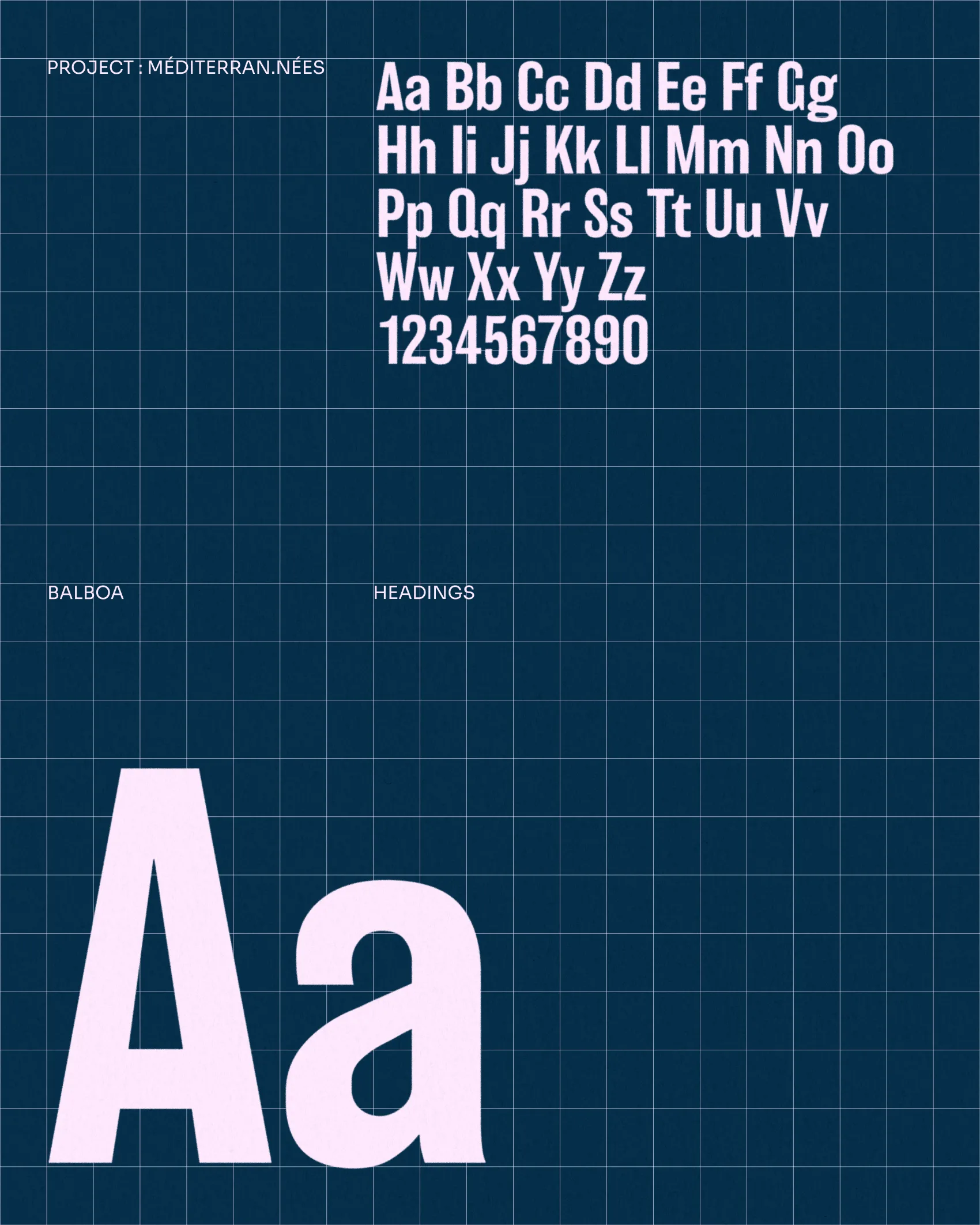
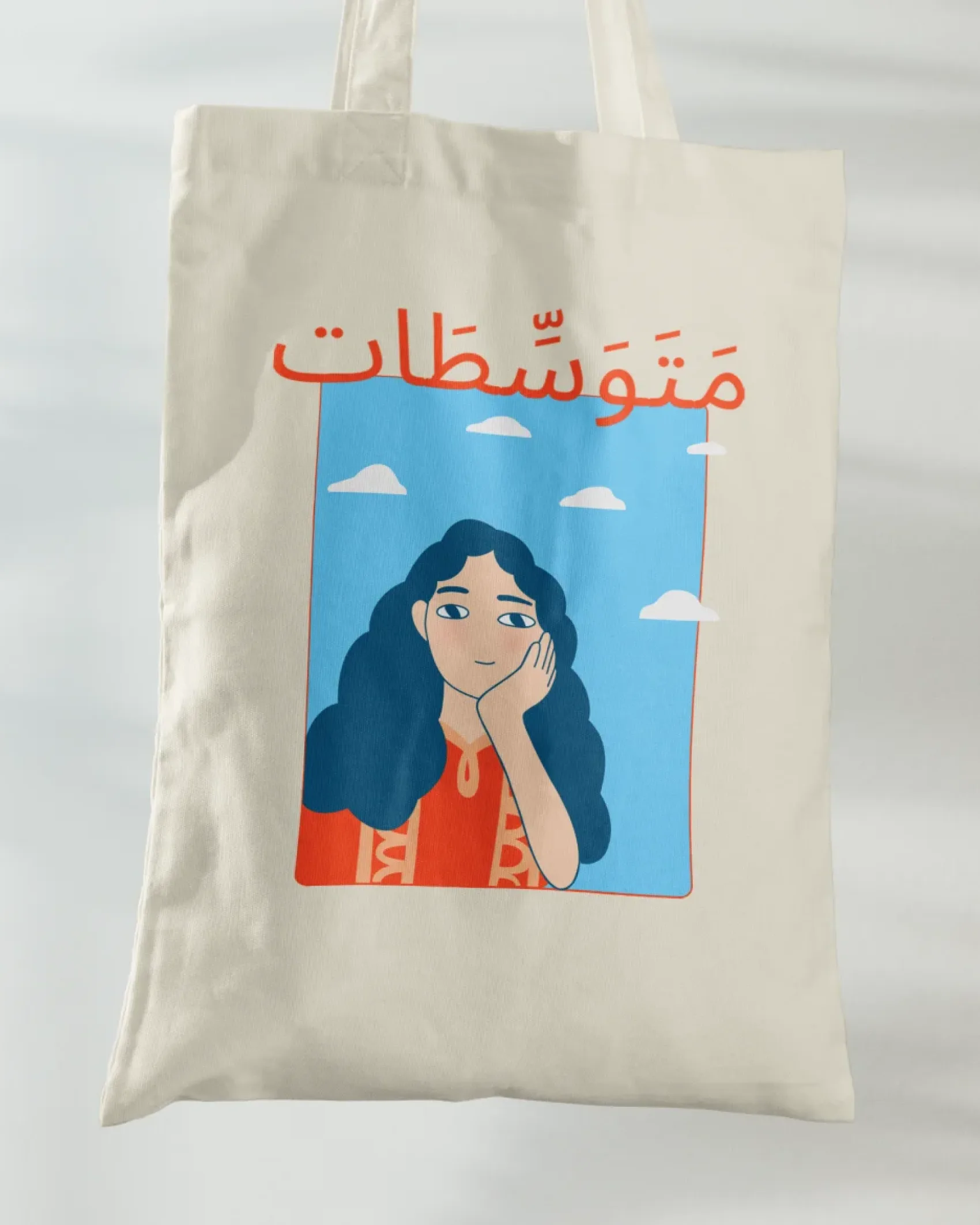
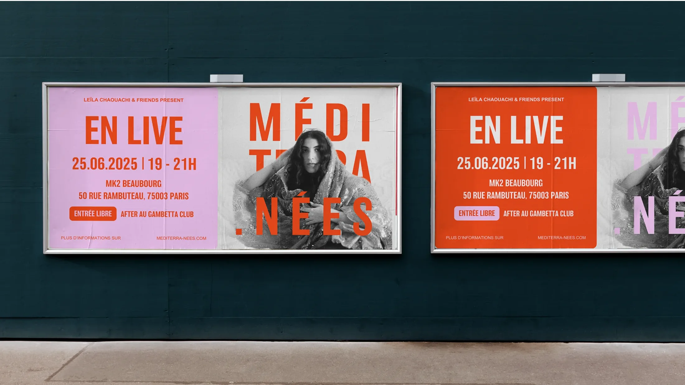
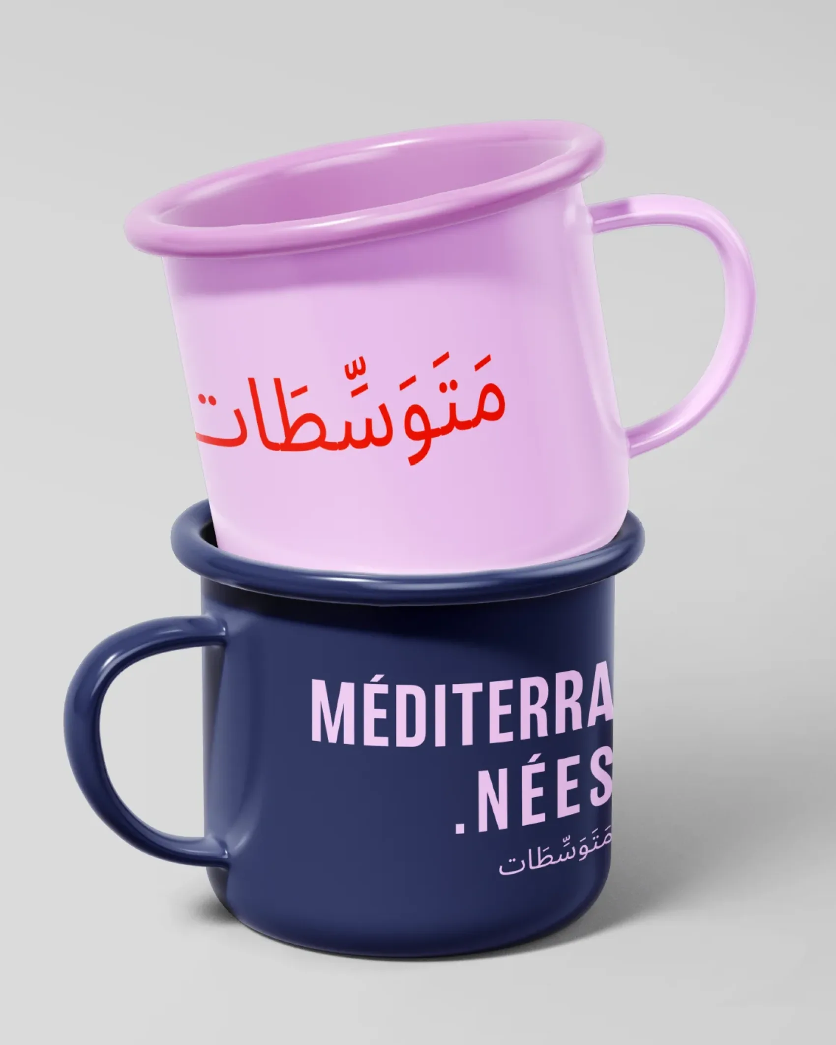
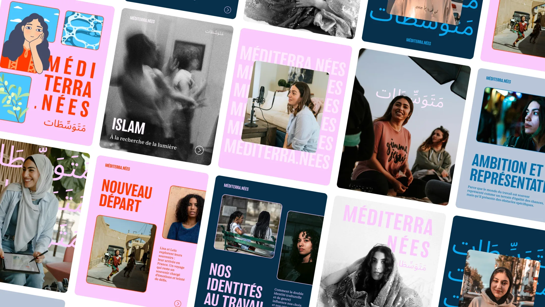
We had to bridge two shores, two languages, and two alphabets, while remaining approachable without losing character. Ségolène made the name the primary visual element: MÉDITERRA.NÉES in condensed capital letters, paired with its Arabic equivalent, "متوسّطات".
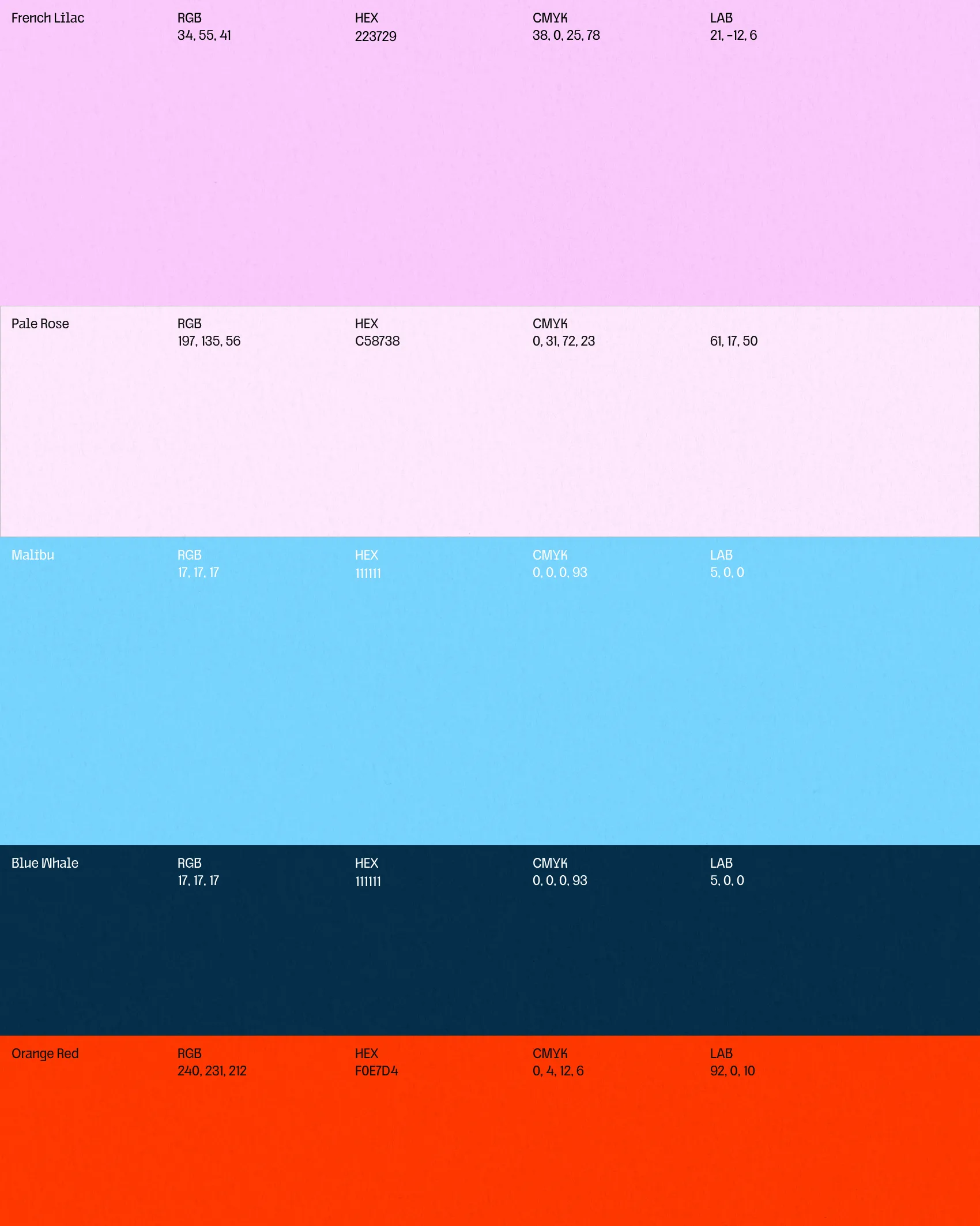
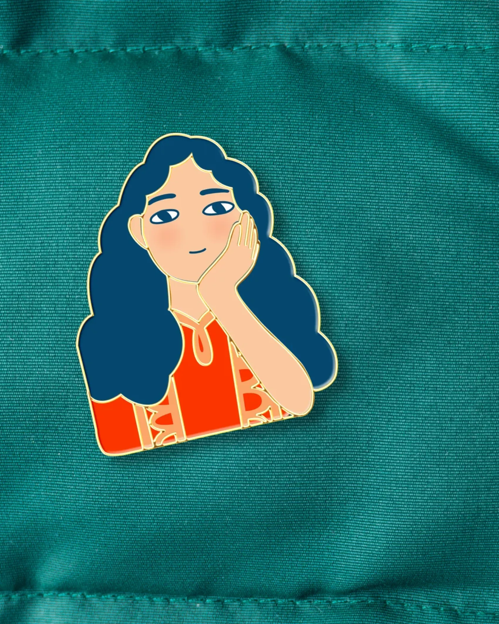
She then designed the illustration that welcomes the listener: a woman, cheek in hand, in front of a window opening onto the sea. With soft lines and a palette of pinks, blues, and reddish-orange, entering Leïla’s world feels like stepping into a conversation.
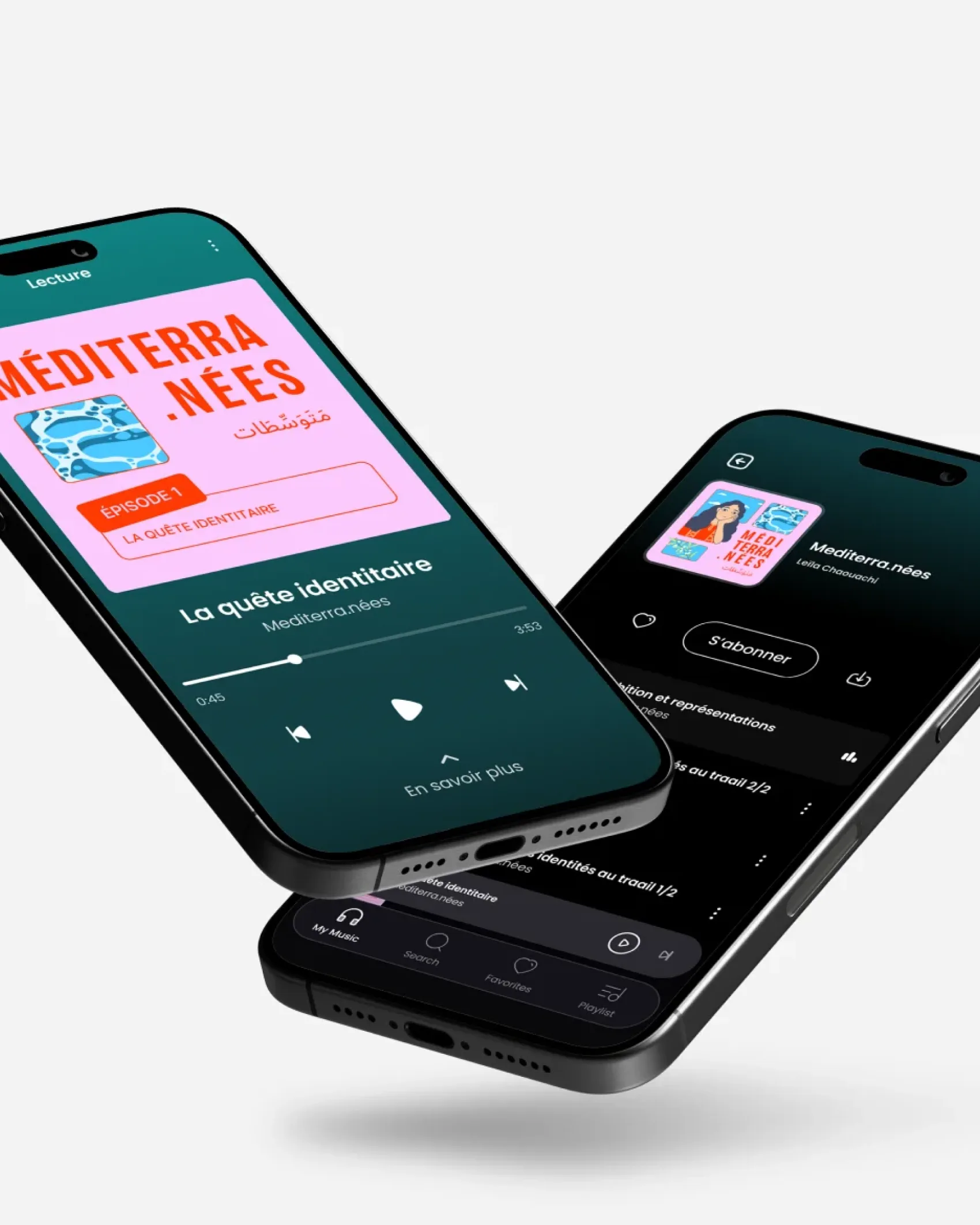
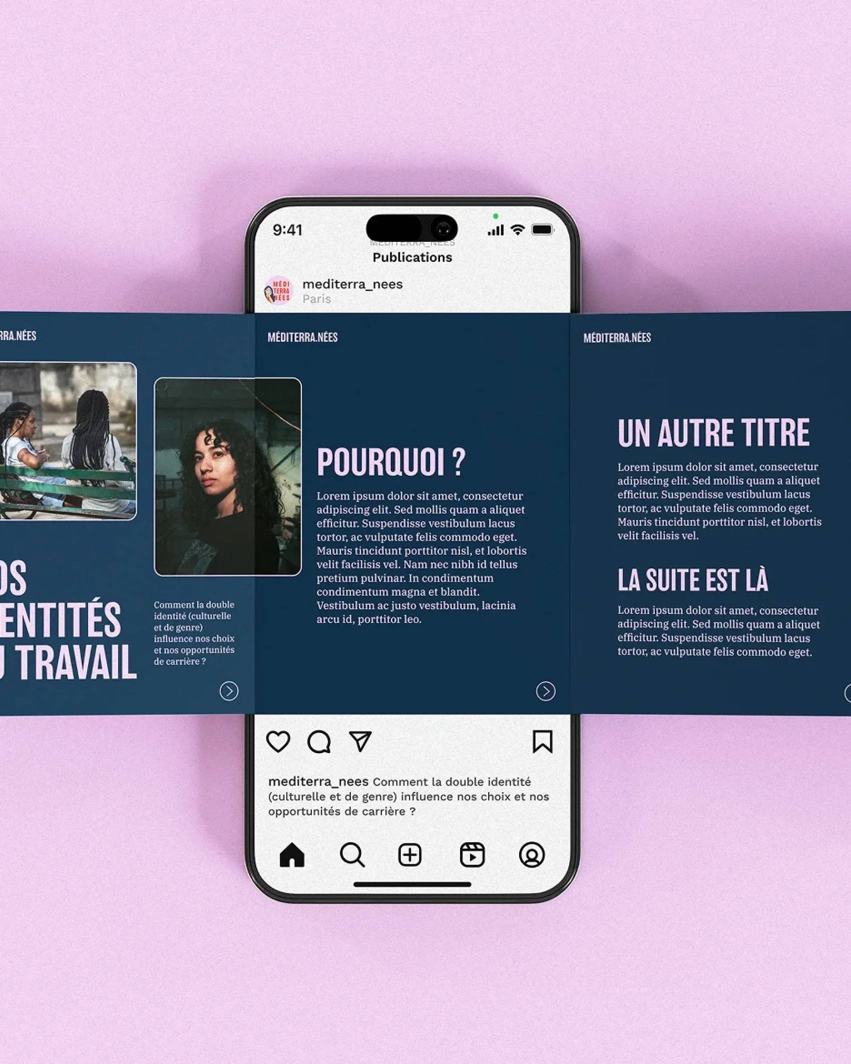
The identity is applied across episode visuals, Instagram carousels, posters for a live event in Paris, and even pins, tote bags, and mugs.