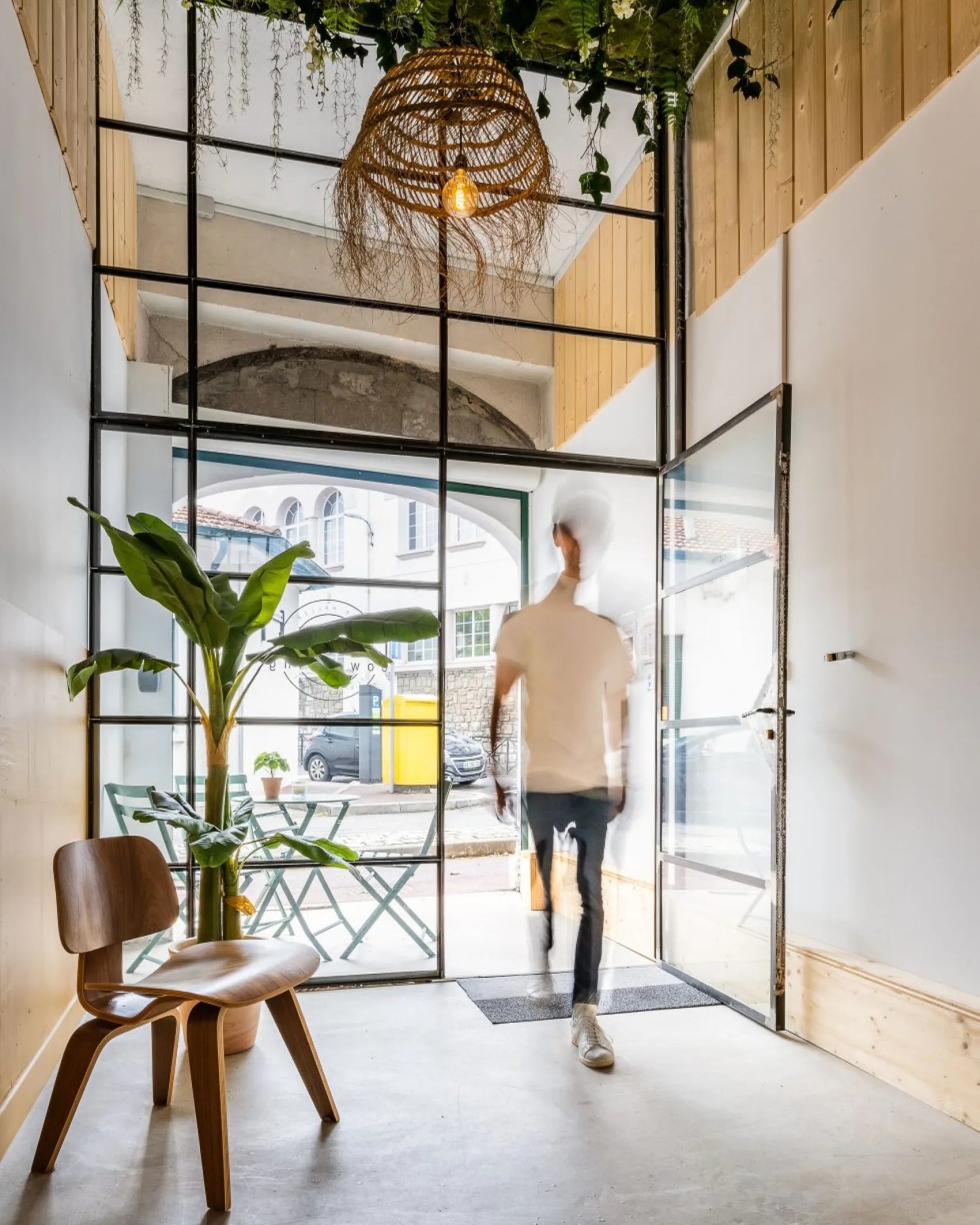
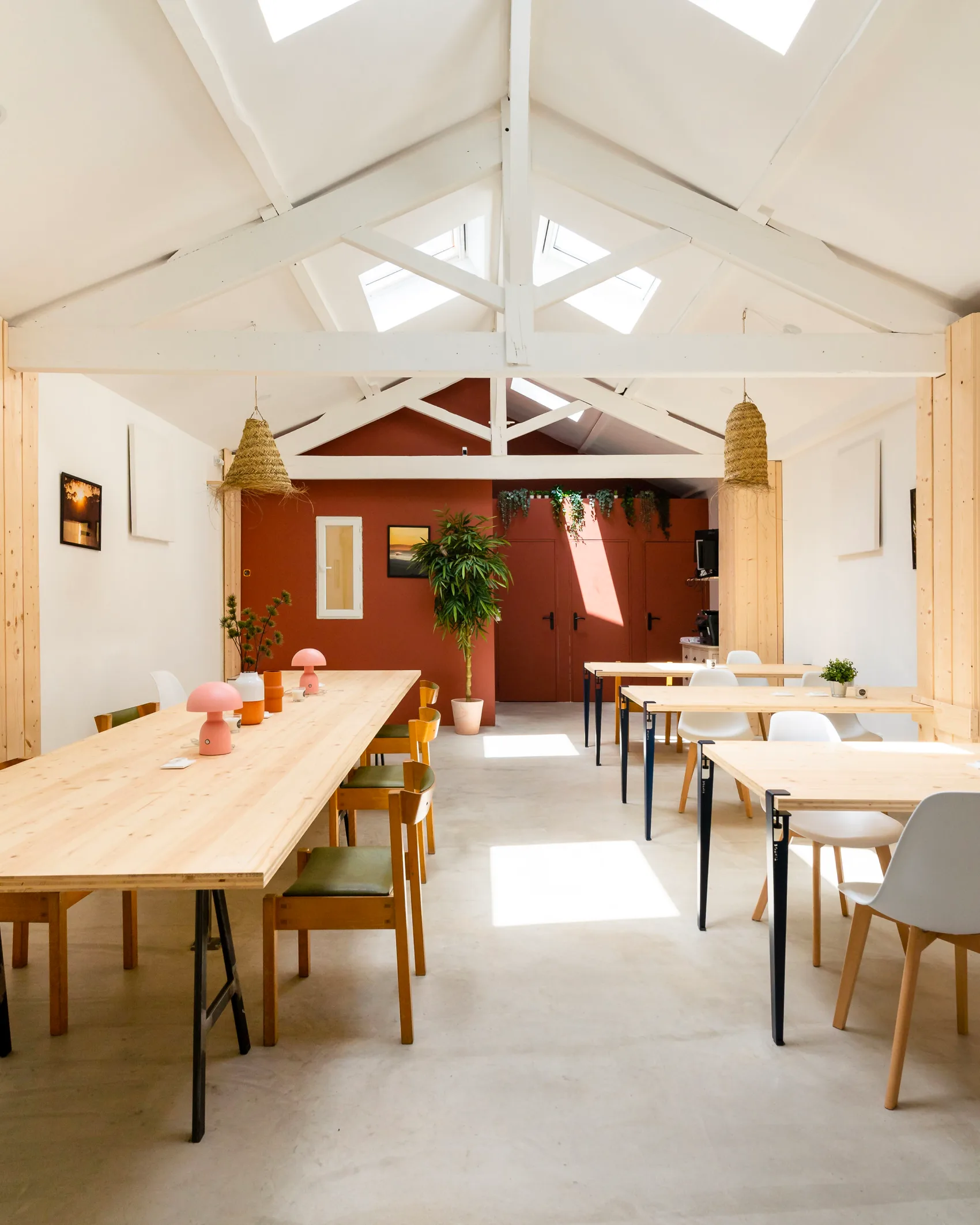
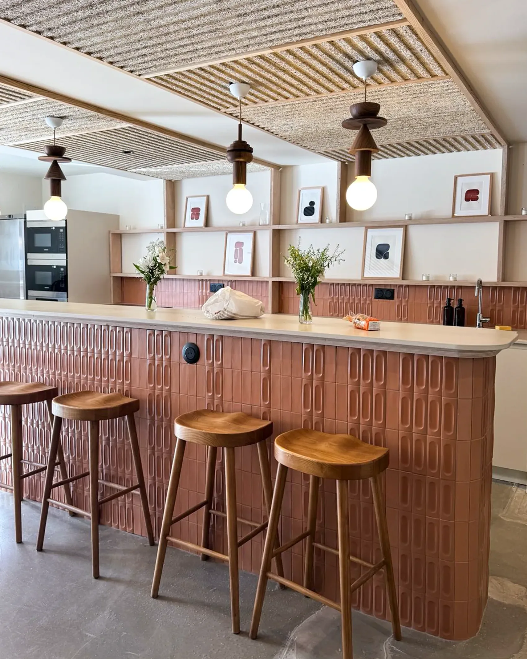
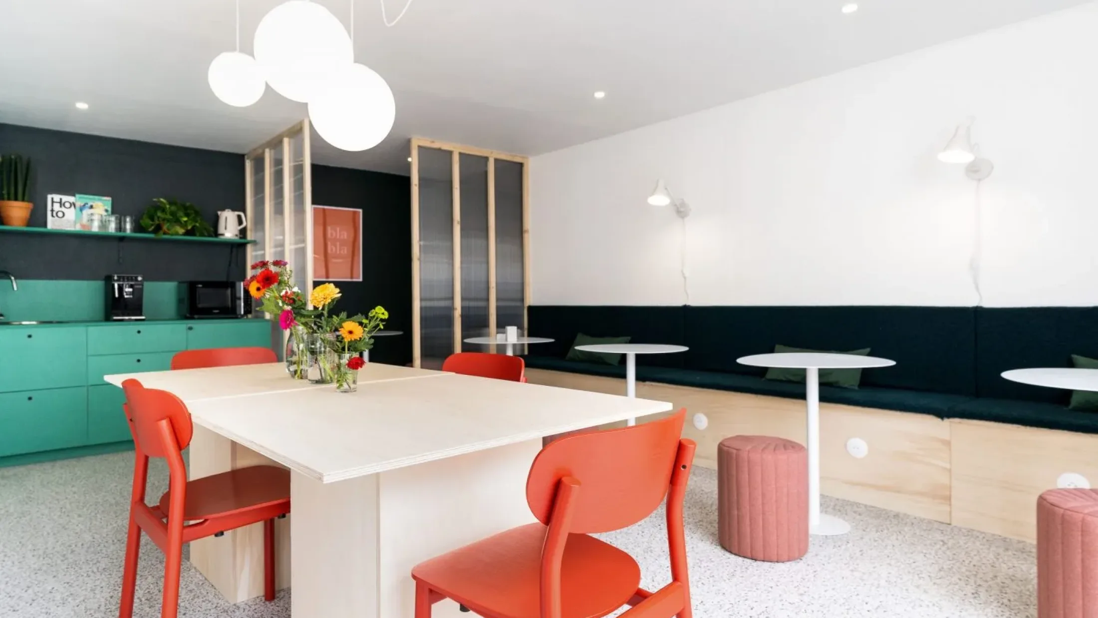
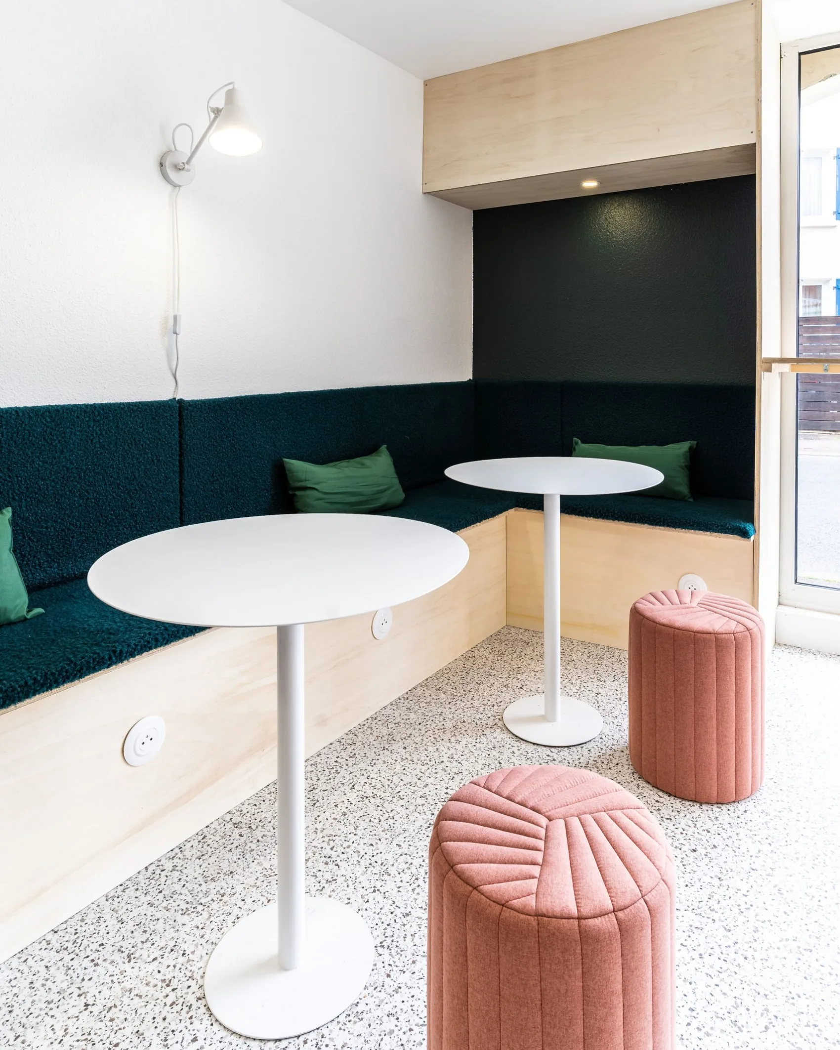
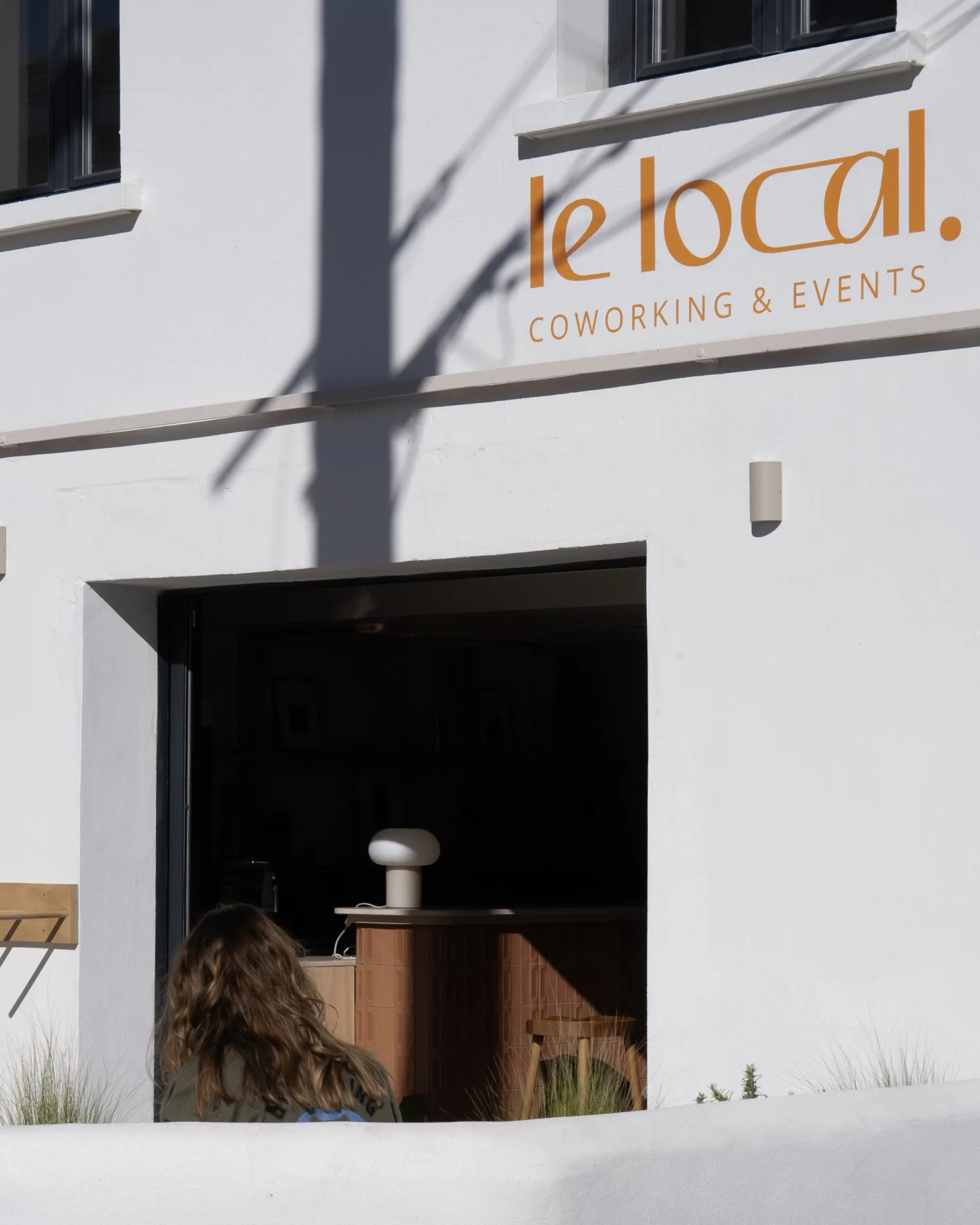
Le Local has opened in Biarritz: a coworking space for local freelancers and entrepreneurs that also hosts events. We needed to stand out from the very beginning with a cool, refreshing identity.
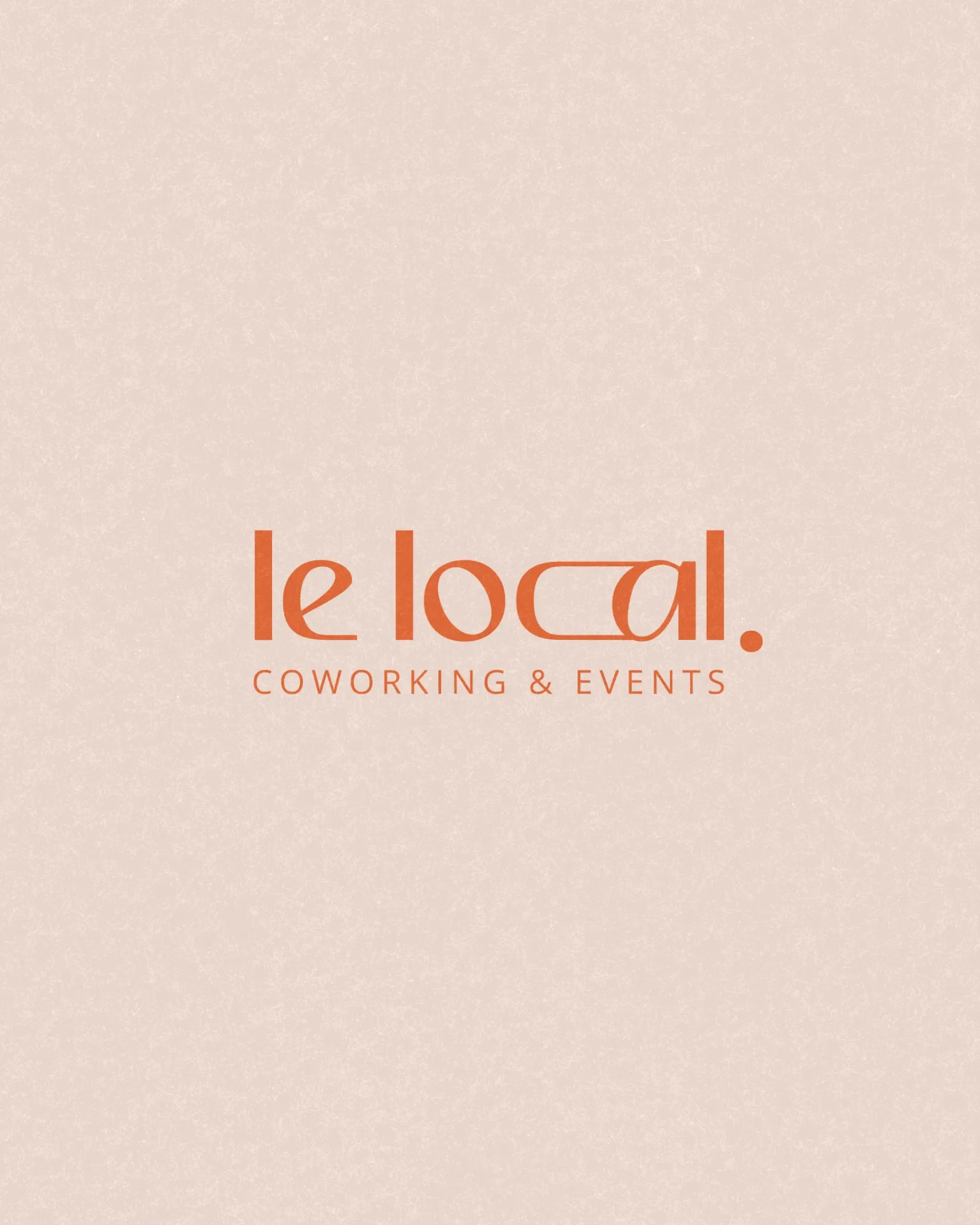
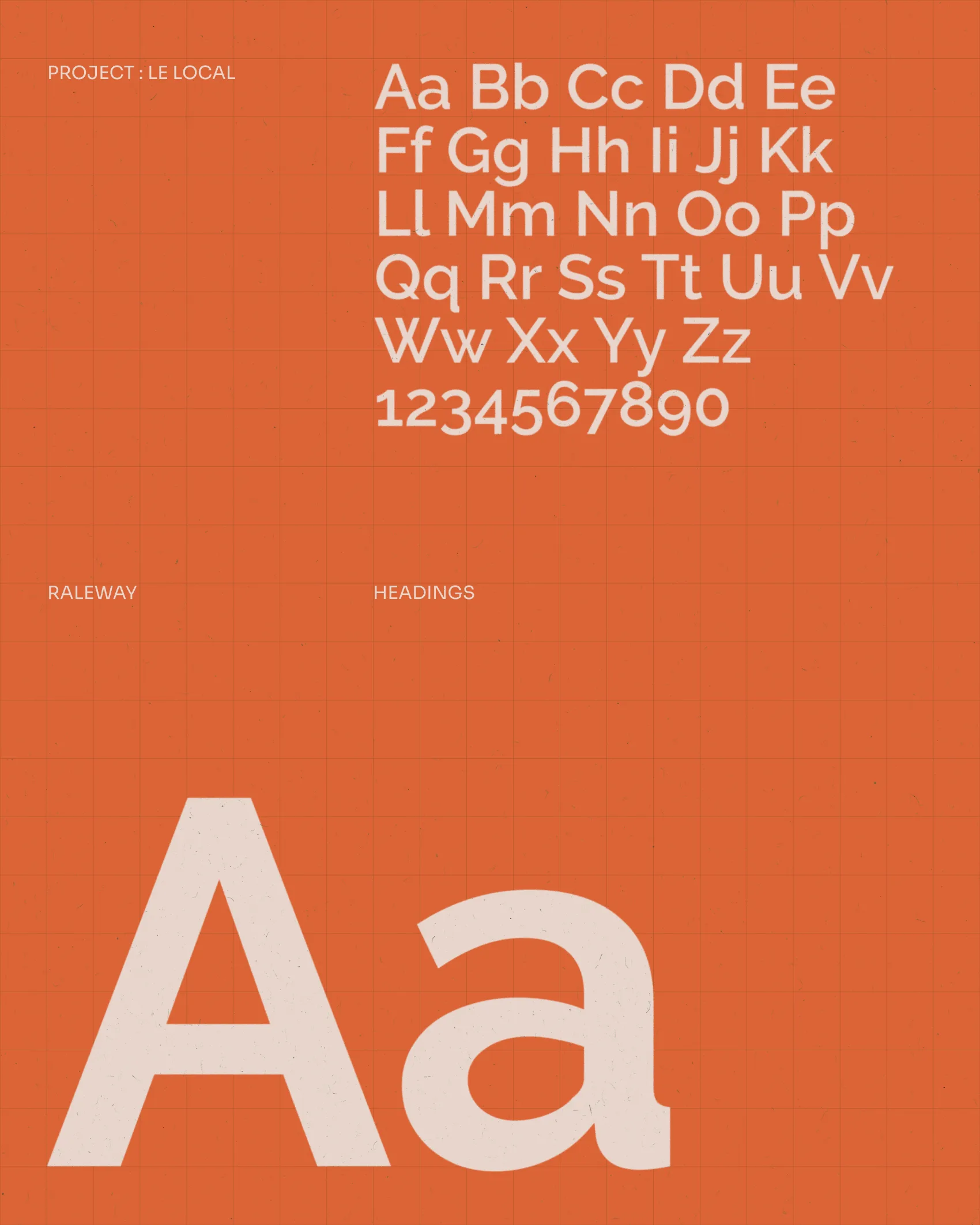
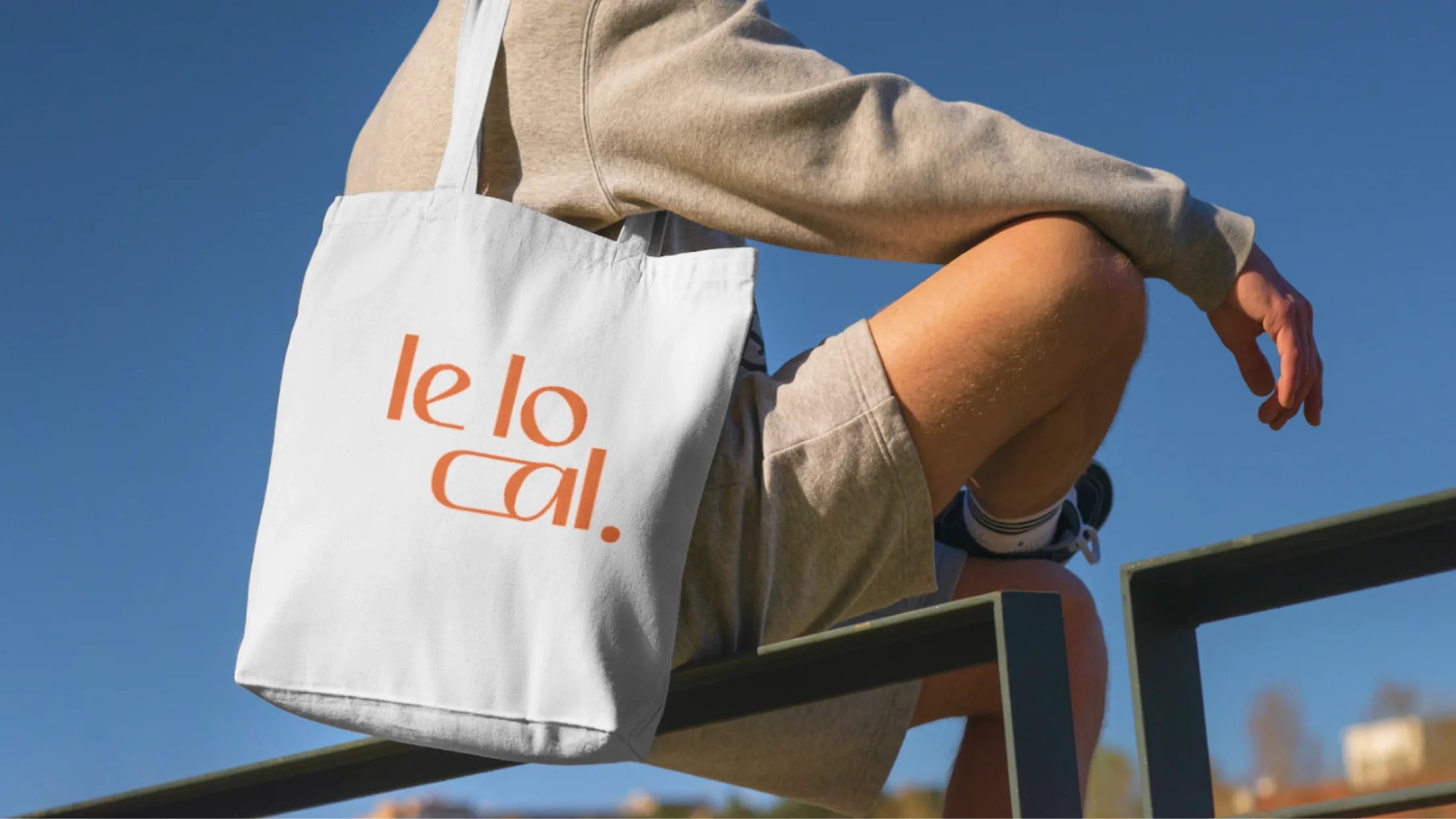
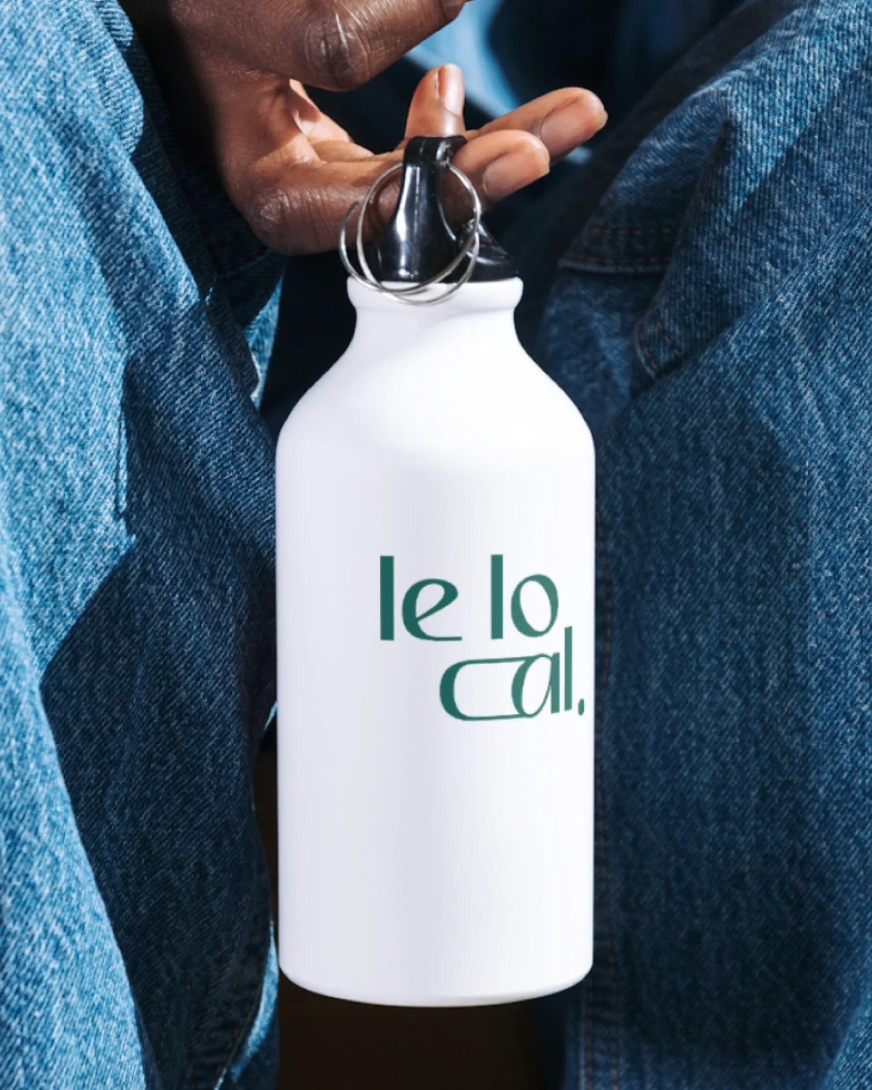
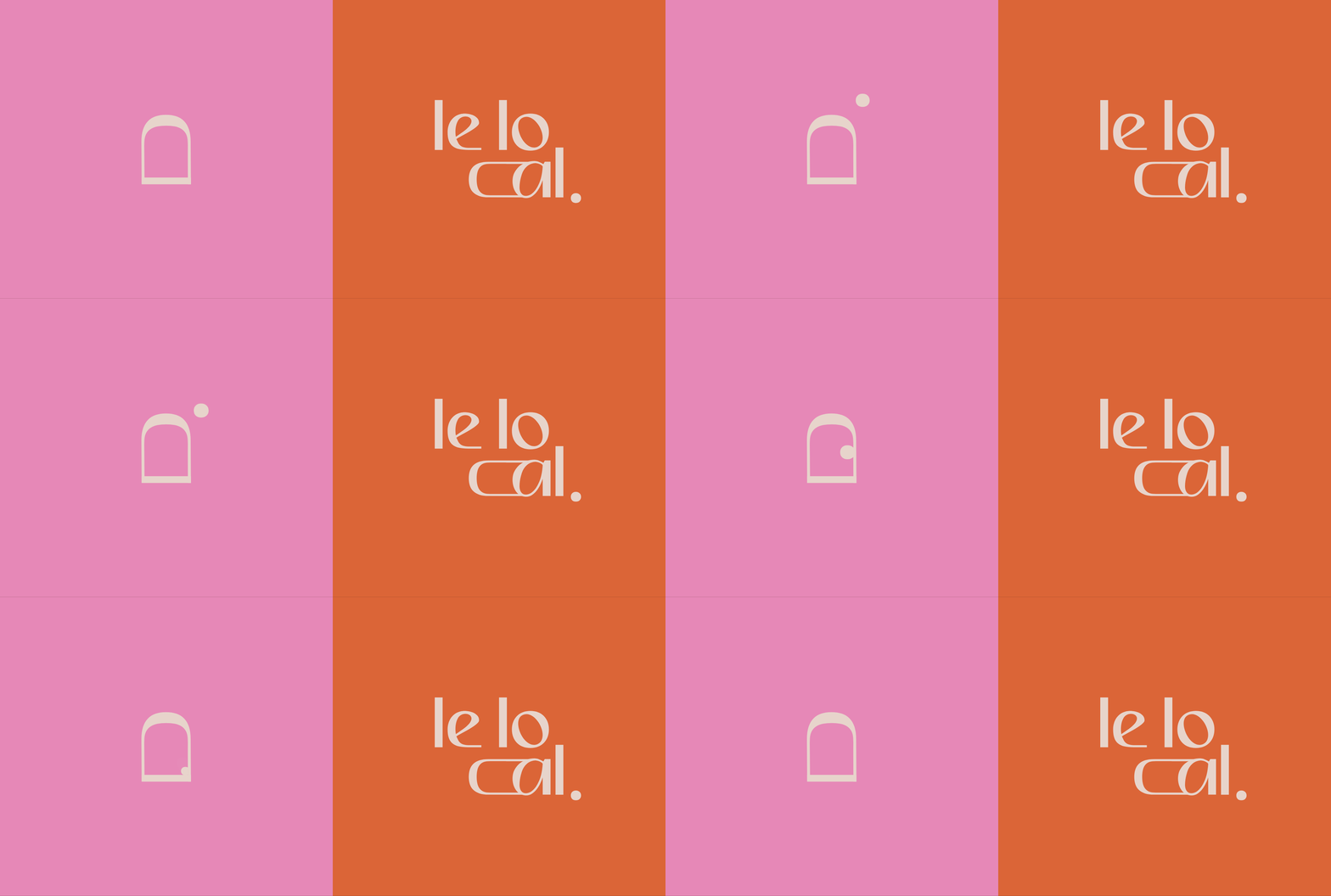
Ségolène split the name across three lines, "le lo cal.", as if sharing a space. A high-contrast typeface adds rhythm to the design. Within the letters, two symbols appear: a window in the C and a door in the L. One opens up new perspectives, while the other invites you in.
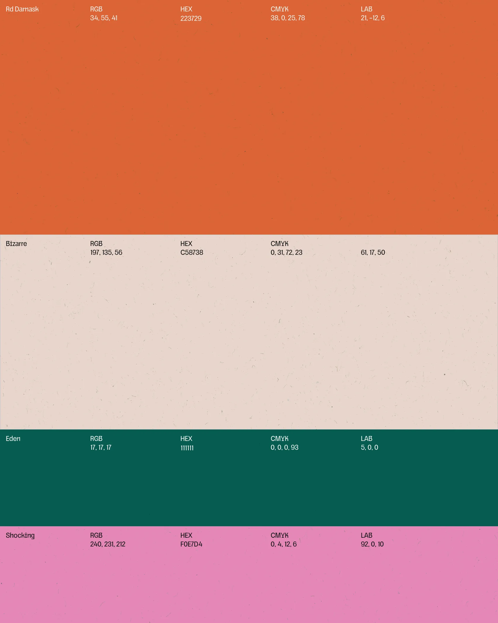
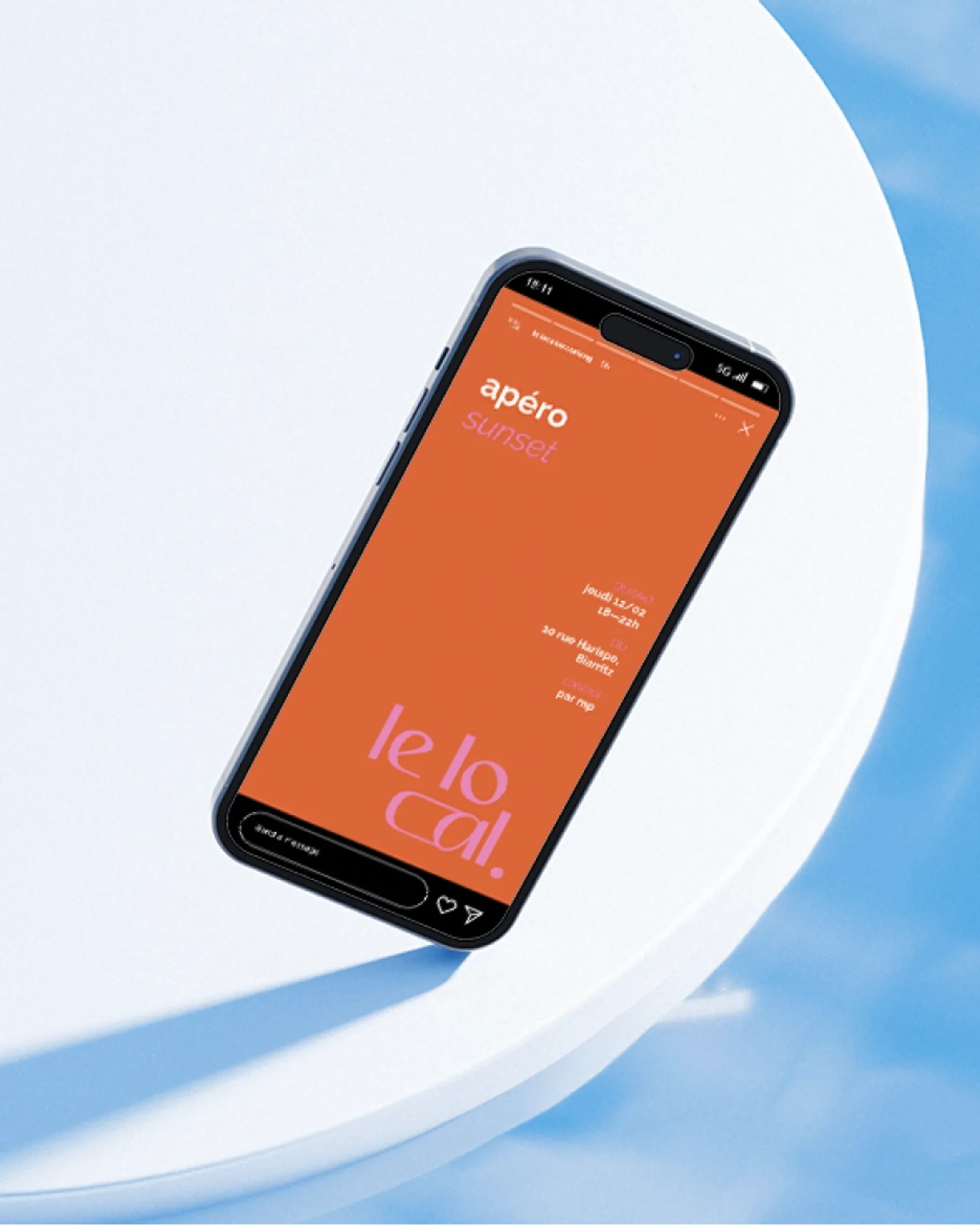
The color palette—orange, dusty beige, deep green, and pink—reflects the atmosphere of the space, balancing calm and energy. It is applied across the signage, tote bags, water bottles, and social media stories for evening drinks.