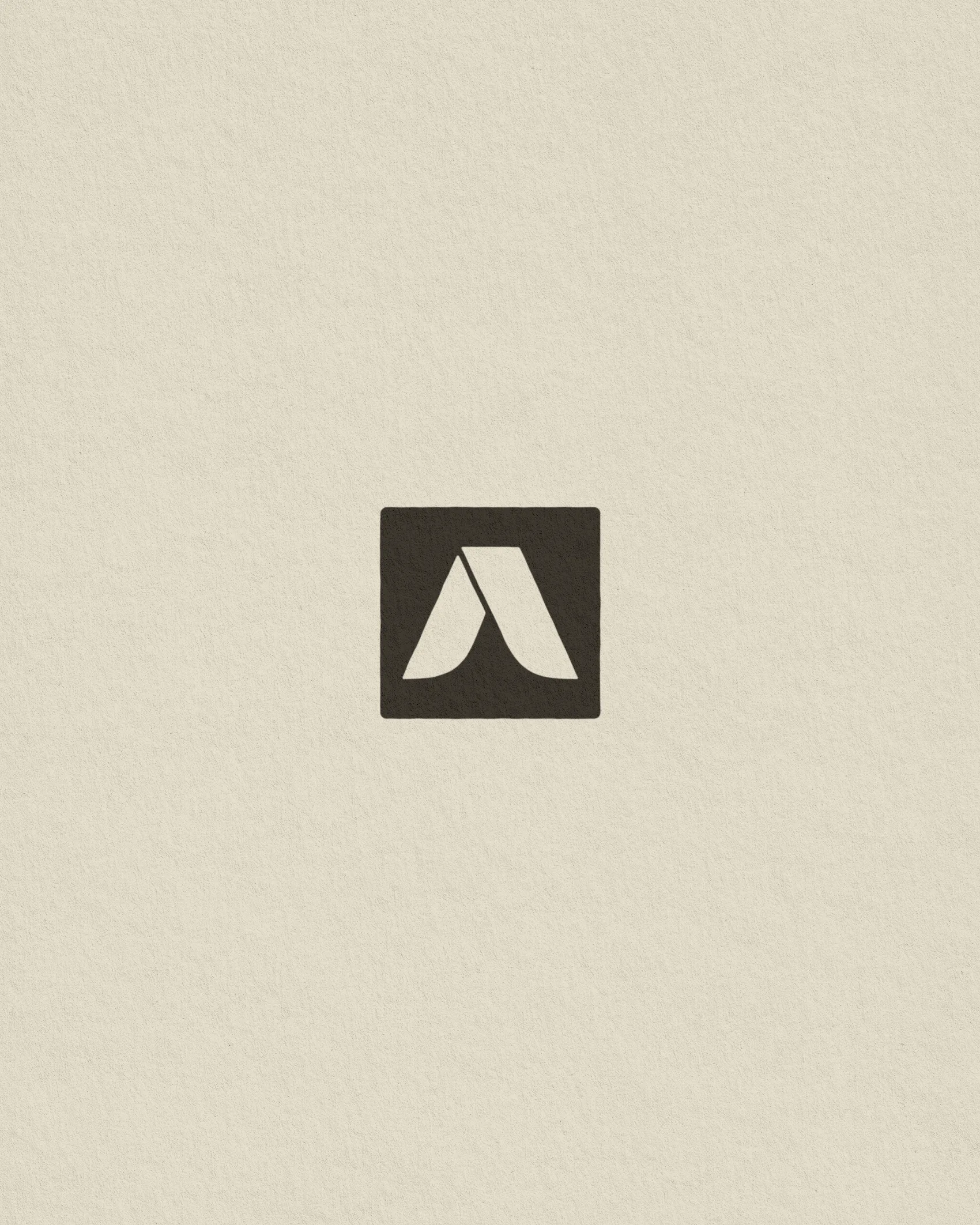
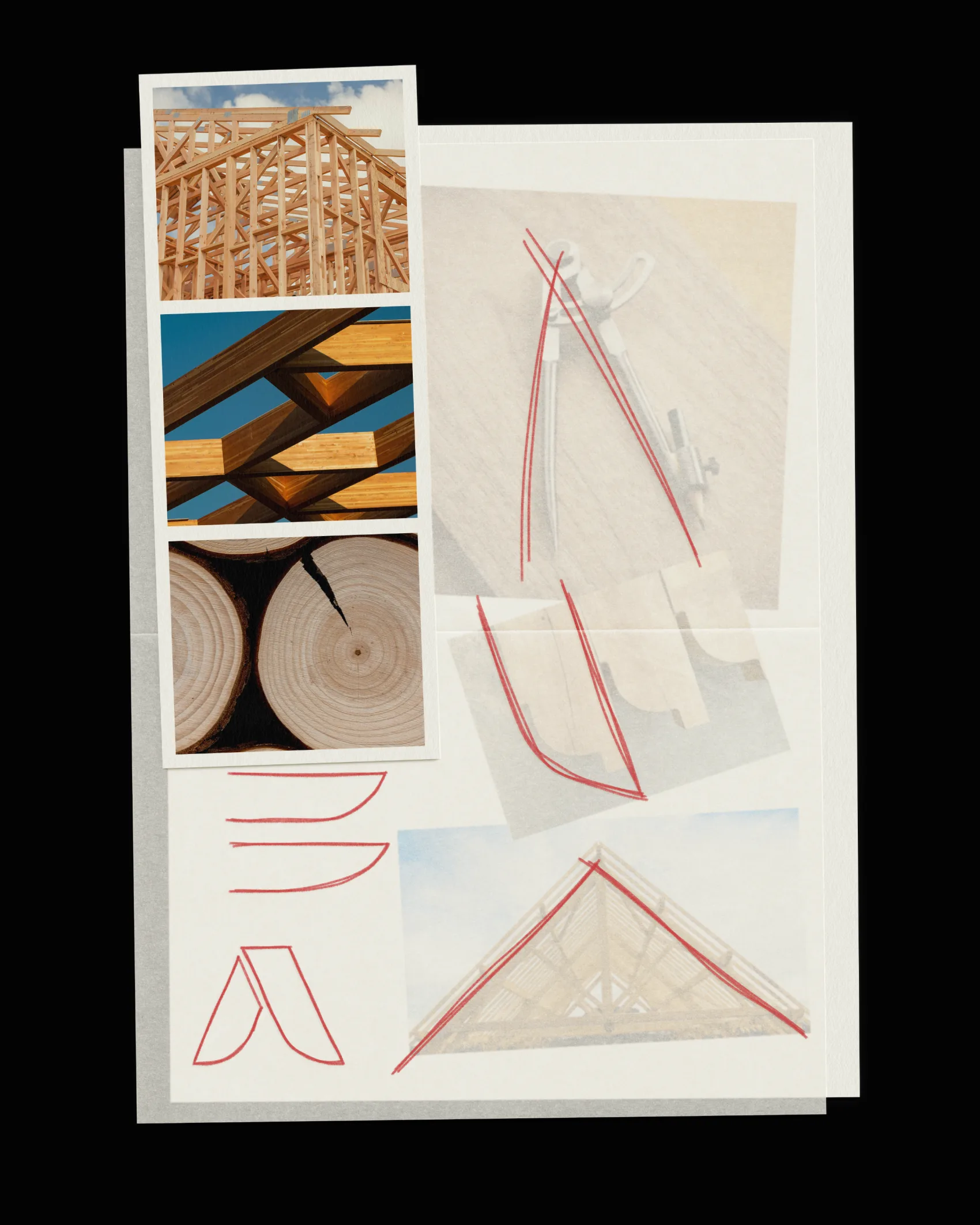
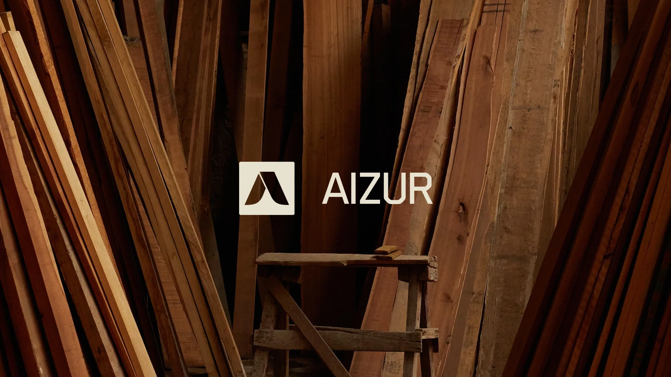
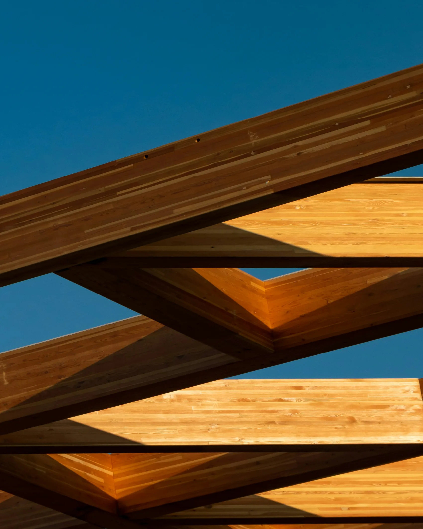
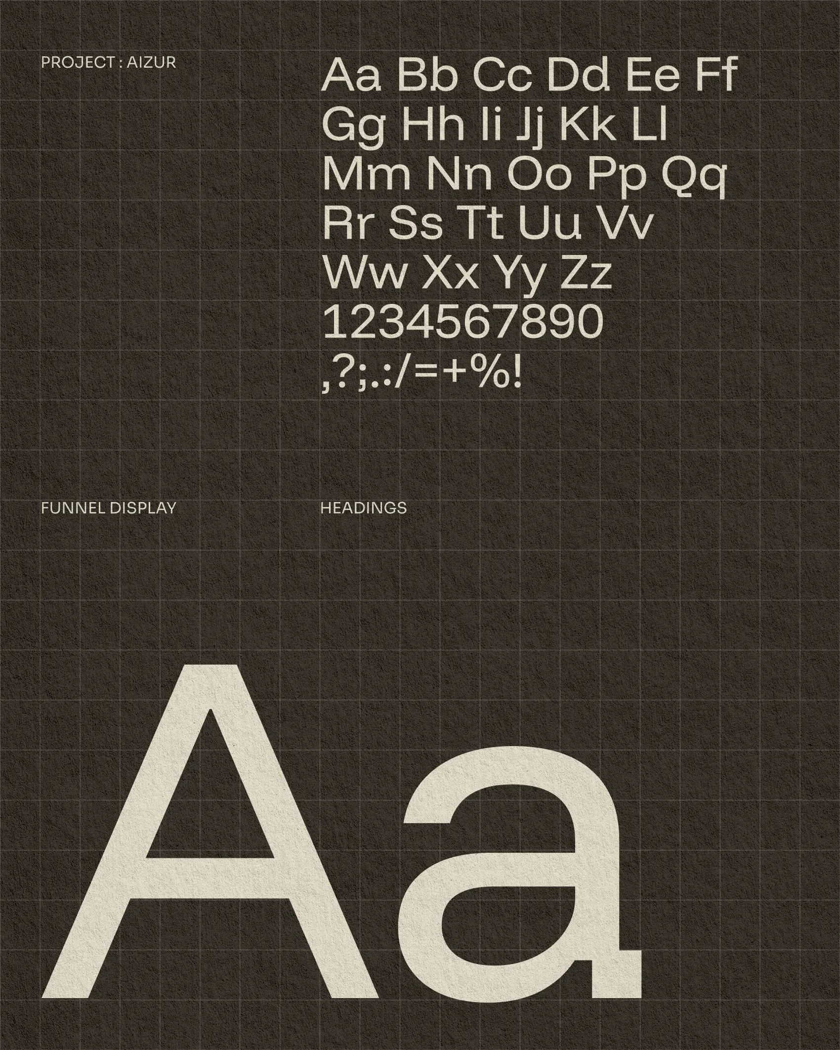
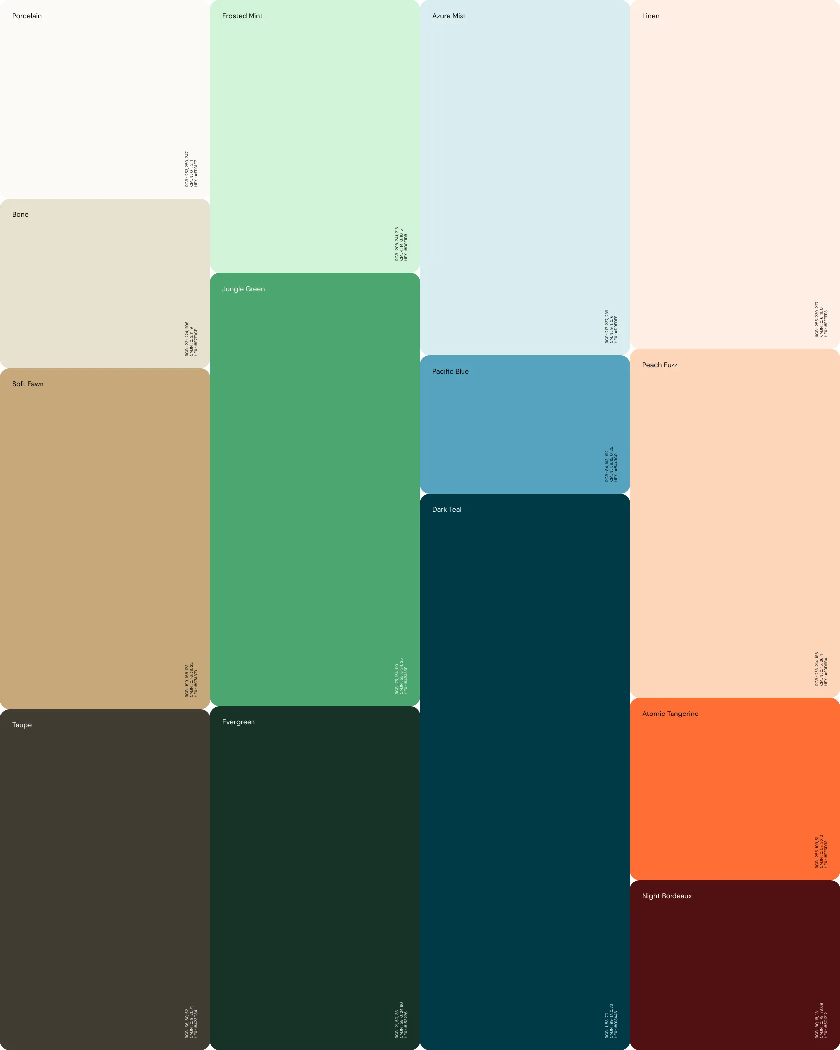
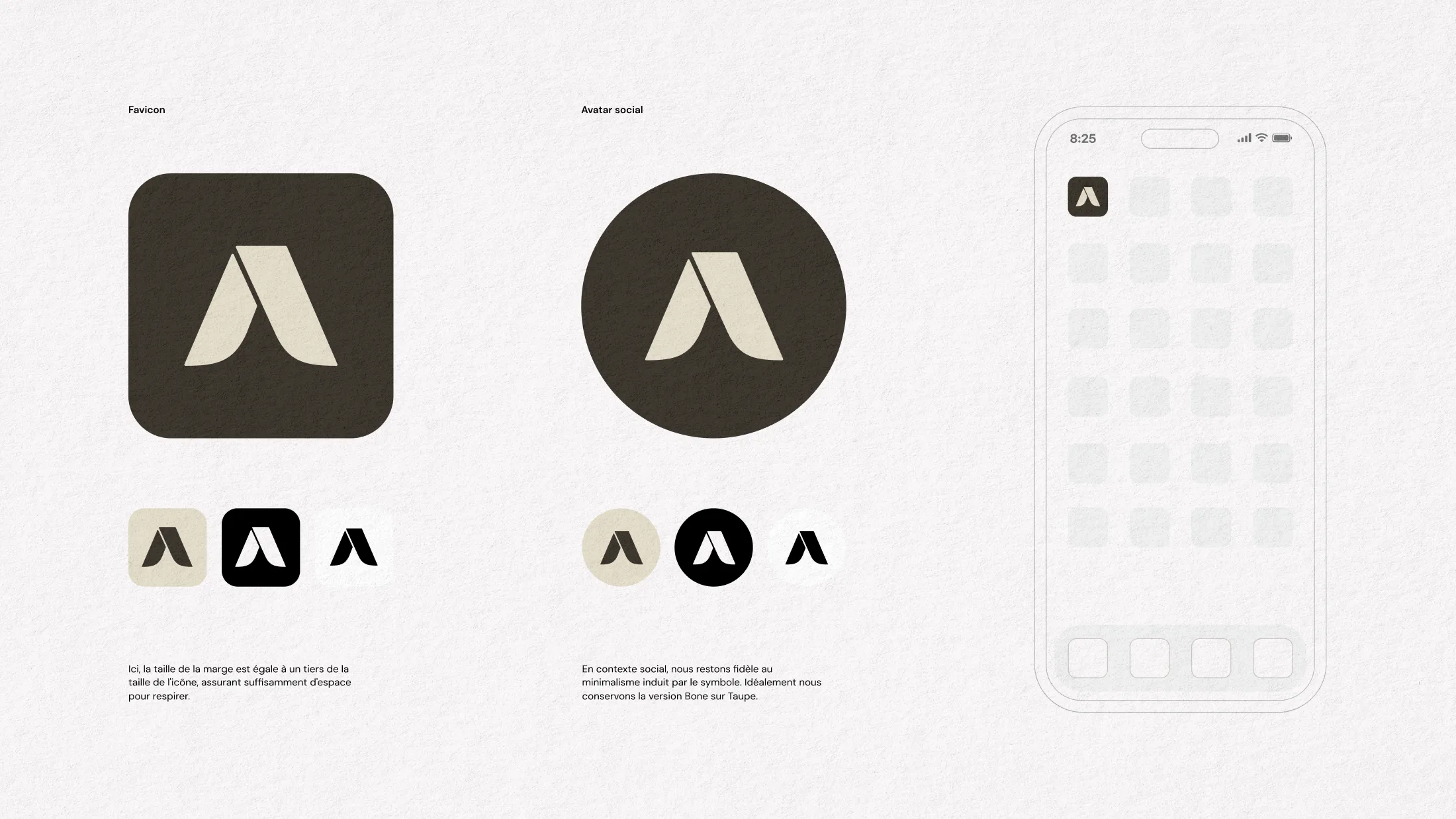
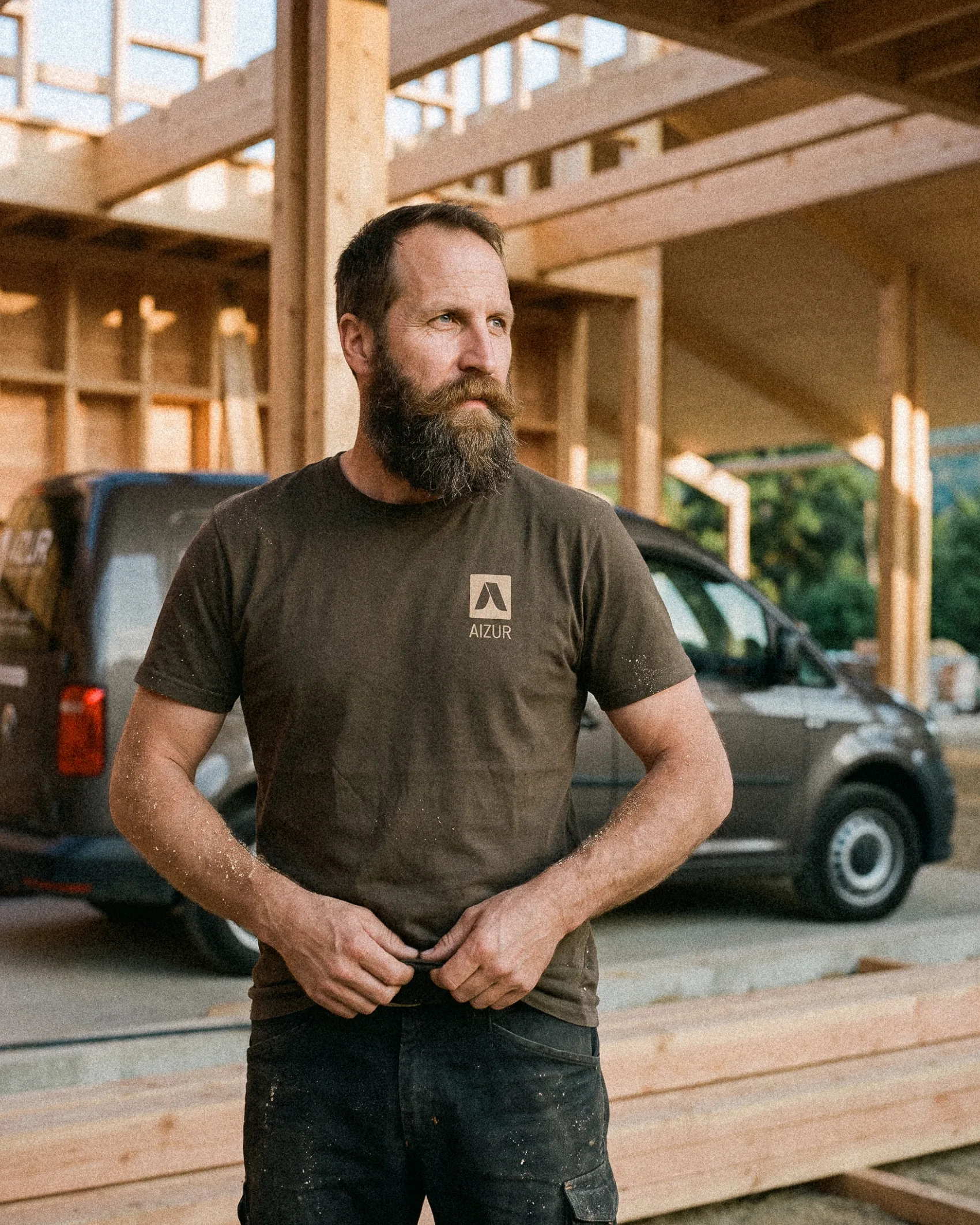
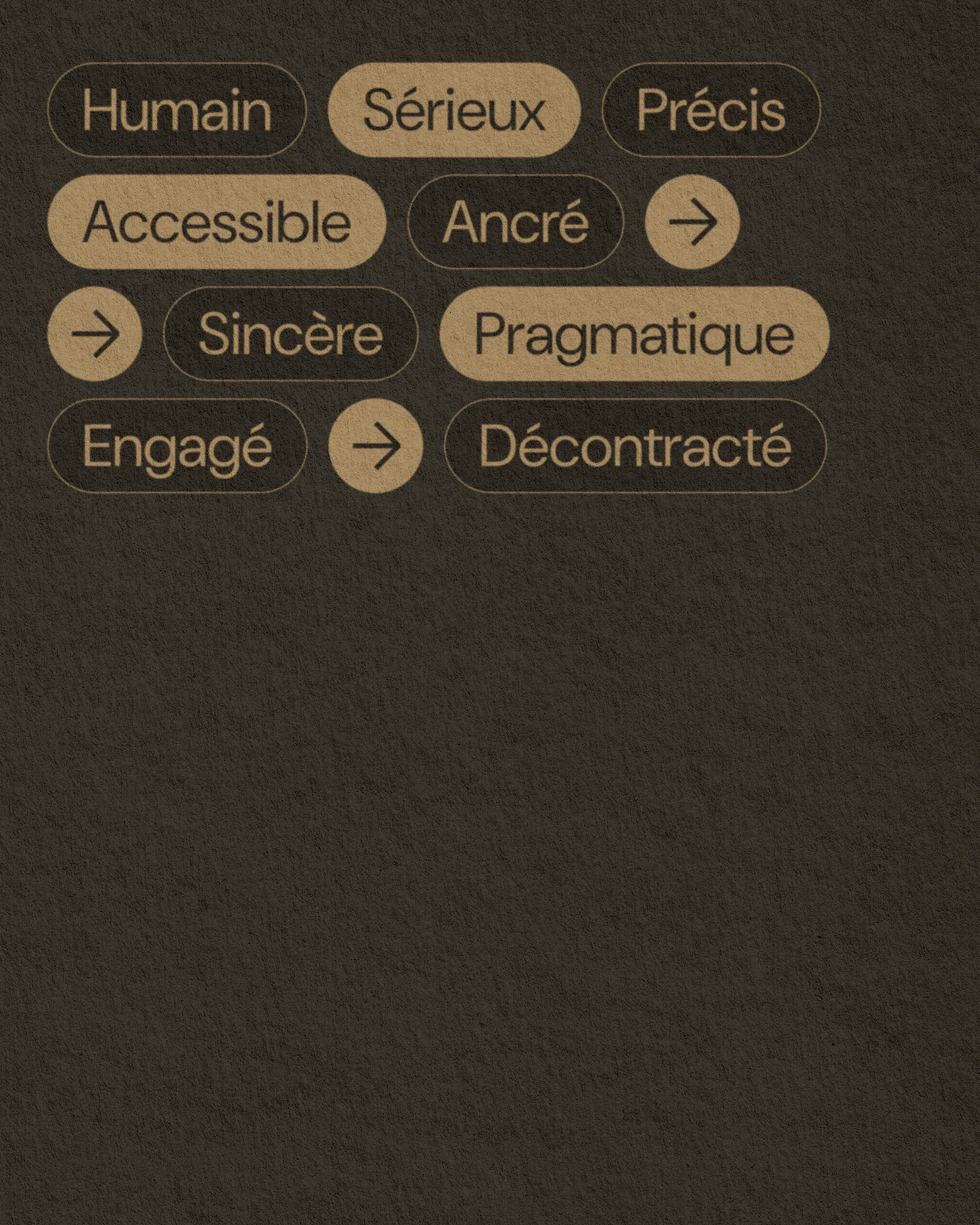
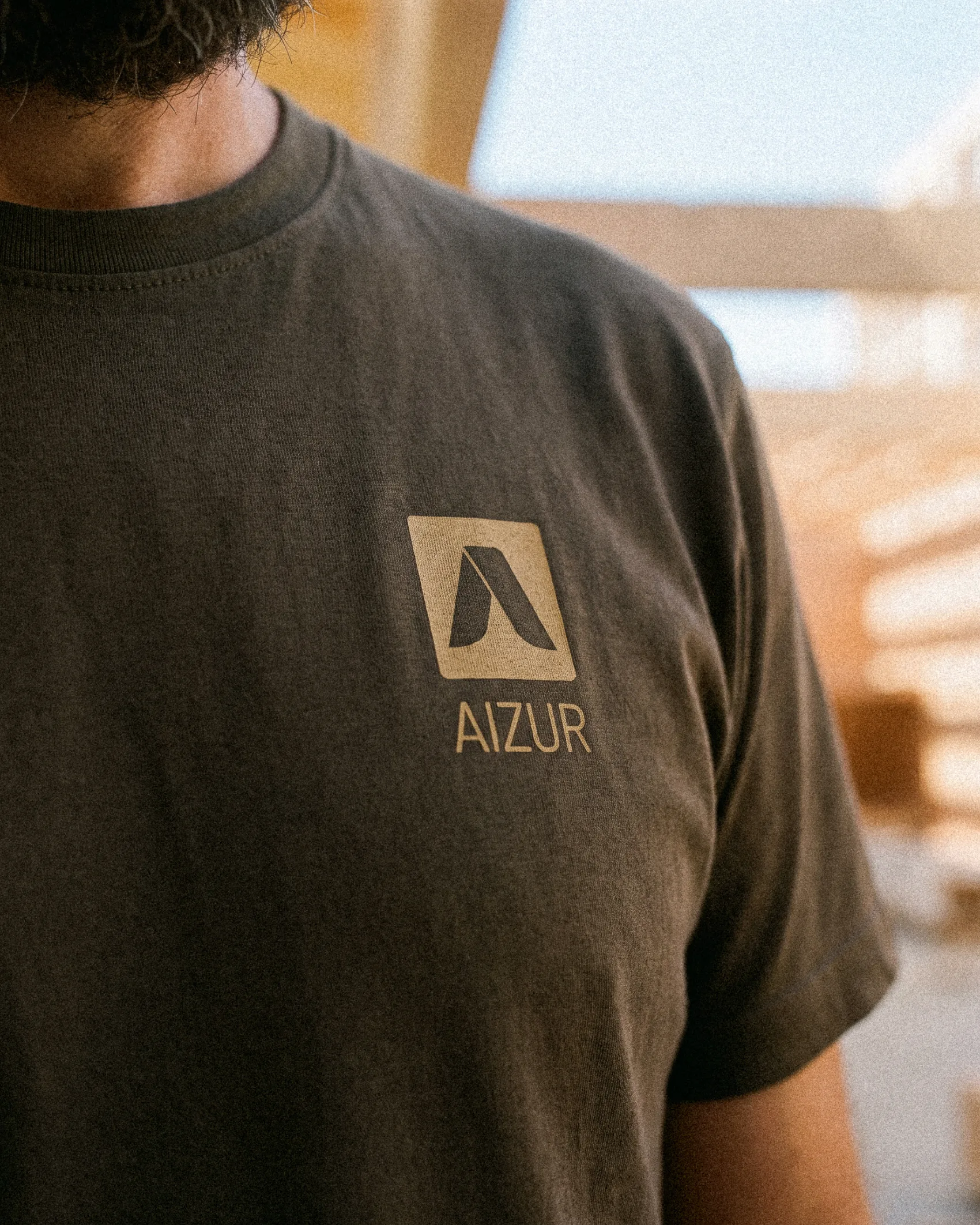
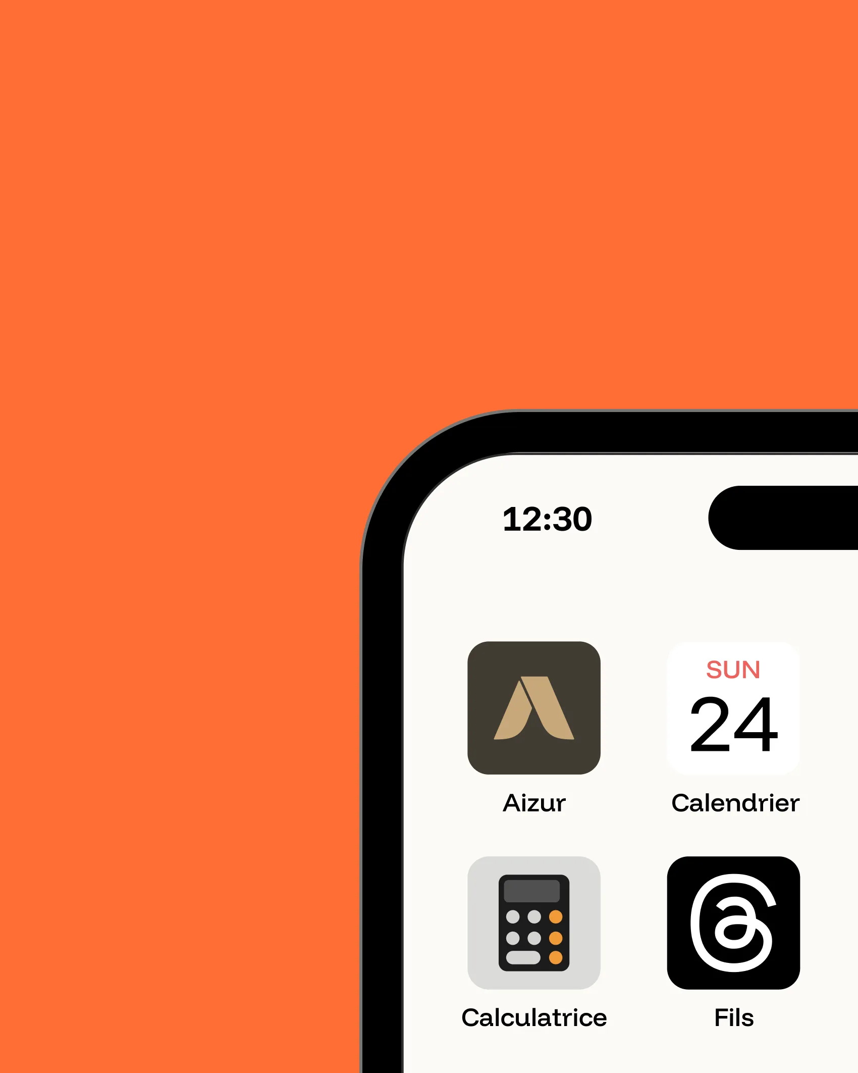
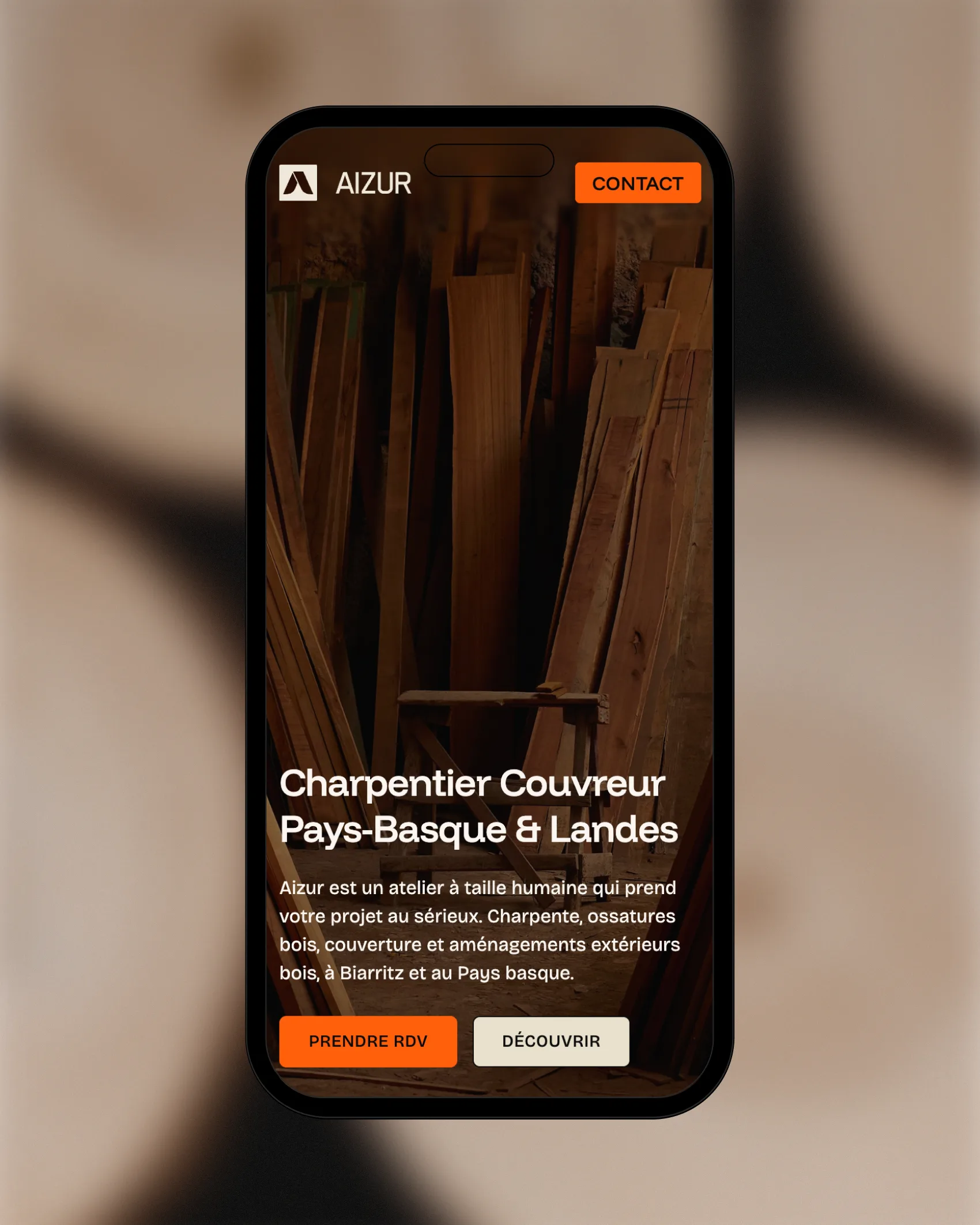
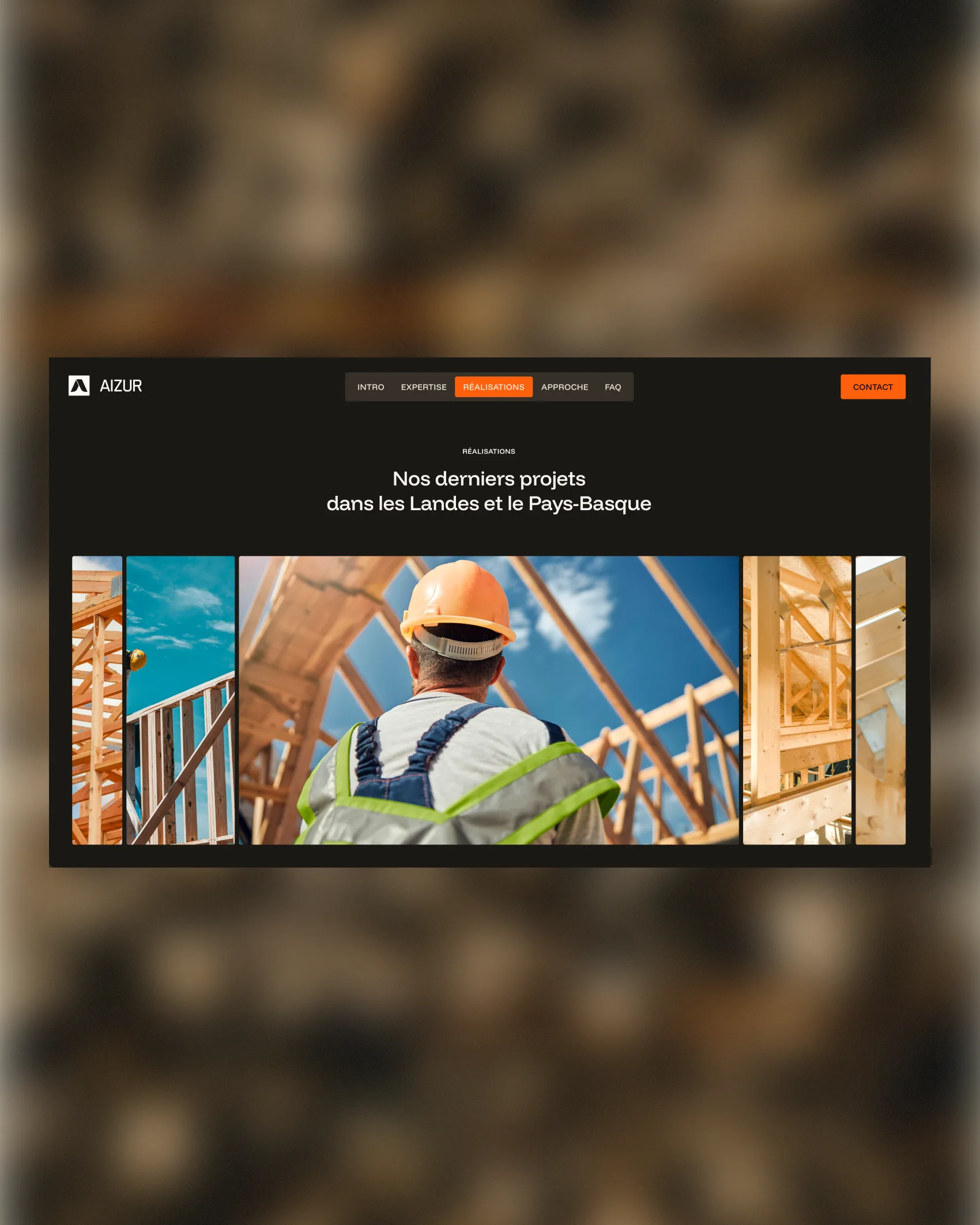
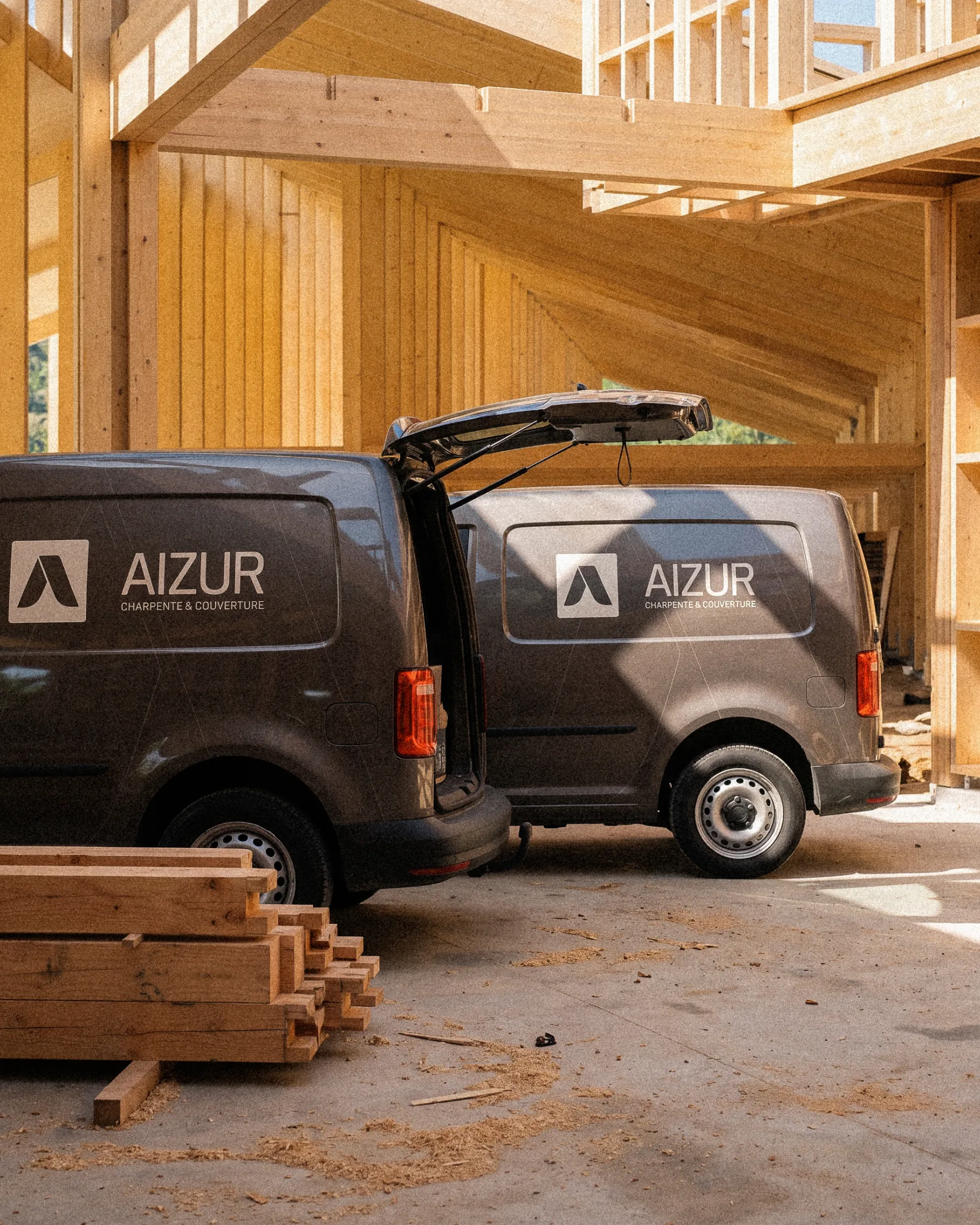
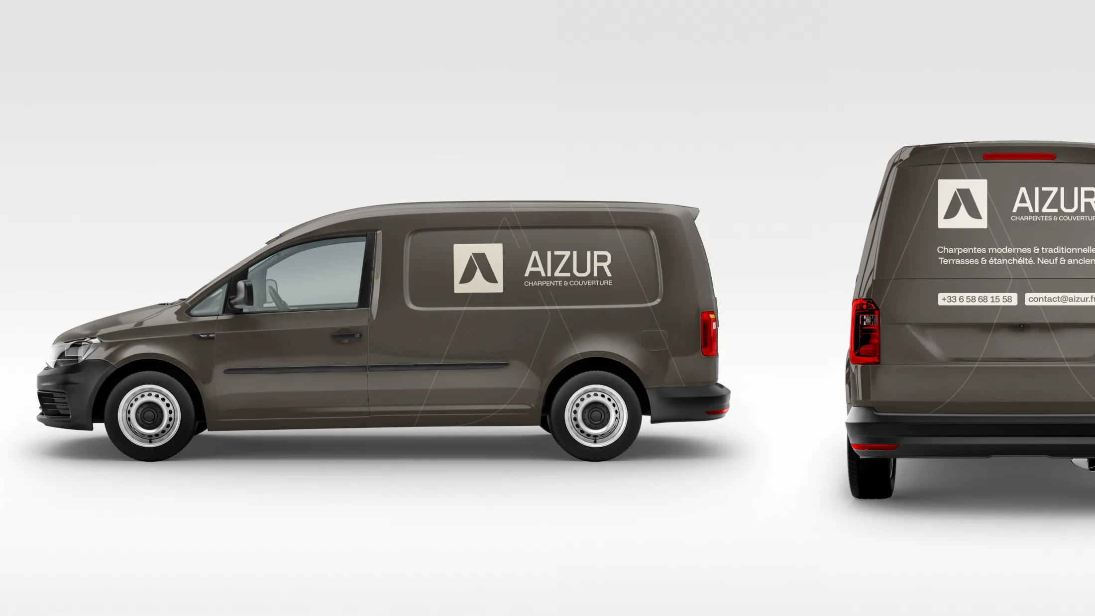
Aizur’s brief was simple: make a century-old expertise accessible without looking outdated. A competitor audit, filled with dusty logos, confirmed the opportunity. We held an express workshop to isolate three pillars: precision, environmental responsibility, and the next generation. The logo synthesizes these themes in a continuous line—a minimalist roof that also evokes a carpenter’s compass and the curve of a purlin. The color palette is inspired by the natural elements surrounding the brand, tempered by a chalky white reminiscent of sap and an accent orange. A concise 20-page brand guide frames the typography, visual direction, and social media usage. On the digital side, we moved from Figma mockups to Webflow integration. The one-page site showcases projects, incorporates micro-animations, and offers a direct contact channel. The team manages the content independently thanks to Webflow’s accessibility.
Aizur
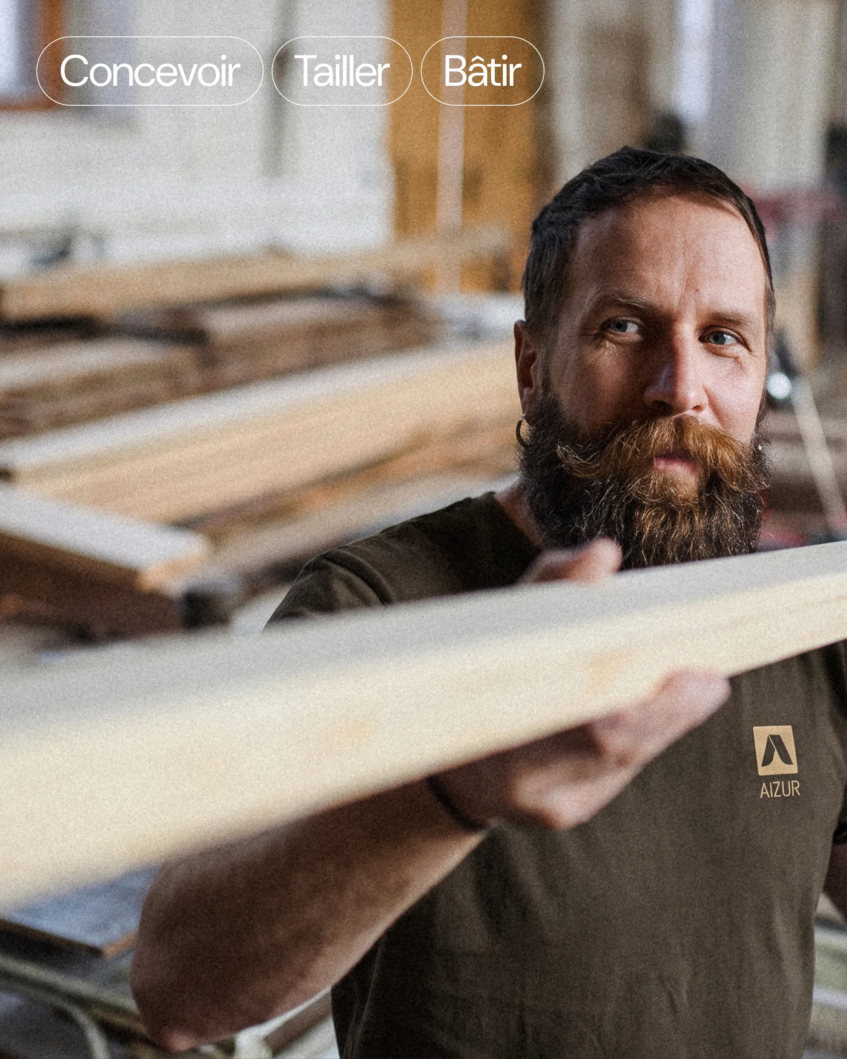
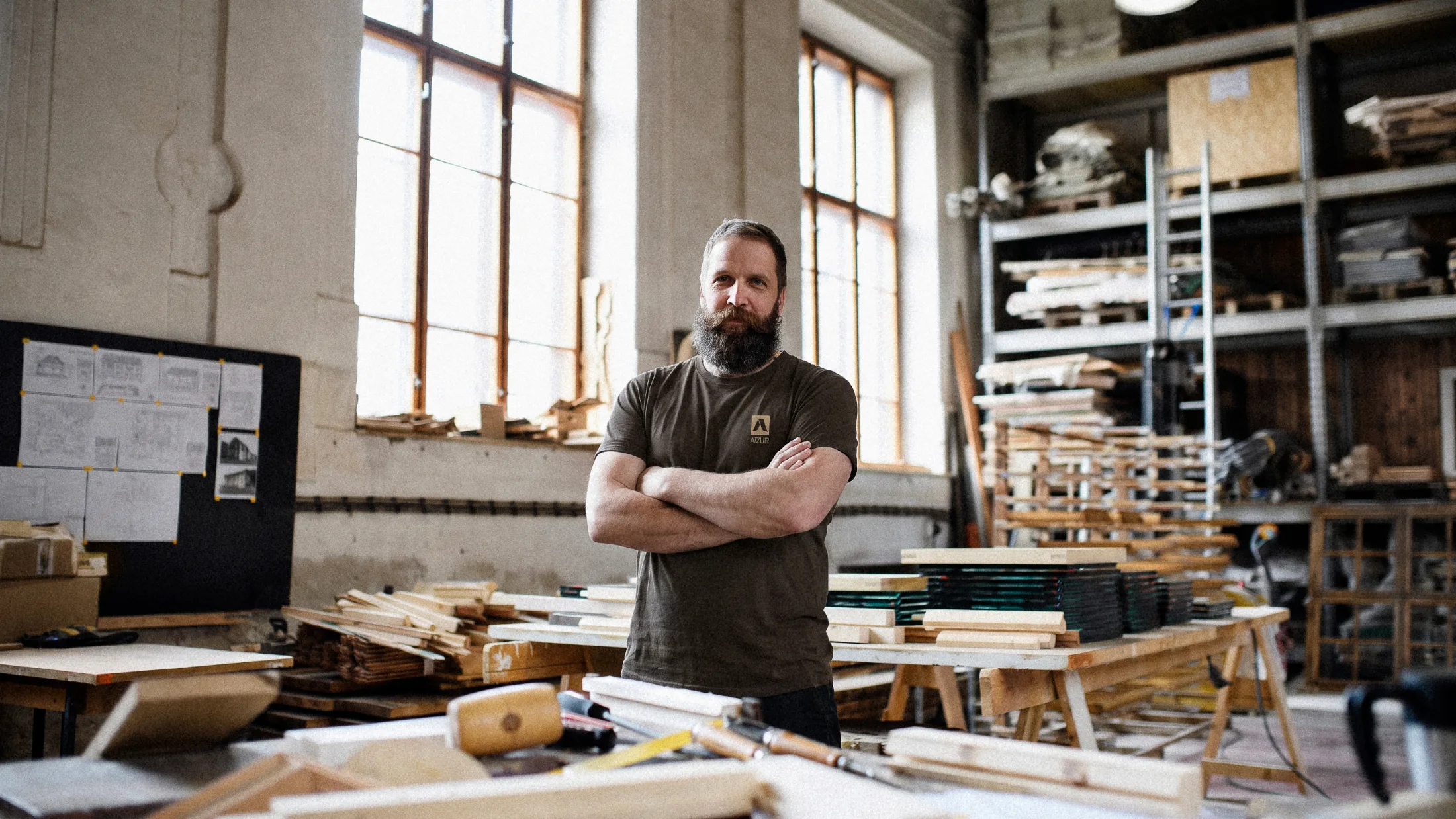
Aizur, a young Basque carpentry workshop, entrusted us with creating a clear and memorable brand identity. Himitsu developed their visual identity, brand guidelines, and custom website.
Credits
Équipe

Lucas Vigneu
Livrables / Branding
Digital
Content
No items found.
Crédits
Client


No items found.
Découvrez également ...
/
Jone Workshop
Premium Textile Craftsmanship
/
KoMunity